Managing Conversion Rate Optimisation, Stage 3: Plan
In this article we continue to follow the 6-step Conversion Architecture model I outlined in Part 1. Analyse and Part 2. Talk. This 6-step process has been developed over the last 10 years of our work to become the foundation of all our clients’ projects so I hope it’s useful both to agencies and clients reviewing their approach to conversion rate optimisation (CRO). In this article I look at key issues to think through as part of planning after the analysis and research have been complete.
Demographics vs. Psychographics
Demographics looks at variables like age, gender, education, ethnicity and income level. Marketers are familiar with this, but for CRO planning you also need to think about Psychographics; which looks at the thought processes of site users. You need to think about your audience from a User Experience perspective. How do they interact with a website? Once you know this, you can create the best possible persuasion path.
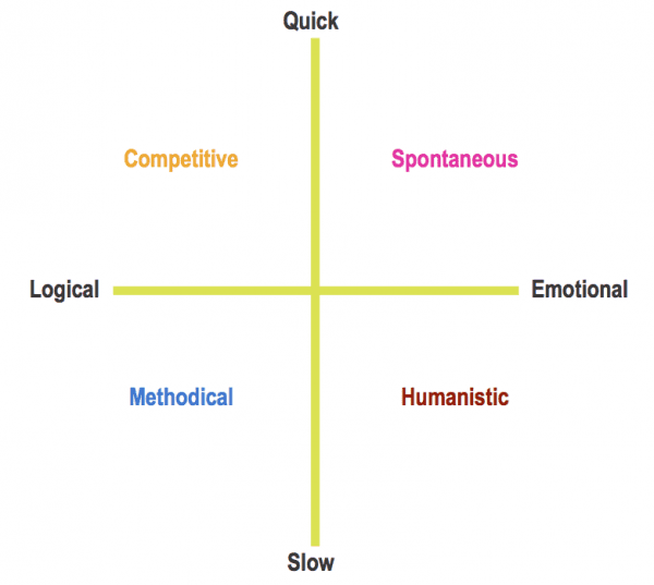
When you think about thought processes, in order to develop a strategy, you need to try to categorize your audience. The same way you use demographics to segment a target market, you need to know what makes your audience unique. To do this, we use a ‘User Temperament Chart’ to form creation of a ‘persona’ to your audience. Here are the main types of personality and temperament exhibited by web users as they take decisions about products and services:

This allows you to make generalisations about the user so you can make a strategy in accordance to their behaviour. If you haven’t seen this approach before, it was introduced by Bryan Eisenberg when at FutureNow (read more details on the dominant personality and temperament types and how they affect purchased decision making).
Applying The User Temperament Chart to create a persona – 3 steps
This is used to map users’ decision-making processes, so you can determine which persona they belong to.
Step 1
After talking with the people on the front line of audience interaction, you should be able to detect what questions a user wants a website to answer; and how their decision-making process works. Based on this, you now ask two questions:
- Is their decision logical or emotional?
- Is their decision made quickly or slowly (prompting further discussion/inquiry)?
Step 2
When you know how they think, you can equate their attributes into a persona.
Each of the four temperaments evident in a persona digests information in different ways:
- Competitive - Businesslike, no-nonsense, disciplined, strategic, what can you do for them? (Power-oriented)
- Methodical – Businesslike, disciplined, methodical thinkers, how can your solution solve their problem? (Detail-oriented)
- Spontaneous – personable, confident, undisciplined, fast-paced, why is your product best for their needs? (Activity-oriented)
- Humanist - personable, undisciplined, take their time, who are you and why do you care about them? (Relationship-oriented)
Step 3
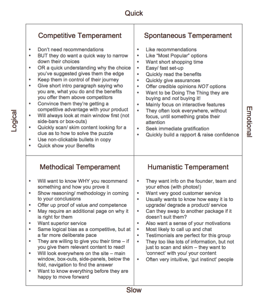
By reviewing these characteristics, you can start to think about what content and user journey they will respond best to. Here is a quick guide to what the different psychographic types like / dislike in a web experience:

This gives you a great footing for approaching the ‘plan’ stage of Conversion Architecture.
Now you understand how your audience thinks, you can construct a user experience that best suits their persona.
Customer Journeys vs. Persuasion Paths
What is more commonly described as a ‘customer journey’, you now call a ‘Persuasion Path’. This is because you have the opportunity to piece together a multitude of cues and influencers to help persuade the user to complete your intended conversion.
The Persuasion path has to be end-to-end. This means the inbound link or traffic source, the landing page and the rest of the funnel has to be cohesive. There has to be a path that is consistent throughout, tailored to the persona type you are targeting.
How do we plan the Persuasion Path?
By creating Site Maps and Wireframes, you can start to structure your site so that it is suited to the persona you are trying to convert – and then instigate that through the right words and images that will best persuade that persona.
Firstly, the site architecture.
This looks at the layout of your pages. You have to ensure that your pages are presented in a way that follows the user’s train of thought. This way they access the information that is relevant to them, at the appropriate time. Easing them into the conversion without confusion or hesitation.
Next, Wireframing.
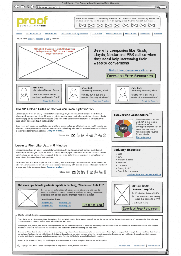
This is where you draw out a template of how your website will look. Here you start to structure web pages so that you can decide where your content will be inserted. Some great tools for this are available with Balsamiq and Omnigaffle. These don’t need to be highly technical drawings yet, we use Balsamiq to create first draft wireframes like this we used for a recent site design [Editor: we use this too at Smart Insights and I recommend it]:

You need to make sure that the structure of your pages represents the users persona. If you complete this stage successfully, the user will have no problem navigating their way through your site. You have to try and answer all their questions before they’ve been asked.
Finally, Content.
Think about your titles, headers, sub-headers and call to actions. Different personas prefer to view content in different ways. This is where you really have to mash up the information you have about demographics, psychographics and your USP’s.
You should have much of this from the exercise of plotting issues/ responses on the user temperament chart covered above. Study that, think about what will convert that persona type (I find it helpful to imagine I’m talking to someone I know who will fit that profile – I do look weird talking to myself in the office, but it works for me!).
Different paths for different users.
It’s very likely that you will be targeting audiences who have different personas. There’s no need to panic! That is absolutely normal and you can cater to them all through one website.
If you are targeting different types of consumer, follow the same routine. This time though, create different persuasion paths to suit the different users. You need to think about which of your USP’s suit the different personas best.
Use these to your advantage. Present specific information, tailored to reach the most relevant persona. Different personas also prefer to view information in different ways. So think about this when putting your Site Maps and Wireframes together.
Conclusion
Do some talking… do some planning.
Make sure you know who your audience is. Get insight from the people who deal with them the most; or conduct research. The better your understanding of the user, the better chance you have of guiding them through your persuasion path.
Tailor your persuasion path to the type of persona you are dealing with. If there are multiple personas, make persuasion paths to target each one. Base the structure of sites, links and journeys on your audience’s thought process.
Remember: conversion architecture is cyclical. Continue to explore what works best. What works best for you?


