Enewsletters are still the main online direct to customer communications tool, so it pays to invest time and thought in a decent template.
Over the past few years of running email marketing training courses I have reviewed hundreds of enewsletter templates and often see the same basic errors. Individually they often aren't important, but if several good practice features are missed, they can definitely adversely affect the experience or response rates.
Three best practice enewsletter template examples
Good practice will naturally vary according to sector. The two main enewsletter styles are B2C retail-style for transactional sites featuring products and information-led for business-to-business, relationship development and publishing. We will look at and example from each.
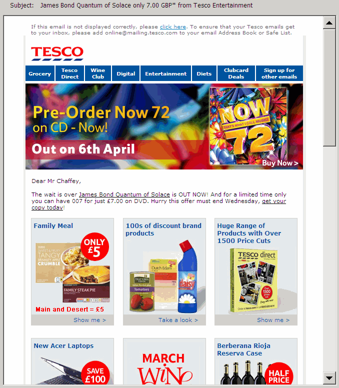
1 B2C transactional newsletter example


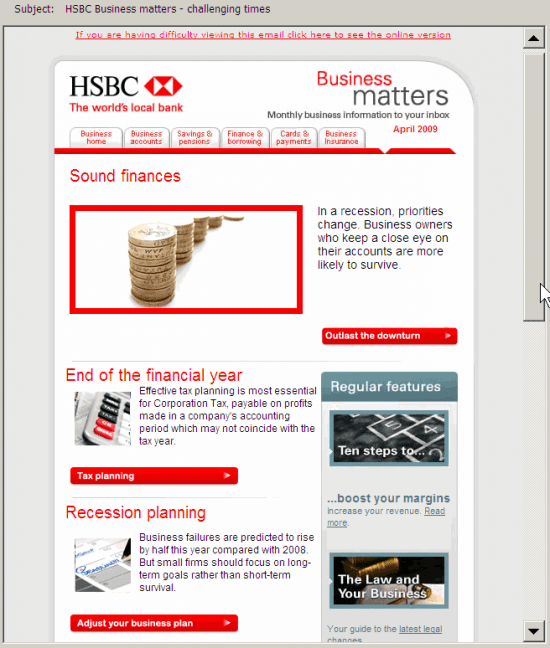
2 B2B informational newsletter example

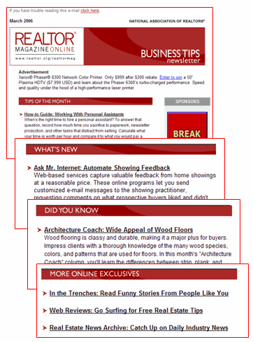
3 Professional services/membership enewsletter
Added this since I wrote the article - includes many of the recommendations here. Have to disclose I gave some informal feedback into the layout for this for this design via my work as a consultant at the time, so I'm naturally a fan of this design, although it's mostly down to the design team and client reviews.

My enewsletter best practice recommendations
These best practice tips, many of which are illustrated by the Tesco.com example, are generally presented from top to bottom of the creative. But we start with the most important practical issue which although obvious seems to be forgotten by many print designers working on big brand accounts.
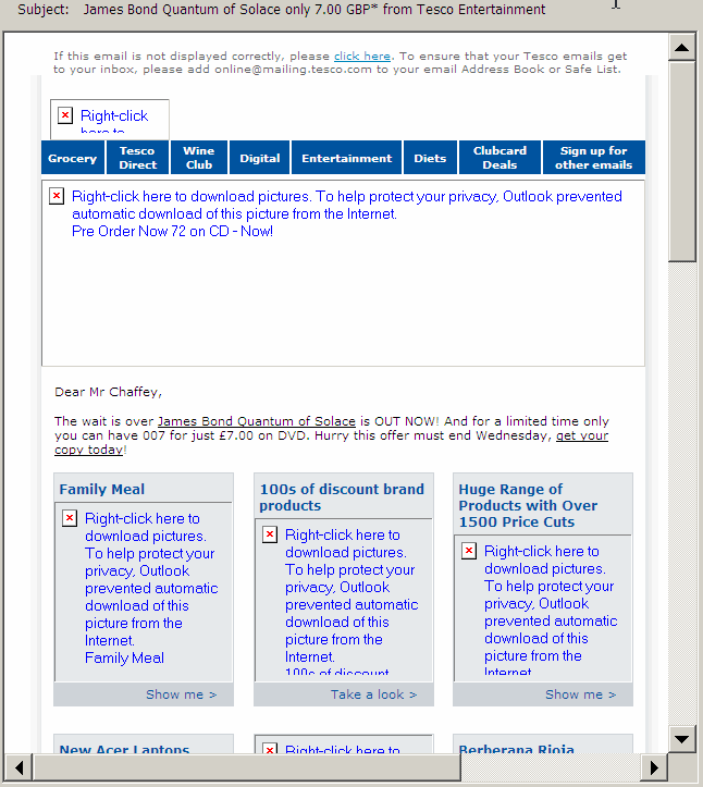
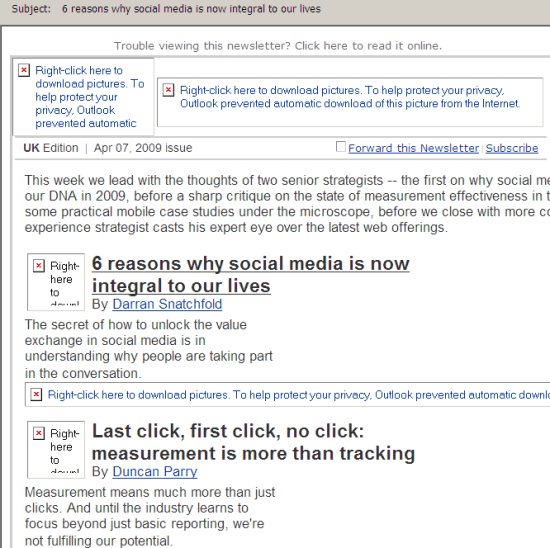
1. Ensure enewsletter version effective in image-blocked version. Many subscribers will initially view your enewsletter with images blocked which is the default in Outlook and most webmail readers
You should design and test that your template, creative and messaging is effective for this situation
Many of these other recommendations flow from this such as the prompt to view in browser.
2. Use a clear, consistent brand ident. Reassure your readers you are a trusted sender. If your branding isn't clear your enewsletter will be deleted or ignored.
Use familiar typography, background tints and logos based on brand guidelines. Is the enewsletter "on-brand" even if all references to the brand are removed?
The from address is also important...
3. Use an identifiable from address. The physical email address (here [email protected]) and the display address (Tesco.com) should reference the brand rather than an email service provider.
4. Devise an engaging subject line. Usual subject line guidelines apply:
- Shorter tends to be better
- First three words most important as readers scan their inbox
- Make relevant through targeting
- Highlight value
- Add branding if relevant
In this example, the subject line is "James Bond Quantum of Solace only 7.00 GBP* from Tesco Entertainment" generally works well.
This is a specific offer, featured in the introductory copy. More generic subject lines may also tease the subscriber to read more. For example, Tesco also use: "Check out This Week's Great New Releases at Tesco Entertainment".
5. Include a prompt to view in browser or mobile version. Make this meaningful. Most enewsletters now do this, although relatively few recipients will select this option. Keep this short and sweet.
6. Include a whitelisting prompt. Again not many recipients will act on this, except perhaps for their most personally trusted brands, so better to encourage during initial subscription confirmation emails.
7. Use an effective banner width. The banner width will often be used by the designer to control how the creative is displayed. If the banner width is set too wide, this may require the reader to scroll right - an unsatisfying experience which may truncate some of your headlines and offers. l advise a maximum width of 500 pixels although 550 to 600 are commonplace.
Specify the height and width in pixles of banners and other key images since these will
be used to control layout when images aren't downloaded.
8. Use an effective banner-depth. It's difficult to get this balance right. You will certainly see email designs where an image banner is too broad and it pushes the content below the fold.
9. Integrate navigation bar with website. Linking to different product categories is a common approach in retail enewsletters. It could be used more widely in non-transactional enewsletters to link to different website sections.
10. Use a distinct text headline. Since the image banner will often be blocked, a large font headline is a must-have for highlighting the lead feature or main offer of the newsletter.
11. Include a table of contents. Particularly important for informational enewsletters, this can reduce the problem of subscribers not scrolling down to later features. Usually positioned in the top left or right, it is generally best implemented as a jump to a named anchor rather than a link to the website:
Link HTML:
<a href="#feature 1">First feature</a>
Label for anchor:
<a name="feature1">Feature name</a>
The link syntax to a named anchor:
12. Encourage the viral affect. A simple forward to a friend / forward prompt to a colleague will encourage some subscribers to forward.
13. Include a subscribe option. This may seem redundant, but if an enewsletter is forwarded, an easy subscribe option needs to be present, likewise for browsers of archived enewsletters.
14. Include personal subscription preferences. These can be incorporated into top-menu bar .
15. Consider a personalised editorial. This helps make your enewsletter more personal and can stress the main offers or features with a text link through to the website which will often generate a high proportion of clickthroughs.
16. Incorporate your main brand value messages. Emphasise your customer value proposition, for first-time customers. This is an example from online office supply retailer Euroffice (www.euroffice.co.uk) where messages are highlighted below the header as they often are on retail site headers too.

17. Group related features into common sections. You can highlight the different parts of your proposition through using section headers, each of which can contain several features. This works particularly well for informational enewsletters.

18. Make feature headers or product offers readily clickable. Rather than using a tiny "read more" link under the snippet about the feature, make it easy to read more as shown by this imediaconnection enewsletter which has nice large point size feature headlines which are underlined for a mouse rollover.

19. Use quality images. The double digit open rates achieved by many enewsletters show that images are often downloaded and quality images appeal, so use larger high-resolution product shots.
20. Make it social. Newsletters that include comments or testimonials from your customers are more engaging. Social options include.
For transactional emails:
- Customer reviews
- Customer ratings
- Most popular products
For informational emails:
- Surveys and polls that can be rolled forward to the next edition
- Top blog postings or discussion forum topics
- Featured customer stories or case studies
21. Use a multi-column design (with care). Using a multi-column format can help fit more content above the fold and make the design more visually appealing. It is essential for retail enewsletters.
22. Use 4-6 panels or areas of visual emphasis. Help the user to scan by limiting the number of areas with visual prominence to a maximum. I recommend "Focus on Five" as a mnemonic.
Tinted background-colours can help add visual emphasis
23. Include an unsubscribe option which links to a communications preferences centre. Of course offering unsubscribe is required by the privacy laws in many countries. But don't make it too easy to unsubscribe. Offer options to change or limit the types of features / offer or frequency.
24. De-emphasise the T&Cs. The terms, conditions and privacy conditions are essential and should be reasonably easy to read, but through use of a lighter colour grey smaller font they can be setup so they don't detract too much from the visual design.
Please let me know other factors you think are important via the comments.
If you're an email marketer, here are some other enewsletter guidelines you may find useful:


