6 examples showing the power of parallax-based designs to engage and impress at the same time
Parallax scrolling is undoubtedly one of the most popular recent web design trends that first surfaced several years ago and is still common on certain types of site. Parallax gives a visual effect to add a feeling of depth to the visual presentation of content or projects.
Parallax is the effect that we can come around on a daily basis. Just pay attention to the way everything moves around while driving a car. The clouds in the sky appear to move at a slower pace than the houses and trees in the foreground. That is how the technique is achieved in the natural environment. Have you ever thought about this? Impressive, right? However, that's not the point of this article. Since all of us are involved in online marketing and web design, let's find out how to use the parallax scrolling effect to keep the audience better involved.
What is Parallax Scrolling in Web Design?
Parallax is a web design technique, in which different components of web pages are set to move at different speeds as people scroll a web page. In most cases, the parallax scrolling effect is added to background images and videos. As a person scrolls up or down a web page, he/she notices that the site's backgrounds move more slowly than the objects placed in the foreground. It's no doubt that such a phenomenon adds a special visual appeal to the web pages, making the viewers immersed into a captivating browsing experience.
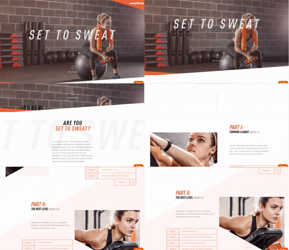
Set to Sweat site
The technique is not new. It has been called one of the leading web design trends for several years in a row. 2017 is no exception. Primarily, parallax was widely used in the gaming apps. As the time passed by, the trick of making a shift from the way a user views an object against a far-flung background gained a wide popularity in web design. So, enhancing the pages of your site with the parallax scrolling backgrounds, you will only make it more attention-grabbing.
Top Reasons to use Parallax
So, why do so many websites adopt Parallax. Here are the main ones:
- As different layers of a website move at different speeds, people get immersed into a more engaging and vibrant user experience.
- Since it's still not a standard technique you increase your chance to achieve a "wow" effect.
- It creates harmony with other design elements within a web page. For example, one of the most popular contemporary trends is long-scrolling web pages. The environment where a user scrolls rather than clicks, the parallax scrolling technique creates the desired illusion of depth.
- As you integrate the effect in the backgrounds, you grow the chances of keeping the audience more interested, thus increasing the visit times.
These are just a few reasons why your site or blog needs to feature the effect on its pages. Next, comes the question of what types of the parallax scrolling effect can we choose from?
Parallax Scrolling Effect Variations
As the time goes by, the techniques evolve and attain new forms of its presentation. Every single site looks differently when loaded with the parallax scrolling backgrounds. Not only do the images and fonts make it different. Shapes, animation effects, patterns, as well as different methods of their combination and presentation can make every design unique and universal. This can be also achieved by means of different types of scrolling.
Classic scroll suggests different motion speeds added to the background and foreground layer of a site. When the effect is applied to images and videos used in the background of a web page, this achieves a captivating feeling of 3D illusion.
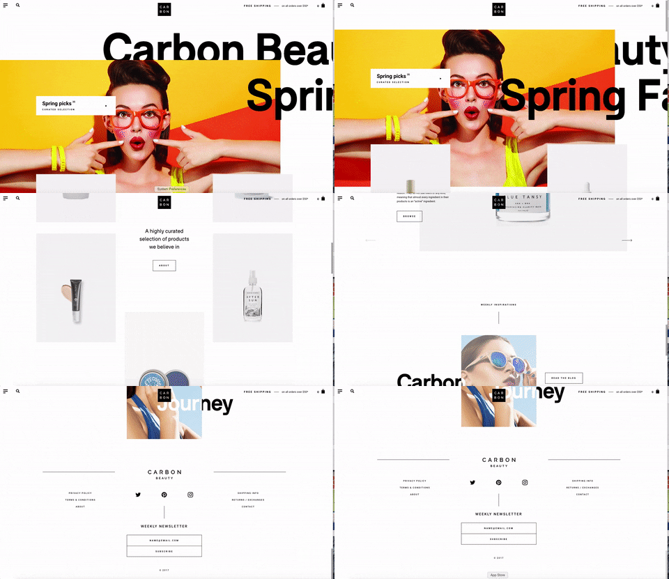
Example: Carbon Beauty
Zoom-in Scroll is used to keep the users' attention focused on one specific item of a web page. On the other hand, the effect can reveal several perspectives to the layout of your site's layout. In any case, by means of the zoom-in effect you put your site into motion, making it still maintain the desired elegance.
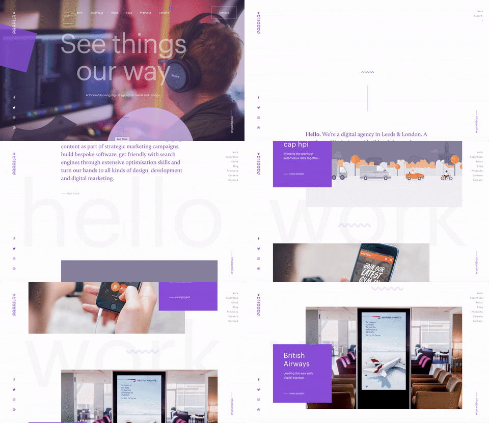
Example: parall.ax
Fade-in Scroll will add a fresh vibe to the pages of your site while making images more vivacious as you accentuate the colors. The effect appears gradually, adding a sense of rhythm to the scroll.
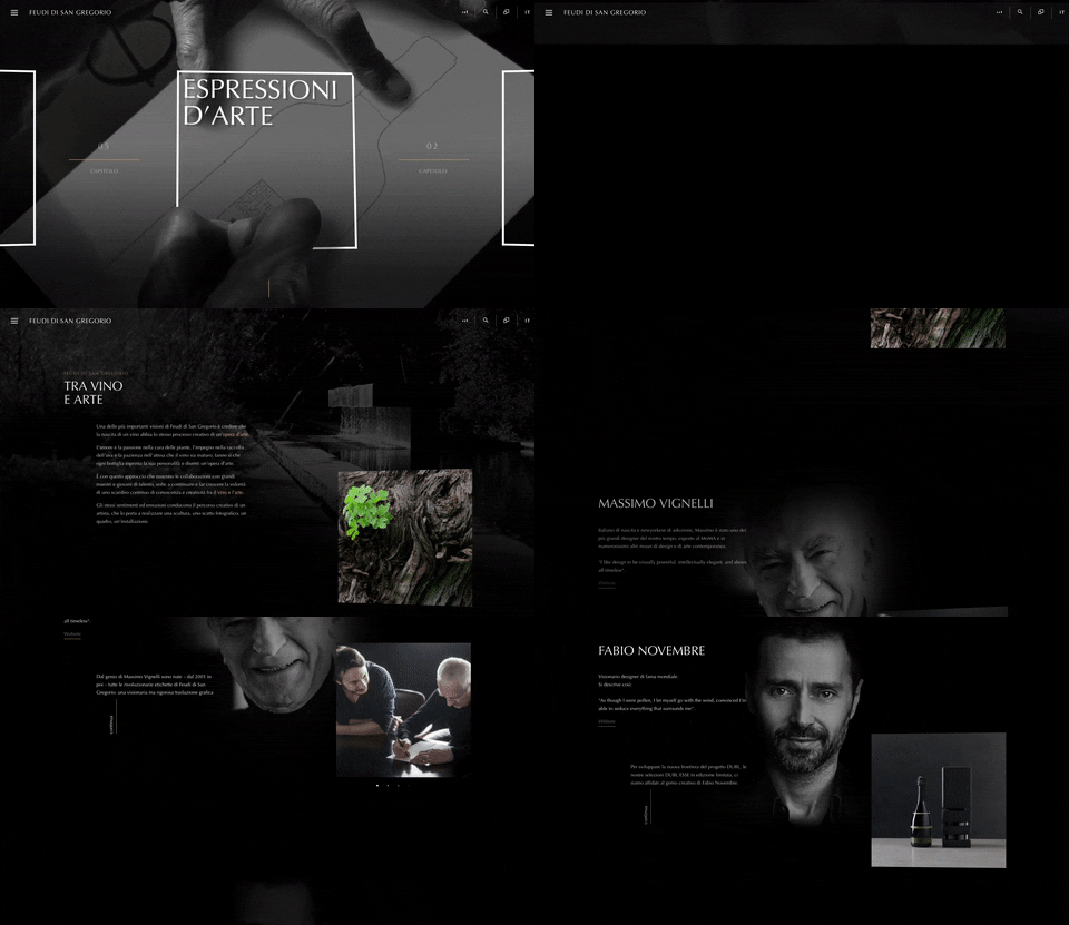
Example: feudi.it
Reveal Scroll effect is great for boosting the users' curiosity in the visual storytelling. The user gets captivated with the view and continues scrolling down the page just the moment when the page reveals just was he was looking for. The effect works perfectly for providing the web audience with a more dynamic and interactive web browsing experience.
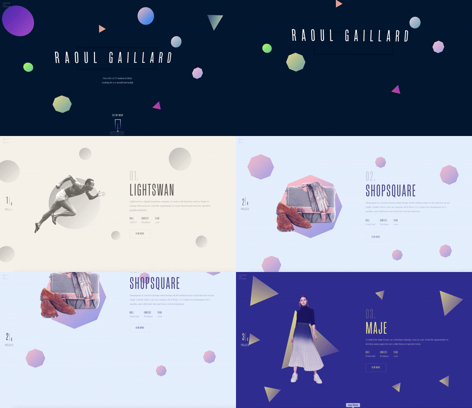
Example: Raoul Gaillard
Parallax Scrolling Design Tips
With all that in mind, let's looking at some tips for implementing parallax scrolling design.
-
- Make sure that all elements of your site's design can adjust to all screen sizes and resolutions. It's not a secret that the web has gone responsive. So, in order for your site to captivate a wider range of users, you need to make sure that it runs on desktop and mobile devices equally well. Moreover, the parallax scrolling tricks should also work flawlessly.
- Make the technique serve its purpose. Enhancing the pages of your site just for the sake of the 3D illusion is not a good idea. Make it interactive, but still effective. For example, you can use the parallax scroll to reveal the latest collection of an outfit on one model as a user scrolls down the page.
- Parallax scroll should tell a story. As you add the technique to the page, you get ready to take people through a journey in digital space.
- Do not forget to use CTAs. As a user scrolls through a page, he expects something to happen or find a route to get somewhere else. This is when CTAs become a perfect means of establishing the user communication with your web resource. Making CTAs bold and outstanding is a rule of a thumb.
- Do not overdo the technique. Make sure that your web page will perform equally well in all web environments. Make it fast-loading on all gadgets and browsers.
- Since parallax scrolling websites make heavy use of images, do not forget to employ pre-loading images and assets so that it doesn't take too long to load every single piece of data.
If you are not as skilled in crafting web designs with different animation effects as you might wish, do not worry. You can always rely on the ready-made themes that are already loaded with the trendiest animation effects. For example, you can take a look at TemplateMonster collection.
Wrapping up
When used properly, the parallax scrolling effect can significantly enhance the visual appeal of your website, boost the UX, and engage the users with a captivating storytelling. We hope that the aforementioned examples of parallax scrolling sites inspired you for the creation of your own impressive designs, and the listed tips will help you avoid committing the most widespread mistakes. Use the parallax scrolling effect to your benefit, achieve a "wow" effect on your site, and increase the visitors' engagement with your content.

Thanks to Katherine Crayon for sharing their advice and opinions in this post. Katherine Crayon is a copywriter reporting on tech news and all aspects of the web design industry. Anyone looking for more inspirational posts, tips and advice or simply the latest industry news, meet her on
G+ and
Twitter.


 Thanks to Katherine Crayon for sharing their advice and opinions in this post. Katherine Crayon is a copywriter reporting on tech news and all aspects of the web design industry. Anyone looking for more inspirational posts, tips and advice or simply the latest industry news, meet her on


