User features get serious enhancement
Value/Importance: [rating=5]
Recommended link: Twitter video
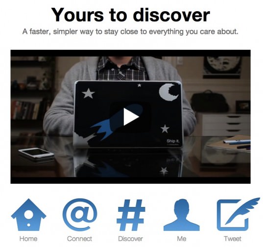
Twitter has unveiled a major redesign today which will be rolling out slowly. There are four key elements to the changes:
- New homepage timeline
- Better way to see anything related to you
- Interface for easily finding context for hashtags
- New user profile
 Is this all in Twitter's attempt at trying to become more mainstream and accessible? A move away from the niche knowledge sharing tag it's gained? It looks good at first glance, this official video is useful to demonstrate the changes: http://fly.twitter.com/
Brands also get Brand Pages
There's a really big change for brands too, new brand pages, as Twitter looks to strengthen its relationship with marketers. Twitter's brand pages have been low key compared with the excitement around Google+ brand pages, which were launched last month. Twitters official post is here. There are two big changes aiming to give brands impact on Twitter:
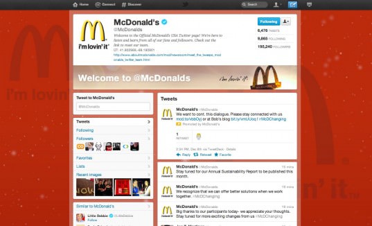
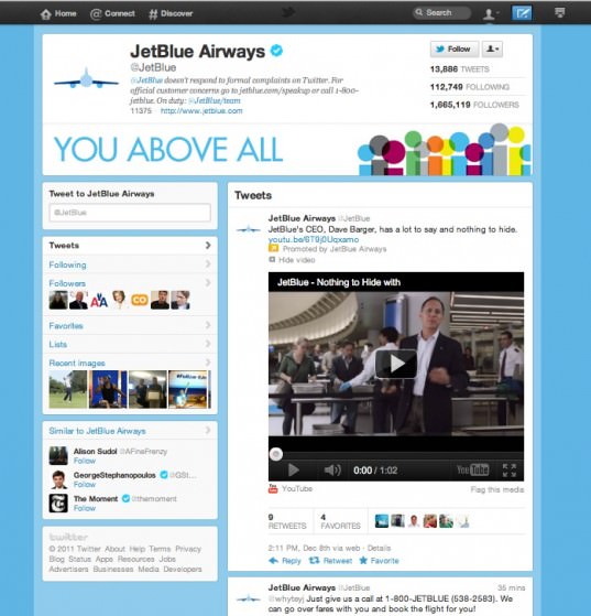
- There's a new customisable large header images that marketers can use to display their logo and tagline more prominently than under the standard format, where branded elements of the page design are invariably covered by tweet timeline
- The ability to a pinned tweet at the top of the brand's stream, particularly effective for tweets with images or video. On brand pages, these video or photo tweets can be set to be open, more eye-candy for the page.
Not everyone can see what these look like yet and there are a limited number of brand pages being launched, 21 apparently, so I’ve pasted some screenshots below so that you can see what's coming (apparently sometime in the first quarter of 2012).
What do you think - will this make you want to work harder in Twitter?
