Do you agree with the importance of these processes?
Here's a cool new infographic. I particularly like it since it's not the same-old, same-old format and it forces you to ask - do we get our design processes right?
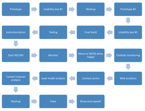
Update: I've changed the description from "great" to "cool" based on your feedback in the comments on this post and Twitter. The main criticism was the lack of iteration. I have included two new visuals which better show this iteration. Check out "awesome" process suggestion from conversion rate optimization expert Craig Sullivan which shows how they tackle improvement of website designs at Belron - this is a real-world example to really learn from!

via 
As well as showing the main activities to plan into a redesign project, it's interesting since it shows circles by importance.
I'm not sure the relative importance of activities looks right for projects I've been involved in. Why are landing pages so large - maybe it's not time, but importance? I've certainly seen many-many times where landing pages are an afterthought to a big web development implementation.
Thanks to David Hollings for alerting us to this via our LinkedIn Group. It's from Visually the newly launched infographics search engine. Unfortunately, the originator isn't credited there.
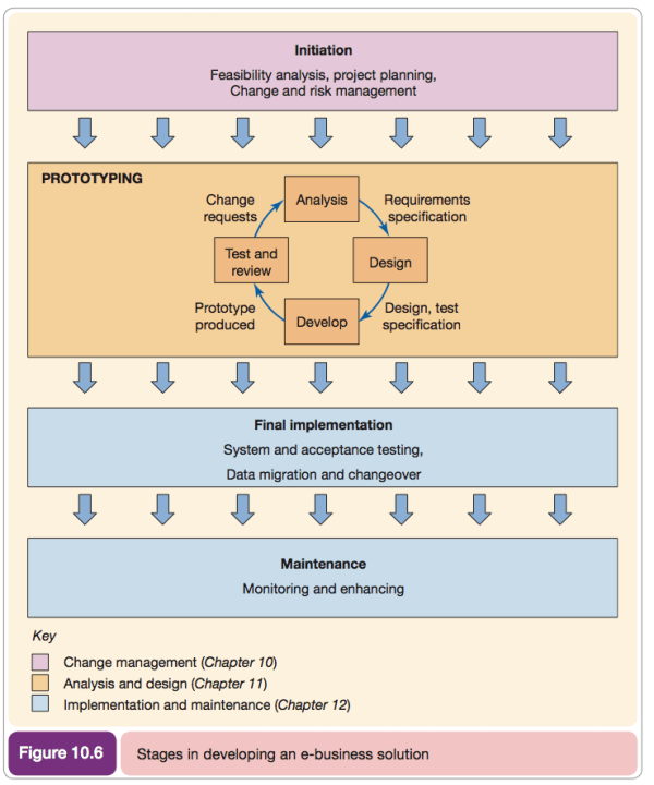
An Iterative design process view
This is a textbook view from my Ebusiness and Ecommerce Management book. It's for all Ebusiness systems, not just front-end and although I created in 2001 I think, the same version is in this years edition. This process summary shows the need for establishing the business case and requirements.

Conversion rate optimization (CRO) process
This is the real-world view and is a process I think we can all learn from. It's recommended by Craig Sullivan is Ebusiness manager at Belron, an international windscreen repair service with local brands such as Autoglass. What do you think?

Source: Craig's recent Testing Year Slideshare.


