Use these 12 insights from ground-breaking eye-tracking research to improve your email campaigns on mobile
How much do you know about how your subscribers really perceive your emails on mobile? If the answer is not much then it’s probably time to optimise: 70% of all emails are now opened on mobile and scrolling on a touchscreen is a completely different experience to using a desktop. Users can interact with content anywhere and anytime and their location, the lighting, sounds, distractions etc. will all have an impact on how our messages are perceived. Additionally, a study by Litmus found that 80% of people will delete an email that doesn't look good on their mobile device.

Although that is worrying, the good news is that there are some very simple changes that you can make to your campaigns to avoid them getting deleted. Benchmark Email recently partnered with Edisonda to study mobile eye-tracking in email marketing and the resulting report gave up a selection of useful points to bear in mind when designing the text, images and layout of your campaigns.
This is a quick summary of 12 of the report’s key insights but you can, of course, click to both study the full report and find out more information on how the research was conducted.
Text
Getting text right is as important now for effective communication in email as it’s always been but have you considered how paragraph length, text alignment and text formatting can influence how a subscriber views your campaign?
- Position of introductory text. Your introductory text is key for catching the reader’s attention and letting them know what content to expect. You’ll see from the heat map below that the study found that this element is best placed above the image (left) rather than below it (right).
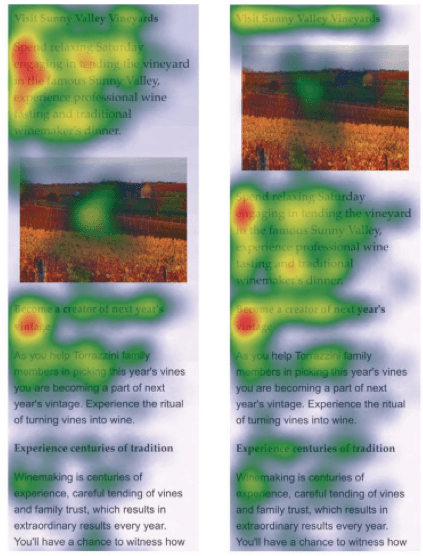
- Size of introductory text. In short, while using a bigger font size for this element meant it being noticed earlier, it seemed to distract the reader from paying attention to the other elements in the email.
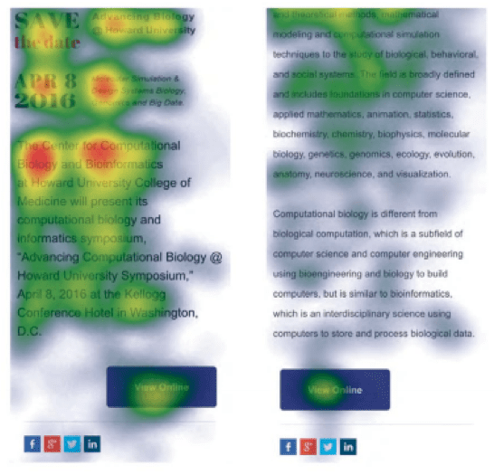
- Text length. Keep it short! Short messages are more easily perceived and scanned. Additionally, the CTA is more likely to be seen in the shorter email.
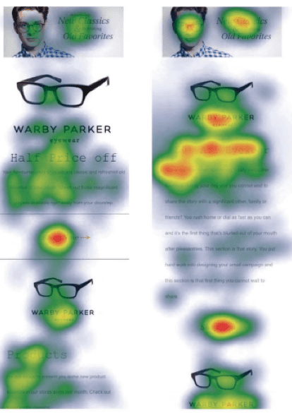
- Paragraph length. As seen in the heat map below, the campaign with text broken up into several shorter paragraphs (left) keeps the reader less distracted and more focussed than in the campaign with longer paragraphs (right).
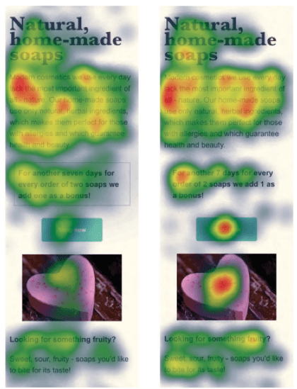
- Boxed text. Whilst boxed text is perceived by the reader earlier and attracts their attention, this may have a negative impact on the attention paid to any CTAs and photos below it. You’ll see in the image on the left that the boxed text has absorbed a lot of the viewer’s attention, leaving less time and energy to consider the CTA. The campaign without boxed text sees the viewer scanning further.
- Text alignment. The recommendation here is that you choose left-aligned text. Text is more easily read and scanned when it is left-aligned rather than centre-aligned.
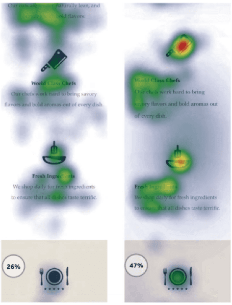
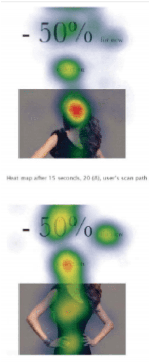
- Numbers. Numbers written as a numeral (i.e. “50” rather than “fifty”) have more impact. Bear this in mind when deciding whether to write “half price” or “50% off” for example.
Images
Images are essential to expressing information that would be tricky or long-winded to explain in words. Use unique and interesting materials but bear in mind the following two points:
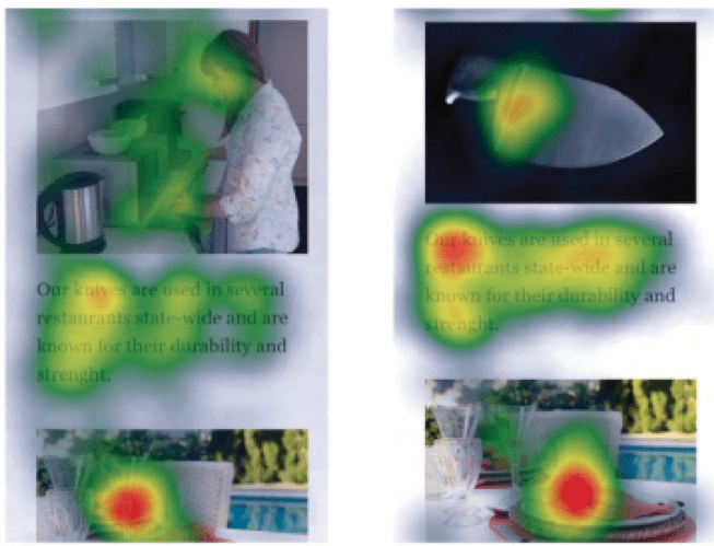
- Faces. Humans are drawn to faces and this experiment showed how using an image of a face in an email campaign absorbs almost all of the recipient’s attention. You’ll see below (top) that the heat map reveals how the viewer focussed on the model’s face rather than other elements in the campaign. The email without an image of a face (below) allowed for a more balanced distribution of the reader’s attention.
- Image featuring product only vs. product being used. While the email with the image featuring the product being used got more attention (left), the research leads us to assume that the reader is more likely to remember the product when it’s featured alone (right).
Layout
Exploring the best location for your logo and CTAs in an email campaign is a widely neglected aspect in the context of mobile. This study, however, has provided the following insights:
- Logo location. The results show that placing the logo on the top left corner or in the centre is more effective than placing it on the top right.
- Call to Action location. Surprisingly, as shown in the heat map below, placing the CTA closer to the main image may mean the CTA receiving more attention than when it is further away.
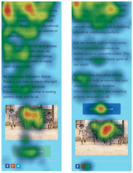
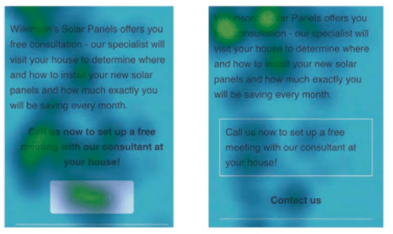
- Call to Action appearance. Users found a plain text CTA without a background (below right) to be less attractive. Add a background to ensure your CTA stands out.
Of course, not everyone has access to the amazing glasses used in this research but that’s why testing is so important. Take note of the above 12 tips and pay attention to your reports because they’ll help you understand what is performing best for you and you’ll discover areas for improvement. Lastly, don’t forget to A/B test as it’s a great opportunity to test designs against each other before you send the campaign out to your entire list.
Bio
Sally Beers is Business Development Manager UK & Ireland at Benchmark Email in Spain. She is fluent in both English and Spanish, passionate about languages and digital, and started her career in a Spanish start-up.

Thanks to
Sally Beers for sharing their advice and opinions in this post.
Sally Beers is Business Development Manager UK & Ireland at
Benchmark Email in Spain. She is fluent in both English and Spanish, passionate about languages and digital, and started her career in a Spanish start-up. You can follow her on
Twitter or connect on
LinkedIn.


 Thanks to


