New research on how email readers interact with marketing emails
Those of you familiar with the latest email marketing stats will already know how important 'mobile opens' are. In fact, emails opened on smartphones and tablets make up over half of all emails opened over the last three years according to a new report from Yesmail. This research makes a compelling case for upgrading to responsive email designs, or if you already have them, for optimising them.
The importance of mobile email readership makes responsive email design more crucial than ever, because users expect attractive emails across devices, and are unlikely to click through on an email which looks poorly formatted because wasn't designed to appear on a mobile device.
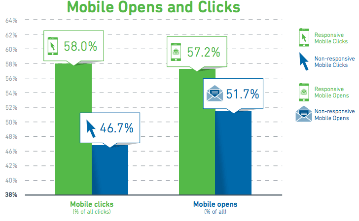
Responsive design is key for boosting mobile clicks
Regardless of whether your emails have responsive designs, over half your email opens will be happening on mobile devices. However, if you don't have responsive designs, most of those 'mobile openers' will not be clicking on your emails. Those with responsive designs got 58% of their clicks from mobile devices, whilst those without responsive designs found mobile accounting for less than half of their total clicks (note the misleading scale in this chart!). This means responsive designs get a 24% increase in mobile clicks vs non-responsive designs.

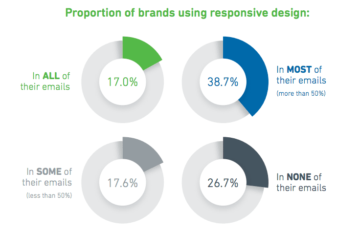
How many are already using responsive design?
Despite its proven effectiveness, only 17% of marketers are using responsive design in all their emails, which leaves plenty of room for improvement. 38% use responsive design in the majority of their emails, so that capability to send responsive emails is present in most businesses. Only 26% said they used responsive design in none of their emails. These businesses need to look at developing the capacity to send responsive emails so as not to miss out on a large number of clicks and conversions. 
Need proof mobile is the future? Just look at the past
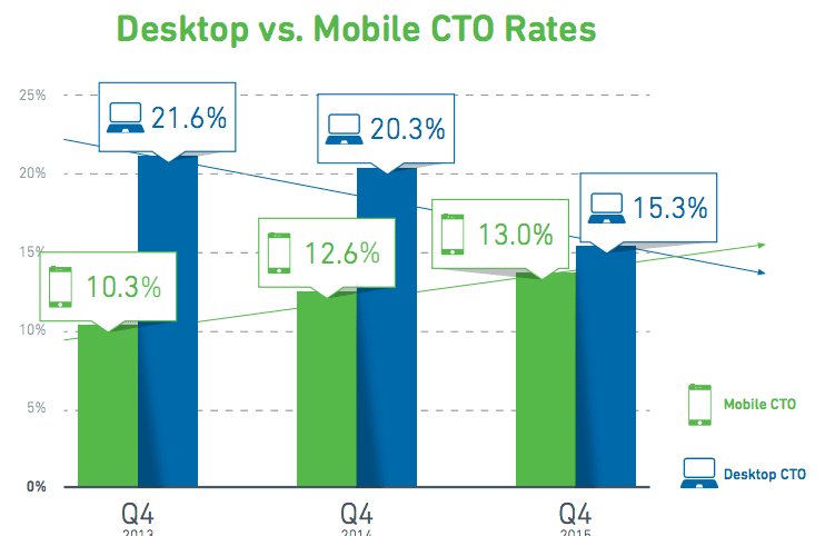
Over the past three years, mobile click-to-open rates (CTOs) have been increasing while desktop CTOs have declined. The trend towards increasing mobile device use is not going away soon, and is likely to continue for several years. Customers are now able to do tasks like checking email on the go wherever they are, which saves time by using otherwise dead hours. This ability should be a boon to marketers, who are able to get customers seeing their messages wherever they are, not just when they are behind a desktop. However if you want to make the most of these trends then you'll have to have responsive design across all your email sends.

As you can see from the graph, mobile click-to-open rates will soon overtake desktop, making it a more effective platform to target. Designers should consider a mobile-first approach.
Mobile email presents a great opportunity for boosting e-commerce revenue
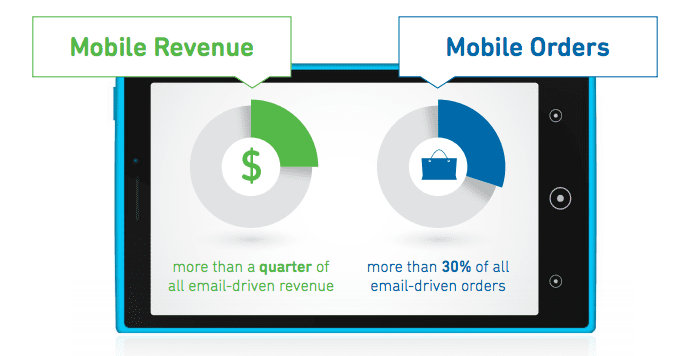
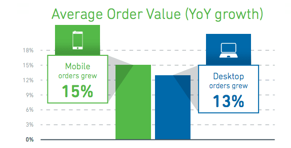
Mobile revenue and orders are growing rapidly. In Q4 2015 mobile made up over a quarter of all email-driven revenue and nearly one-third of all email-driven orders. Much like with the CTO rates, we will see mobile revenue making up an increasingly large percentage of email-driven orders, and it may come to overtake desktop within a few years.

Mobile is already outgrowing desktop, and it is likely to see it pulling even further ahead through 2016.

If you want more insights into the importance of mobile email and responsive designs, download the latest report email marketing benchmark from Yesmail.


