Your menus may be letting you down. Here's how to perfect them
When businesses are looking to understand why their websites aren’t performing effectively or reviewing options to convert more visitors as part of a CRO programme, they should take a hard look at the different types of navigation they are providing.
If some visitors can’t find their way around a website, or more importantly find what they are looking for, then a pretty website is useless to them.
The primary and secondary navigation menus are the key to getting visitors effectively around a website. Without an effective navigation menu in place, businesses risk confusing and frustrating their visitors. More importantly, they risk losing conversions and sales.
So how do businesses keep that from happening?
This article will go into detail on how to create an optimal navigation menu that effectively helps visitors find their way around.
Choosing Buttons
To start, businesses must choose buttons that will be the most effective. Placing buttons that they think will be most effective is a bad way to start. Businesses should first have their visitor’s needs and the businesses marketing outcomes in mind. They, after all, are the ones browsing the site and looking for what they need.
Businesses should dig into their analytics and find which pages are most viewed by visitors. These can be deemed as the most important pages to visitors.
If many visitors are viewing a “Customer Support” page and it’s hidden somewhere in a submenu, the placement is doing a great disservice to that business.
On the other hand, if you place a “catch-all” button in your global menu bar and very few people visit this page, space is being wasted. So reviewing the popularity of different nav elements using heatmaps or the number of destination views of target navigation pages is a useful analysis technique
Menu option Order
Once it’s decided which buttons will be used, the order of those buttons is also very important.
The primacy and recency effect describes how people remember items in a list. According to the primacy effect, items that appear first in a list are more easily stored into long term memory. The recency effect states that items that are last in a list also hold memory.
That said, it is vital to put the most important buttons towards the beginning and end of the button sequence. Put the less important buttons somewhere in between.
It’s not by mistake that you will typically find a “Home” button at the beginning of a global menu and a “Contact Us” button at the end of a global menu. It’s of great importance to most businesses that visitors are able to find their Home page, the hub of their entire site and that visitors find their contact information to make contact.
Number of menu options
The number of buttons businesses decide to use is also of importance.
Too few buttons and businesses don’t provide enough information to help their visitors find their way around. Too many buttons and visitors may be overwhelmed with too many choices.
Menu Text
It’s vital that businesses choose text that clearly defines the purpose of the button. Using a word such as ‘Calendar’ that brings visitors to an Events page can be somewhat ambiguous. A better choice would be to use ‘Events’ or ‘Events Calendar’ to clearly define where visitors will be lead should they click the button.
If your website is object based and serves somewhat as a Table of Contents – use wording such as ‘Services’, ‘Portfolio’ and ‘Resources’.
If your site is action based, use words such as ‘Borrow’ or ‘Invest’ to describe that action.
If your website is viewed by several audiences, use words to help them identify themselves such as ‘Students’, ‘Alumni’ and ‘Partners’.
Navigation Menus That Can Cause Problems
Menu type - hover Menus
Hover menus can also cause problems for users. When a menu is opened upon clicking, visitors can generally then move down to the sub buttons. In doing so, should they move their cursor outside of the drop down menu, the menu generally stays open.
Hover menus are a little bit different. The word ‘hover’ implies that you must hover over something in order for it to appear.
With a hover menu, should your cursor move outside of the menu, the menu will disappear. You can’t slide over to a menu button to the far left. You have to first go downward and then mover your cursor to the left to stay within the hover tunnel.
This is problematic for users because it’s pretty easy to slip outside of the menu and then they’re forced to start all over again. They may not even recognize that this is the reason that the menu is disappearing – adding to more frustration.
Menu types - Mega Menus
Mega menus seemed to be a good idea. All the information available appears with just one click. All the big name websites like Amazon were using them. Keyword – were using them. They can also be used for visual prompts of product options and even promotions
However, often times there are just too many categories listed to make it easy for visitors to find the specific item they are looking for.
They also take up a large amount of space when opened up, knocking the rest of content on the page out of view.
There’s also the problem that visitors don’t always know which content will open up a mega menu. If there’s no way for them to tell, they may never click to open t in the first place.
Jared Spool of User Interface Engineering states that it wasn’t unusual for their clients to see a 15%-20% decrease in revenue after launching a mega menu as their form of navigation.
Menu-location left Hand Menus
Left hand menus, in some cases, also have their problems. For one thing, they use up a lot of prime online real estate. Consider the difference in space amount that a horizontal main menu bar with drop down features lends in comparison to a lefthand aligned menu bar.
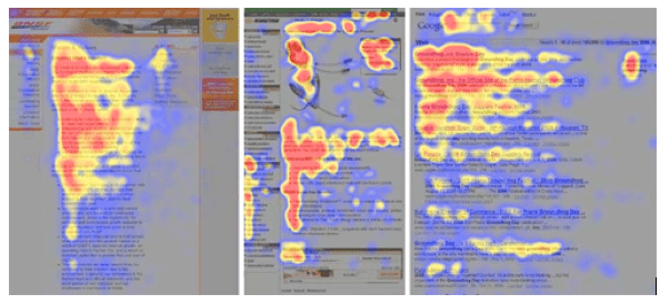
Eye-tracking studies also show that lefthand menu bars don’t grab the attention that they should in order to take up this much space. This heat map image shows that lefthand menu bars are largely ignored.

Most of the focus is placed on the main content and the upper navigation menu bar. Not the lefthand menu bar.
Hamburger Menus for mobile responsive designs
Many visitors have likely seen this icon when the viewport is small, as on a smartphone responsive design. But do they even know what it is?

Therein lies the first problem. If visitors don’t know what it is, who says they’ll ever click it?
The second problem – this icon should only be used on mobile sites to save space. And it should include the word ‘menu’ so that visitors understand it’s purpose.
A global menu bar should be front and center on a website. Why? Because it’s one of the most important elements. It’s the hub to getting visitors around a site. Using this icon on a desktop site defeats the purpose.
Conclusion
In order to ensure that businesses are effectively getting visitors around their website, they must make sure that they are doing the following.
Businesses must put aside what they think are the most important pages and take the time to dig into analytics in order to review the behaviour of their current visitors. Completing usability studies such as card sorting to define navigation is essential, if you are looking to improve navigation on a large site.
Second, put those buttons in optimal order with the most important buttons at the beginning and the end of the navigation bar.
Provide an ample number of menu options to effectively do the job without overwhelming visitors.
Choose effective button text to propel action.
Avoid the types of menu bars that can cause more harm than benefit.
In taking these measures, businesses will provide a navigation bar that is far more effective in getting visitors to where they want to go rather than a menu that is just thrown together haphazardly.

Thanks to
Marie Dean for sharing their advice and opinions in this post. Marie Dean is the Innovation Director at ConversionLifters and has been working in the field of conversion optimization for 12 years.


 Thanks to


