Taking a more systematic approach to discover why your website visitors are not converting
What’s stopping you from converting more of your website visitors into sales or leads right now? One of the reasons, that we'll explore in this article, is a lack of tangible insight. There’s often a mistaken understanding that analytics and insights are one and the same, or that viewing charts and tables will provide answers when often the right question itself hasn’t yet been asked.
Analytics will only take you so far in understanding your website visitors using averages and actions taken but they won’t give nearly enough insights into why those actions were taken.
To uncover why your non-converters are leaving your website you can create hypotheses based on watching user session replays (recordings of them browsing of your site), look at screen mouse and click based heat maps to see where people are loitering and clicking, run remote or local usability tests in lab-like environments or run focus groups with potential and existing customers. But you’ll still only be left with hypotheses. Why not directly ask your website visitors when they’re ‘in the moment’?
To uncover reasons closer to the truth as to why potential customers or leads are not converting, asking in an unobtrusive way whilst they’re on your website can help uncover the type of insights from which conversion rate changing decisions can be made.
Technique 1. Website surveys - use them or lose out
Website surveys have evolved in the last decade, from interruptive, full-screen prompts which required visitors to take 5-10 minutes to complete, to the pop-up layered surveys which appear in a corner of a user’s browser. It isn’t just the technology which has evolved but also the way in which data is collected and used. Whilst longer form questions do still exist to give in-depth user insights, many websites are taking advantage of the bite-size questions popularised by tools such as WebEngage as you can see in the screenshot below.
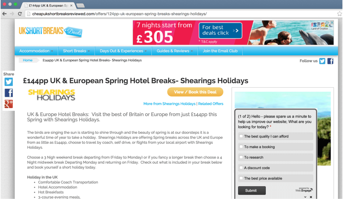
Getting started with a survey tool like this is fairly simple; install a small snippet of code to allow you to run the small, unobtrusive quick-answer pop-up surveys. If you want something a bit more detailed, you can use this same tool to run more involving surveys but it is important to think about what effect this may have on your potential customer if they’re distracted away from what they are doing on your website. For this reason, it is beneficial to keep questions short and succinct.
The example shown here is taken from a holiday deals website which is aiming to understand the reason a particular visitor is on the site. By selecting one of the 5 options, the website team can bucket these respondents and segment them by marketing channel and more importantly, by the action taken. For example, if those that on the website to ‘make a booking’ are those closer to the bottom of the funnel, you gain a measurement over time of what % are on the website to take that action. For this company, the % on the site looking to make a booking (based on 6 weeks data and 500 respondents) was around 5%; given their conversion rate was around the 1% mark this gave a clear indicator as to the potential being missed - an extra 4% of people ready to make a booking left without doing so. That’s an incredible amount of insight, but that’s not all.
This post from Dave Chaffey lists alternative types of online customer survey services.
Technique 2. Integrating survey feedback into Google Analytics
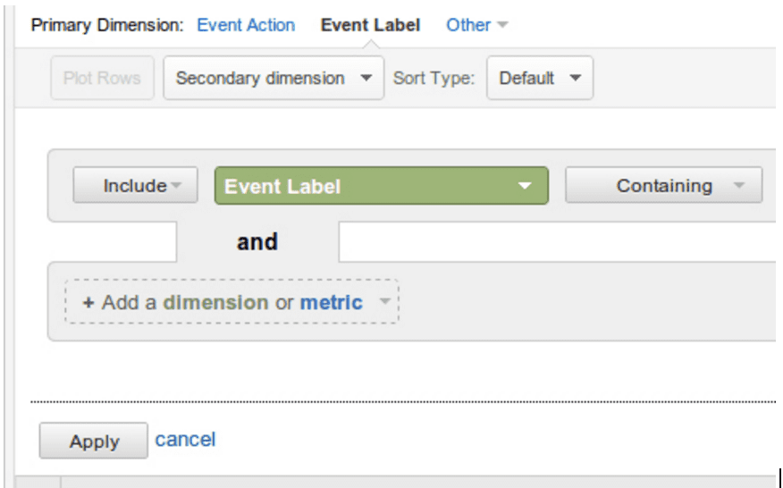
While I’m citing Google Analytics here, the solution can work for other analytics providers. By plugging in events from the survey, you can match these events against actions within analytics. Where this proves of use is matching intent vs action - using our example above, of the 5% that had visited the site to make a booking, we can model their intent (I want to make a booking) vs action - which pages they visit, how long they spend there, which page clusters they look at (i.e. search, browse, basket etc) and importantly, which page they exit on. Exit page, in particular, is useful to match to intent as you’ll know the mindset of the user on that page which gives your analysis an extra depth.
Advanced features also allow you to target existing customers or those that have purchased more than a certain number of times (the latter would require additional information to be passed to the survey tool by your backend systems).
With this in mind, you can choose to tailor your survey question(s) based on who you want to target. When writing survey questions and considering the style of survey (i.e. multiple choice, freeform entry etc) it’s imperative to think about how you plan to analyse the data. Parsing through lines of freeform data is potentially going to create less immediate insights than choice based responses.
Now you’ve seen how easy a survey tool is to install and a glimpse of how to use it, here are 4 ways you can gain valuable feedback from your potential customers via a survey to help improve your website and increase conversion.
Question 1. What is the reason you visited the website today?
This is one of the most basic but powerful single questions you can ask a visitor. Targeting this to new visitors, in particular, will give you lots of additional insights on your marketing effectiveness, especially when the survey is recorded in your analytics tool. For example, if your survey tool is connected to your analytics platform, for every answer you receive, you’ll know which marketing channel they arrived through. Depending on the level of tracking in place, this could help marketing managers measure the quality of their marketing and improve efficiencies.
To give the example of an e-commerce store, the example below breaks site visitors into buckets which can be segmented later.
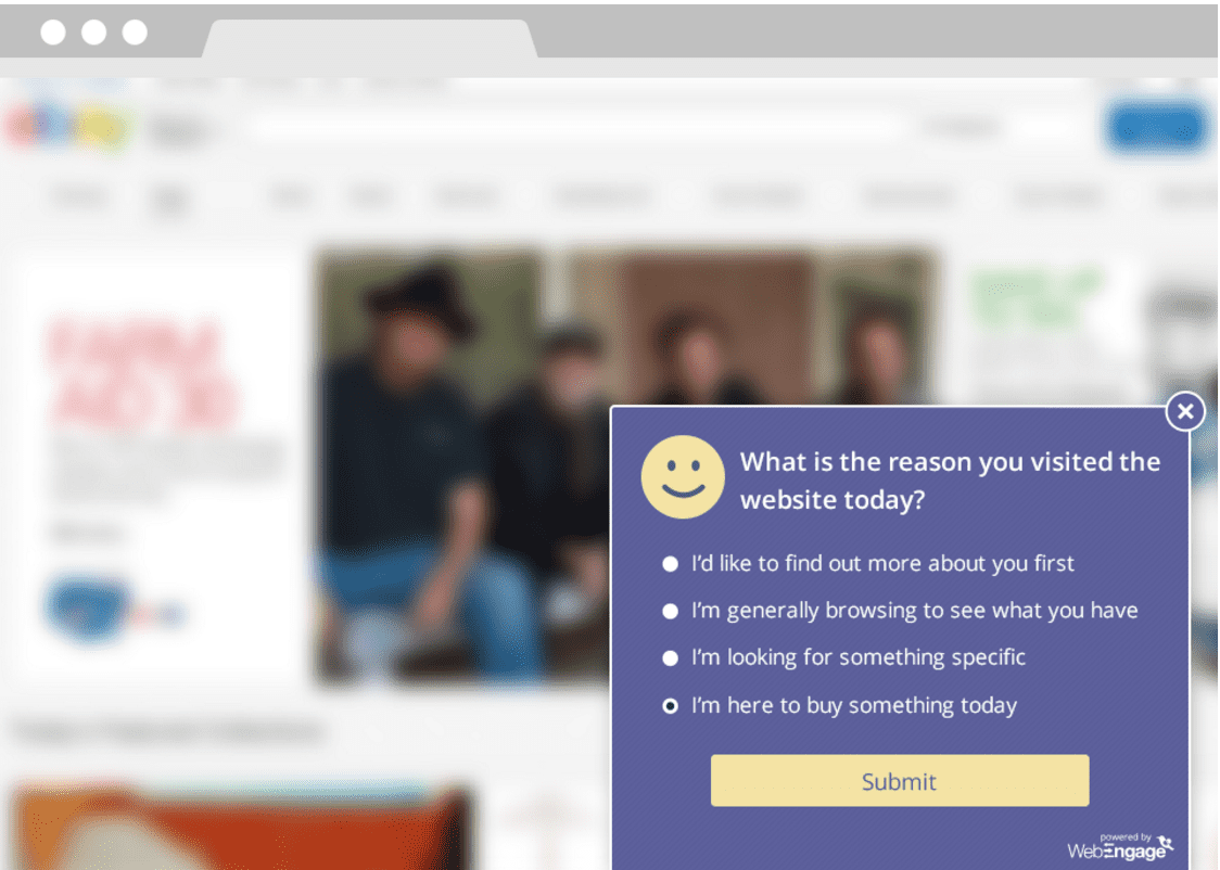
These 4 responses will unearth a whole range of insights. To give an example of how this might affect your thinking, the majority on your website may not be on the website to buy today or at that moment in time (possibly the large majority of visitors) and so how good (or bad) is your average conversion rate? Or if there are particular patterns for those that are simply browsing? Do they notice they can ‘save for later’? Perhaps many go to delivery/returns and can’t find what they’re looking for?
Segmenting this into traffic sources provides additional insights on acquisition which become useful in understanding the consumer journey, which is matching channels and intent through the funnel. Often organic and direct visits sit further down the funnel (brand searches for example) and channels like Display may sit further up. Whilst analytics tools can display multi-channel attribution, the addition of attaching intent and drilling down to campaign or keyword level can help hone and optimise marketing spend to increase efficiency and ROI.
Comparing maximum potential against actual conversion rates
The percentage of respondents answering the last two responses in the image below are those that your site should be aiming to convert right now. They’re your benchmark for website conversion potential.
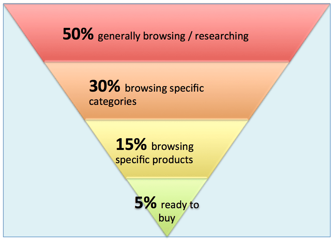
Let’s say the 20% responding in the example above are either here to look for something specific (in the case of bidding for particular apparel keyword in paid search) or on the site to buy (after seeing a promotional email for example). This becomes your max conversion rate with the difference being your potential. If your website is currently converting at 2%, yet 20% of people on average have an intent to buy, then your goal is to convert the other 18%, not the bigger 98% of non-converters. As for the other 80% that are not intending to buy but in general browse mode, you need to turn those from warm to hot prospects. Hooking this up with your analytics
As for the other 80% that are not intending to buy but in general browse mode, you need to turn those from warm to hot prospects. Hooking this up with your analytics ecommerce conversion goals creates something intriguing - of those responding X, what did they actually do? If they were looking for something to buy today, how many of those actually convert? Where are the blockers? Combining these with session replays can add further insights to uncovering conversion rate improvement gems.
This level of insight can help focus your website optimisation and testing based on actual paths and patterns to remove the guesswork from your insights work often missed by staged user testing. As a bonus tip, using session replay tools you can label users and drill down on how they respond to pages based on their current state of mind. You’ll likely find those that are looking for something specific will head for search or navigation. This doesn’t mean your landing page isn’t doing a good job, but it does give credence to ensuring you cover all user states in your site design process. Surveys like this are good to run all-year round, increasing and decreasing the % of your visitors you’re profiling as required, as you can also match responses back to seasonality and marketing campaigns.
[Editor's note: To compare your conversion rate with other businesses, see these industry averages for conversion rates in different sectors]
Question 2. Why are visitors leaving (without buying/signing up)?
Exit intent is another method of firing up survey questions to try and find out more about your visitors. In this situation, you can identify high exited pages (pages which have a high ratio of visits to visitors leaving your website like an exit door) and serve customers an exit survey to understand reasons for leaving. It is likely to be these visitors that are going to give you the insights to help find those little nuggets of conversion blockers you may not have thought about. Whilst response rates are likely to be lower than those that are engaged with your website, it is often the silent majority where your golden insights lay.
Let’s take an example of an ecommerce business I analysed a few years back suffering from high exit rates from their site search page during a sale. We discovered that promotional marketing efforts were being hit by product fragmentation; that is, during the time sensitive sale period the most popular sizes were sold out. With this knowledge, the marketing team are able to reduce spend on fragmented lines until stock levels could be replenished and possibly explain a declining ROI in certain product or category lines.
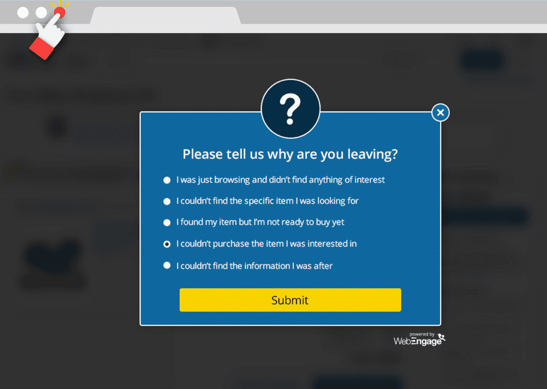
An example set of questions for an exit survey is to ask why they’re leaving and segmenting new and repeat visitors. For each response, you could consider collecting a free-text entry to allow customers to explain further if they wish. Those browsing and not finding could relate back to marketing or stock issues. If users are not finding the specific item they’re looking for, this suggests they believe you have the item so what went wrong? In addition, if visitors highlight specific issues they could be the low-hanging fruit you can fix straight away such as payment issues in your checkout or input issues on your sign-up page. These type of surveys are useful to put in place when needed in order to uncover insights.
Question 3. Did your visitors find what you’re looking for?
This is a question often useful to learn more about specific pages, such as a product or informational page. After all, your user testing, design and optimisation team are likely basing decisions on user research and analytics as to what to do and whether it is working. However what you’re likely missing is the ‘real-time’ in-situ data on whether your visitors are finding the information they need. A simple question served to customers either after spending a certain amount of time on the page (perhaps based on the average time people spend as per your analytics tool) or scrolling to a certain point can help to determine whether your page is working as hard for you as it should. Perhaps your product details are too light or your add to basket isn’t obvious? Perhaps that supporting page explaining what you do doesn’t actually answer the most important question?
The example here could be a ‘how it works’ page which attempts to explain how your products or services work. Asking questions based on what you have on the page (using a money transfer service as an example) you could ask why they’re on the page:
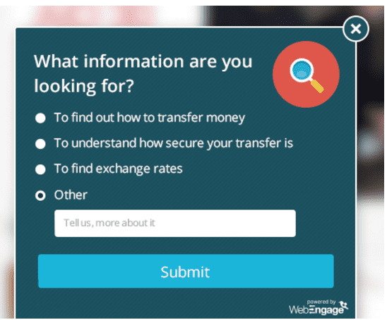
In this real-case example, it turned out the majority of people actually visited this particular page to find out about exchange rates, something which the page in question didn’t cater for and subsequently led to a change in user experience. A segmentation in this example by country gave further insight into certain cases where security was more important - something which could feed into onsite personalisation by country/IP to tackle customer queries more efficiently. Cases like this ensure your website is always focussed on delivering the right experience for your visitors and are suitable for category and specific product or service pages to ensure you’re serving your customers in the right way.
Question 4. Would you recommend this website to friends/family?
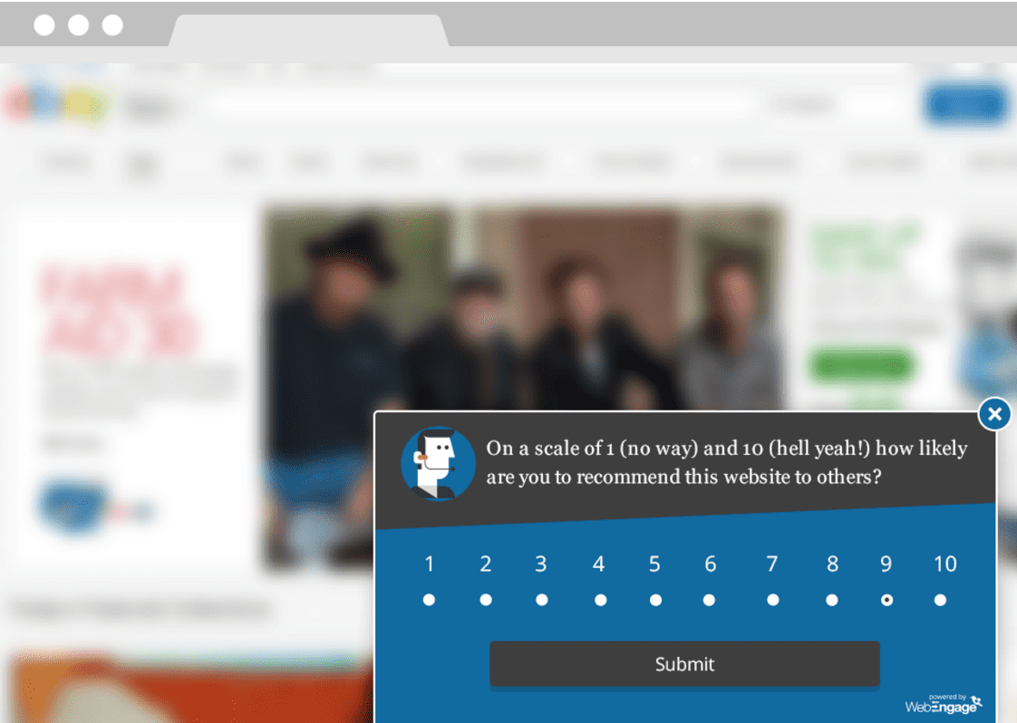
CSAT (Customer SATisfaction) is a customer measurement of a particular product or service. You can measure website visitor (not yet customers) sentiment as to whether, based on their journey so far, they would recommend your website to others. This gives feedback on your website as a product itself for how well it is doing in servicing your users’ needs. This creates a useful gauge of overall sentiment which can be tracked over time and plotted against site updates, design changes and optimisations to determine issues overall with the website. As an ongoing benchmark, it can provide insights into the impact changes are having on the website experience, such as launching new landing page designs, changing your site navigation or perhaps introducing new font styles. In particular, segmenting responses by marketing channel and page can provide a further breakdown into areas where perhaps recent changes have caused a drop in overall satisfaction where otherwise bounce rates or conversion rates may have remained constant. It’s important to remember that additional friction on a site may not always show up in site analytics hence why I’d recommend having a finger on the pulse of your site.
Access Quick Win – Run an effective CSAT survey
Learn tips, tools and questions for Customer Satisfaction and Net Promoter Score surveys.
Access the Run an effective CSAT survey
Get started with your first survey today
The 4 survey questions above are a good way of understanding why something isn’t, or indeed is working. Not everything is about fixing things wrong with your website as you also want to be aware of the things that are working well too so they remain that way. The big challenge in understanding the feedback is in really understanding what you’re asking and what you’re trying to understand. Often survey questions can lead consumers down the wrong path, however, these 4 survey questions allow you to set the right tone to deliver insights. How you structure the questions will define the quality of what comes out.
If I was to pick one survey question to get you started, I’d go with finding out why customers were on your site or page. This is the number one insight which helps to drive further questions and insights. As you use surveys more and more you’ll get a feel for what creates the most action for your business. Keep surveys short, timely and relevant and you’ll start to see how actionable conversion rate optimisation really can be.

Thanks to
Depesh Mandalia for sharing his advice and opinions in this post. Depesh is a senior UK marketer with global experience in driving growth through marketing, insights and optimisation. You can follow him on Twitter
@DepeshM or connect on
LinkedIn.


 Thanks to Depesh Mandalia for sharing his advice and opinions in this post. Depesh is a senior UK marketer with global experience in driving growth through marketing, insights and optimisation. You can follow him on Twitter


