Answering the right questions on the path to conversion
Whether you're working on increasing conversions for an online enquiry form, quote request form, e-commerce transactions or an online application process, answering more of your visitors questions will help them and your business. It's a fundamental of web marketing.
For more practical examples of testing and optimisation approaches to increase leads and sales, hear Paul Rouke of PRWD speak in a webcast at the free Smart Insights #marketingpriorities2013 Digital Marketing Summit on 11.01.2013. View the full programme of speakers at
http://bit.ly/priorities2013.
Of course, what you're asking visitors to complete and what your product/service is will dictate the amount and type of questions that they may have, but by identifying and answering typical questions you are more likely to encourage more visitors to ‘do what you want them to’.
In this post I'll look at:
- A case study showing the potential of this approach
- Some of the key site areas where this applies to (and typical questions users may have)
- How and where you can answer user questions
- How to find out what questions you should be answering
1. A case study of how this approach increased conversions by 66%
Let's start with an example of a quote form I worked on to boost conversion. Here is a "Which Test Won" - which do you think worked best - Version A or Version B?
Version A
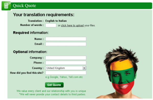
Version B
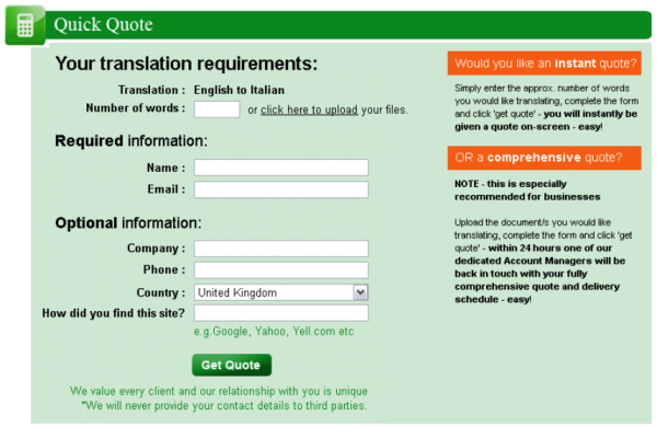
And the answer is...
 Version B - I guess you answered correctly given the title of the article? But it's an effective example of the principle of answering the right question. How many forms just use empty space for simplicity?
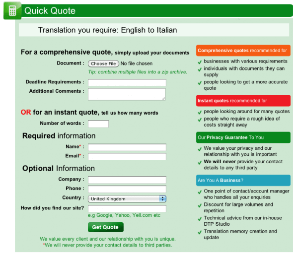
We increased conversion of the form further through AB testing with Google Website Optimiser and the result was...
Version C

To see further information on this case study and other form conversion results, see my presentation: Usability & User Experience 101 - #UX101.
2. Different types of conversion process to apply this analysis to
Quote Request
This is typically where you are asking visitors to submit their characteristics and needs so that you can issue a quote. Providing a quotation may happen as soon as they submit their requirements, for instance when looking for car insurance, breakdown cover, mortgages, loans and utilities. Alternatively it may only be possible to provide the visitor with a quotation after their requirements have been manually reviewed.
Typical Questions That Visitors May Have
- Why do you need this information when I only want a quote?
- What are you going to do with my information?
- Will the information be safe?
- Will you pass the information on to other organisations?
- In short, will I be spammed?
Enquiry forms
Standard across most websites, the contact page enquiry form is there to allow your visitors to provide their contact information and details of their enquiry. There are no rules as to how much information you should ask for on enquiry forms, although when it comes to personal information, I always recommend that companies keep this to a minimum.
If you do provide a variety of products or services, then I recommend that along with an enquiry form text box you provide dropdowns, radio buttons and checkboxes where suitable to allow visitors to quickly specify the type of enquiry they are making.
Typical Questions That Visitors May Have
- When can I expect to get a reply?
- Will you share my information with any other companies?
Buying (e-commerce checkout forms)
In comparison to quote request and online enquiry, once you are expecting visitors to provide both personal and financial information, the amount of questions that visitors (particularly 1st time visitors) may have as they are going through the browsing and buying process can increase considerably.
Transparency
Of course transparency should be a primary objective for retailers. That's transparency about your proposition, stock availability, delivery options, delivery costs and other parts of your terms and conditions, in turn you are answering visitor questions which in turn will encourage more of them to consider making a purchase with you.
Dependant on where in the browsing and buying process the visitor currently is will mean the questions they have will vary.
Typical Questions – Product Page
- Is the item in stock?
- When will it be delivered?
- Is there an express delivery option available?
- Will they charge me if I need to return it?
Typical Questions – Shopping Basket
- How much is delivery?
- When will my items be delivered?
- Is there an express delivery option available?
- Is this site secure?
- Do they accept Paypal payments?
Typical Questions – Checkout Process
- Why do I need to register to buy this? (view more on handling new customer registration)
- Is this site secure?
- Why are they asking for 2 different telephone numbers?
- Can I get it delivered to an alternative address?
- Can I pay with [XYZ] card type?
- What do I need to do if I want to return it?
- Do they have a customer service number I can call?
- Why do I need to register in order to checkout?
Booking
Online bookings have been available for a long time for a variety of services, such as holidays, flights, lessons, events and conferences. As part of the online booking process, if visitors are required to provide financial information then some of the same questions for checkout process will apply.
Typically online bookings will be a multi-step process, where visitors are expected to complete more than 1 web form as they move through the process. A critical point to make here is that the higher the value of the booking, the more likely it will be that visitors will have more questions that they want answering in order for them to complete their booking.
Questions That Visitors May Have
- Are there discounts available for group bookings?
- Can I come back and complete by booking at a later stage?
- What information will I need to hand to complete my booking?
- Exactly how much will this booking cost me?
- What happens next?
Application
Online applications include the likes of loans, accounts, mortgages and courses . Each type of application may lead to a variety of questions for your visitor, and similar to online bookings the application process will typically be completed over a number of steps.
Questions That Visitors May Have
- How long will the application process take?
- What information do I need to have to hand?
- Can I come back and complete this later?
- Why are they asking for this information?
- When will I know if my application has been approved?
- What happens next?
- Can I speak to a customer service representative?
Sign-up
These can range from visitor signing up to your service (perhaps you provide a free version as well as a more feature rich paid for service), signing up to receive your newsletter to signing up to join a social network.
As with all the examples I have used in this post the questions visitors may have will vary dependant on what product, service or feature they are signing up for.
Questions That Visitors May Have
- Why do I need to provide this information just to sign-up?
- Will you share my personal information?
- Is your service popular?
- How many other people have signed up?
- How can I upgrade at a later stage if I want to?
3. How and Where To Answer Questions
There are a variety of areas you can utilise to answer visitor questions. Below I have provided some recommendations for how and where to do this.
Header
When visitors are working through a multi-step process such as buying, applying or booking, I strongly recommend businesses consider enclosing the process. This results in you providing a simplified header which rather than containing your sitewide navigation, search feature and other links, allows you to promote more clearly answers to typical questions visitors may have.
Typically your header that is used on each of the steps can:
- Make your site security highly visible
- Provide customer service contact details
- Provide links (which open in a lightbox or overlay rather than the same window) to useful customer information ie. Returns policy, delivery methods, payment options
- Make it clear what payment methods you accept
Right of your web forms
Particularly for countries where visitors read from left to right, support information which usually answers questions which visitors may have about this particular form are positioned to the right of the form.
This area to the right of your web form may typically:
- Provide useful information relating to this form (which could for any of the different types of form described above)
- Not be specific to 1 particular field, but more about the what the visitor is being asked to complete on this form
- Provide information on next steps once the visitor submits the form
- Provides ‘social proof’ for the visitor so that they see either testimonials or comments from other happy customers who have been here before
In-line with individual fields
This method is particularly relevant for fields where visitors may question why they need to provide this information.
There are 3 main methods for displaying information for particular fields:
- shown automatically at the side or underneath the actual field
- shown once you click in to the particular field, usually at the side of the field
- shown once the visitor hovers their mouse over a small icon, usually which contains the letter i to represent ‘information’
It’s important to note that I don’t recommend providing this level of information for every field, just for the fields where it won’t be immediately clear to the visitor as to why you are asking for this information.
One example could be if you are asking for both a landline and mobile number, you can make it clear why, for instance if they also provide their mobile they will receive text alerts on the status of their order.
On your button!
Its usually best practice to use descriptive words on your buttons rather than continue or next, for example. Particularly for multi-step processes by making your button descriptive you can in turn help to answer visitor questions such as “what happens next?” or is this site secure.
Examples of button wording include:
- Checkout securely
- Review my order
- Place my order
- Proceed to delivery options
- Proceed to payment
4. Finding out what user questions you should be answering
There are a variety of methods of customer/user research you can use to determine what questions you should be aiming to answer. One of the best ways is by conducting user testing, whether this be moderated lab based testing or remote user testing. You can read more about good, better and best approaches to user testing.
Summary
As I've detailed in this article there are lots of potential questions that users may have on the wide variety of sites vying for their attention - it is up to the people (like you!) responsible for running and improving the performance of the website to find out what questions users have which they can then provide the answers for - good luck!


 Version B - I guess you answered correctly given the title of the article? But it's an effective example of the principle of answering the right question. How many forms just use empty space for simplicity?