Form conversion optimisation tips and recommendations
Unless you sell online, chances are one of the main objectives of your website is to generate online enquiries or new business leads. Dependant on your products and services, you may want visitors to pick up the phone and make an enquiry, or alternatively you may prefer visitors fill out your enquiry form and send their details to you.
This post will focus on providing tips and recommendations for those of you who would like to increase online enquiries.
What makes a good enquiry form? Not always the usual best-practice
Some of the best practice techniques we hear again and again about enquiry forms are:
- Keep them simple
- Don’t ask for too much information
- Don’t ask lots of questions
This generally translates in to asking your visitor for their name, email address, phone number and then a text field for them to submit their enquiry. But it's always good to test conventional wisdom.
The problem with this approach is that you asking your visitor to describe their requirements, interests and other parts of their enquiry in one field. Dependant on your products and services, and the specifications of them, this requires a fair bit of effort in the typing department.
So, rather than providing another basic enquiry form like lots of companies do, there are a number of reasons why asking visitors for more information about their requirements can and does benefit businesses.
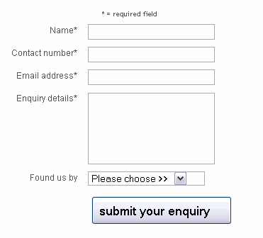
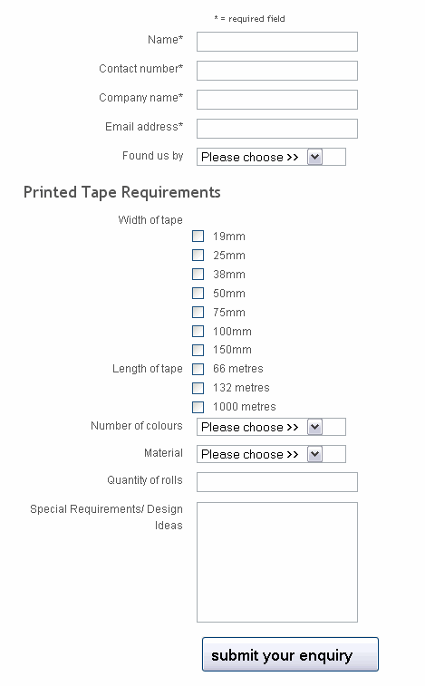
Here is an example where a longer landing page performed better for the business than a simple landing page. You can read more about it in the presentation at the end of this post.
Simple enquiry form

Detailed enquiry form

So why ask the visitor for more?
Asking the visitor to provide more information in order to make an online enquiry provides a number of key benefits for your business, as well as benefiting your visitor.
Benefits for your business
- You demonstrate the range of your products and services
- You weed out time wasters who can't be bothered providing the required information
- You receive more qualified leads
- Enquiries are more structured and easy to respond to
- You come across as more professional compared to your competitors
Benefits for your visitors
- They are presented with a more intelligent, tailored enquiry form
- They are able to specify their requirements quickly
- You remove the need for them to type out lots of information in the one ‘your enquiry’ text field
- They feel like you have gone to more effort to understand their requirements than your competitors
- They get a clear idea of your products and services (especially if they haven’t browsed your site)
- They can specify a range of requirements based on the specification of your products or services
13 enquiry form best practice tips
In addition to the recommendations and benefits described above, there are also a number of best practice tips that I encourage all businesses to consider following on their enquiry form.
- Make your required fields absolutely clear at the top of the form
- Don’t feature a ‘back’ or ‘clear’ button – they are un-necessary and are a distraction
- Ensure your call to action is the more prominent visual element on the page, encouraging people towards filling the form out and pressing submit
- Consider using descriptive, inviting wording on your button ie. request my free brochure, send my enquiry, rather than just send or submit
- Don’t ask for un-necessary personal information – other than their name, email and telephone number (and business name if your site is aimed at Business-to-Business)
- If there is the potential for some visitors to be unsure why you are asking for certain information, provide a tool-tip alongside that field which explains why you need or would like this information
- If necessary provide support information on the right hand side of the enquiry form explaining what visitors can expect to happen next
- Don’t neglect your thankyou page – provide useful links for visitors who submit an enquiry, and make it clear when they can expect to hear from you
- If your form is quite long, break up the information you are asking for in to logical groups, and give each group a fields a heading
- Use friendly wording on your error messages – don’t appear to telling off the visitor if they have made a mistake
- If there are errors on the form, provide a clear summary above the form, clearly highlight the field/s that require attention, and you can even provide links to the appropriate fields in the error messages at the top of the enquiry form
- Consider using inline validation for fields such as email addresses to give immediate feedback to visitors as they are completing the form
- •Allow visitors to include characters such as brackets and hypens in their telephone numbers, as you can simply remove them in the back-end
Points to keep in mind
Although I would encourage you to provide a more comprehensive enquiry form to encourage the right type of visitors to make an enquiry, there are a few points to keep in mind.
- There is no reason to not provide an optional basic enquiry form, for those visitors who have a very simple enquiry which can be described in one or two sentences
- Don’t make all the additional fields you are requesting required – leave them as optional so as to not to frustrate those visitors that don’t have specific requirements
- Consider providing an option for visitors to request a call-back, especially if the nature of your products and services means that telephone contact is required
- As with all changes which are put in place to help increase online conversion rates, I always recommend companies look at adopting a testing and optimisation strategy, using tools like Google Website Optimiser to test different versions of pages and page elements to determine which version results in the better performing/converting pages
A case study of forms optimisation where more content increased conversion
Results and impact on the recommended approach described on this post can be seen on slides 36-42 on this presentation I have recently delivered.
Summary
Hopefully this article has opened up a few ideas for you to consider using for your enquiry forms. Remember, asking for more isn’t always a bad thing! What do you think?


