7 examples of landing page design techniques inspired by the growth in mobile usage
The technological progress of the 21st century has made online users more choosy and difficult to interest than ever before. If we take a look at the evolution of the web, it becomes almost impossible to believe that it all began with a simple networking protocol more than 20 years ago. And nobody was complaining of poor navigation or unappealing visualization back then. Growth in mobile device usage has sparked many changes to the way we approach landing page design which I'll review in this article.
Due to the ongoing improvements of the digital market, every business tries to find the most effective and eye-catching landing page solution. All of the companies ask themselves if there are some fresh ideas to win the hearts of prospective customers. If you're creating a website for your business or just planning to redesign a landing page of the existing one, I hope these new landing page trends will bring you some inspiration.
In this post, I'll take a look at 7 landing page design trends which have become more commonplace in 2015. You can see more landing page examples here.
1. Parallax Scrolling

Telling a story is one of the most common techniques marketers all over the world use to attract the attention of consumers and create an emotional bonding with them. Parallax scrolling can do just that. It's a computer graphics technique that allows to create a 3D effect by moving the background of a landing page at a slower rate than its foreground. It gives you an opportunity to show your visitors the details of your company and products step-by-step in an engaging and exciting manner. This is a really hot trend now, so don't miss your chance to use it to your advantage.
Examples of successful implementation: Sony, Atlantis World's Fair
2. Appealing to Several Types of Your Target Audience
As a rule, your target audience can be divided into several groups with their own needs and desires. It is very appealing and flattering to the visitors of your site when you differentiate the needs of each of these groups. This approach makes it much easier for them to find the necessary information and use your site more effectively. This strategy is successfully implemented by BeReel:
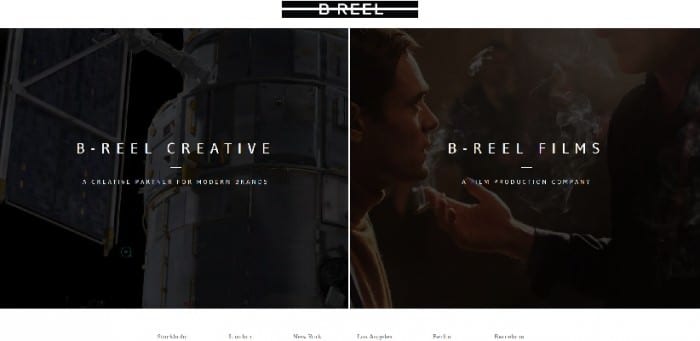
All you have to do is to let the user decide on the purpose of his/her visit.
Examples of successful implementation: Code Academy Labs, Muck Rack
3. Full-Screen Background Images and Videos

It's a great way to show your audience something important for your brand's image and perception. When using a silent video for a landing page, you choose an emotional approach of telling the story of your brand to the visitors of your site than simply providing a link to it. And a clear background image can be as visually appealing as a colorful video. Proved by Jeff Bridges:
Examples of successful implementation: HBM, Blu Homes
4. Unusual Navigation

If you've got a lot of information to place on your landing page but don't want to make it difficult for visitors to navigate through it, use unusual approaches. Floating navigation bar will easily solve this problem and make your call to action more effective. There will be no need to scroll the page up and down for several times. Or, you can turn your page into a real quest for a visitor to discover new piece of information with each move he or she makes, like it is in the case of this amazing site of Giampiero Bodino:
Examples of successful implementation: Austrian Summer Moments, Ford Answers
5. Minimalism and Simplicity
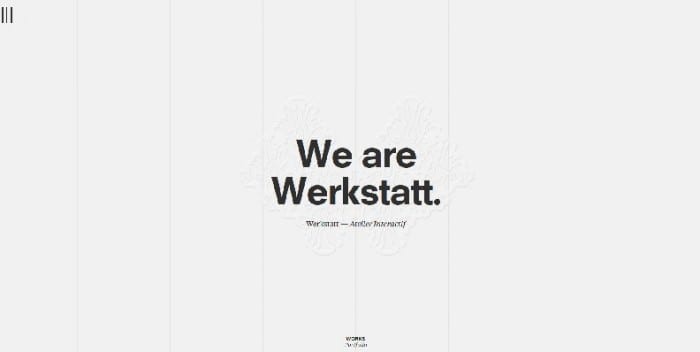
It may seem illogical to simplify the design of your landing page with so many options available. But there's one thing you need to keep in mind – accessibility. This, of course, depends on the type of the product you're selling, but you have to take this point into consideration anyway. Users should be able to access your site from any device, including their smartphone. And if it takes ages for a landing page to download you risk losing a considerable amount of prospective customers. Your landing page has to be light and clear. Like this one, for example:
Focus on making your page more accessible to lead the way to a better performing website.
Examples of successful implementation: Lunar Gravity, Kalium
6. Illustrations
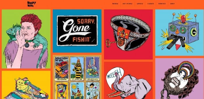
Your task is to make your site stand out. Using illustrations instead of images can add that personality and uniqueness to your landing page you're looking for. You can use this idea for telling a story of your brand's concept or its main benefits. It gives you better chances of becoming more noticeable than simply listing the unique selling points of your product or service.
Examples of successful implementation: Kelsey Dake, Goran Factory
7. No Navigation Bar
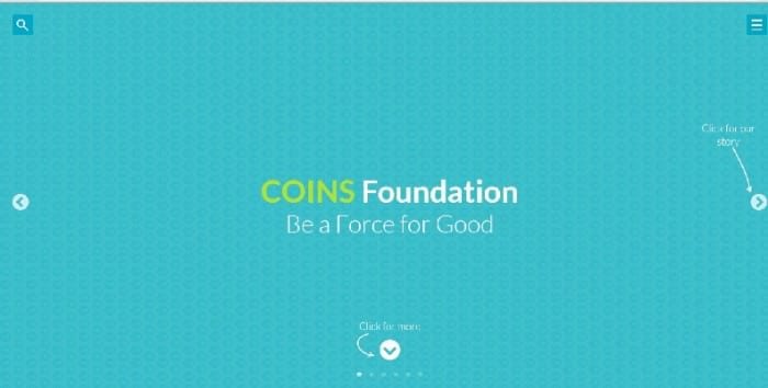
A lot of people are afraid of taking away the navigation bar from the top of the page because it seems to be a somewhat revolutionary step. But in reality, it helps your audience to stay focused and spend more time reading or watching the information you give them. The less distracted your site's visitors will be the better for your business.
Examples of successful implementation: Matt Spanky, Coins Foundation
 Thanks to Martha Simons for sharing their advice and opinions in this post. Martha Simons is a marketer with more than 5 years of experience in brand management and digital marketing. She currently works as a copywriter and is a contributor to Essayhave.com and also writes for numerous online resources. You can follow her on Google+ or connect on Facebook.


 Thanks to


