5 areas you need to look at to improve your ecommerce
As digital marketers, we spend a lot of our time perfecting landing pages and ad copies. We also hire the best writers for our content. I am not here to say that those dollars are spent in vain. But when everything’s said and done, these efforts and dollars are all spent to produce a conversion.
When it comes to eCommerce, this sale/conversion has to happen via the shopping cart that leads to the checkout page. I am afraid that the shopping cart is where most marketers fall short and thus lose what they have gained with great pains.
In this post, I am going to list exactly what you should do to get all those sales and optimize your shopping cart to perfection, in order to boost conversions.
1. Best Shopping Cart Design
The shopping cart is an integral part of the shopping experience. Great design doesn’t simply mean that the shopping cart looks beautiful. For starters, it should be pretty obvious to the user when he/she adds something to the cart. Clear confirmation is the first thing that a good shopping cart does right.
Secondly, after the confirmation that the product has been added to the cart, the user should remain on the same page. It makes it easy for the user to click on the checkout button. Sudden things like page reloads and slow reloads may confuse the user. He/she may even be led to abandoning the shopping cart.
Apple does it right in showing the product and its details in the shopping cart and prompting the user to proceed with a green Call to Action.
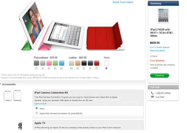
Image Source
2. Cross-category Connections
Cross category connections refer to the recommended products that we can make after or just before the customers complete their purchase. We can recommend them something that complements the product they have purchased to add into their cart. Products from connected categories could be the best solution to widen average order. Connect main category products with products from other main categories that match or accessories and supplements.
Examples: bands and batteries for watches, earphones for cellphone, bags and shoes.
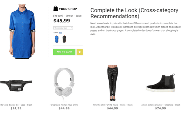 There are many ways you can define these cross-category connections.
A cross-sell is a product that complements the existing purchase but is from a different category.
There are also add-on sales. Add-on sales refer to little services that go along with the product. If while purchasing a smart phone or laptop you also added the extended warranty that’s an add-on that you fell for.
3. Collaborative Filtering
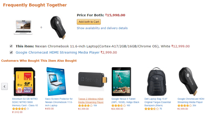
Sometimes crowd wisdom from collaborative filtering could give better results than logical connections between categories. Collaborative filtering works like this: if we see that customers purchase product A and product B together, we should show everybody who saw product A product B and vice versa. Sequences of products that customers often browse or purchase together could be unpredictable but efficient.
These are also called bundle sales. Not many companies use collaborative filtering in their activity. Amazon is one of them; it is famous for bundling products together. There are also some companies such as Softcube that provide easy integration of personalised recommendation services to online stores of different sizes.
Here’s an example of the same.
4. Guest Checkout
People just don’t like signing up to sites. If your eCommerce site requires users to sign up to complete the purchase be prepared to know that you will lose 25% of traffic that was otherwise ready to buy.
Guest checkout or allowing users to create accounts later on after the purchase is a good idea to implement. To do that, simply ask the user if they want the information that they entered to be saved.
The thank you page serves as a great place to ask this. You may also want to abandon using the term “Register” for obvious reasons.
I recommend using something like this.
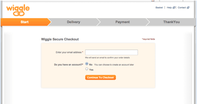
Image Source
5. Ecommerce Checkout (security)
Conversions are mostly based off of the perception your site manages to create. When you display security seals, it increases the trust of your customers.
Survey conducted by Econsultancy confirms that it was trust seals that gave users the greatest sense of trust when shopping. 48% of users confirmed this. The site’s design aroused trust in only 32% of shoppers.

Image Source
The report further reveals shoppers felt the greatest sense of trust on sites that displayed the Norton Secured seal that was powered by Verisign.
So, you now know which seal to go for. In the case of Norton, its familiarity breeds trust.
Concluding thoughts
The shopping cart is the last step in a conversion funnel. It’s here where the buyers are almost in. But there’s many a slip between the cup and the lip.
If you make the same mistakes which I highlighted above you will be losing hard-won sales all day long without even realising what you are doing wrong.

Thanks to
Marina Iermolaiva for sharing their advice and opinions in this post. Marina Iermolaiva is a marketing specialist at
Promodo International department . She has been working over different big projects connected with software, web hosting, internet marketing and online retail. You can follow her on
Twitter


 There are many ways you can define these cross-category connections.


 Thanks to


