Recommended design patterns and best practices for your Checkout Funnel
Checkout design is the last in our series of posts covering design best practices for different parts of the Ecommerce customer journey. Previous posts include discussion and examples and potential design elements to test for:
- Home page
- Product listing or category page
- Product page
- Site search pages
- Shopping Basket design
Design issues for the checkout pages?
Checkout is the most critical part of the conversion path in some ways since it throws many challenges, due to the multiple stages, with each step influenced by the previous one. It is further complicated since it's not necessarily linear; so there is no standard path from start to finish and so this depends on the user's profile, where some steps can be skipped.
In the Smart Insights Ecommerce design guide, I focus on 3 stages:
- 1. Sign-In /Register
- 2. Personal Details and Addresses.
- and 3. Payment.
One size doesn't fit all for the checkout flow, and the art of the template design is in masking the complexity of the logic and process flows behind an intuitive and user-friendly page design - not an easy challenge. In our experience, it takes rigorous testing to find the optimal flow for your website.
Key Ecommerce Checkout Funnel Wireframe requirements
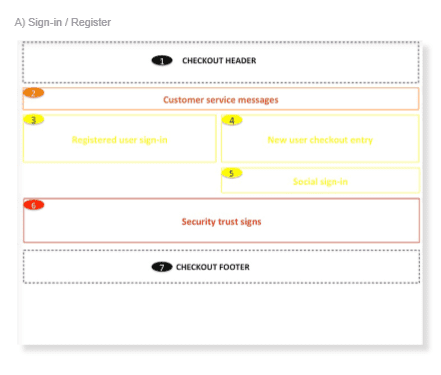
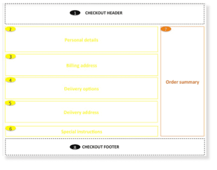
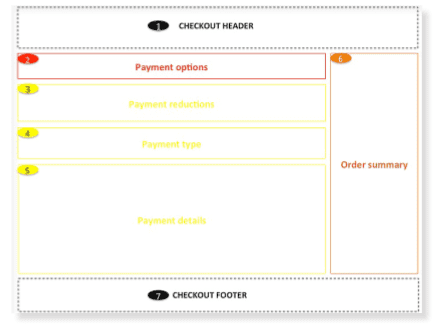
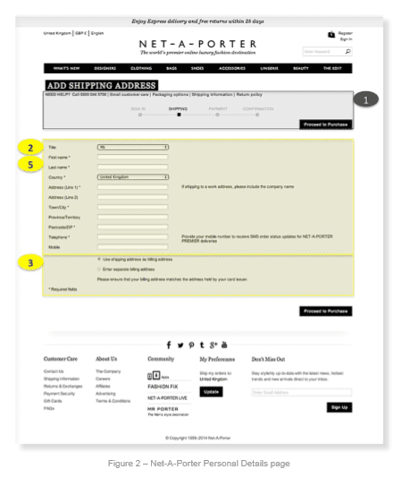
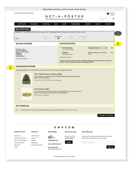
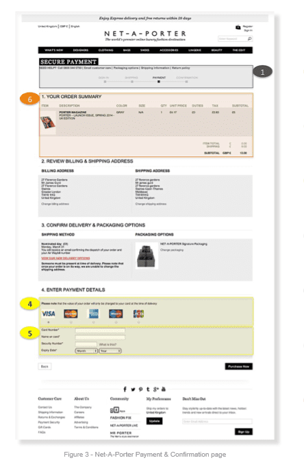
The wireframe below outlines the core elements for the checkout funnel, though UX/UI design patterns can vary across websites. Please note that in the checkout we recommend a custom header & footer that is different to the standard site header and footer we discussed in step 1 of this guide. This is because it’s widely accepted that unnecessary navigational elements like mega menus and footer links can distract users from the core goal of completing an order.
1. Sign-In/Register Template

2. Personal details and addresses

3. Payment and confirmation

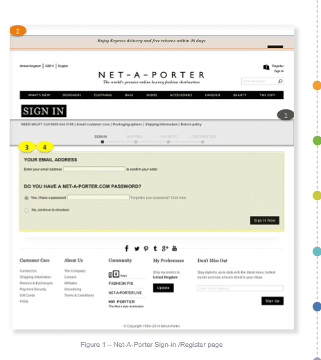
Case study for Net A Porter
Instead of separating new and existing user checkout (the classic Amazon approach), the user is asked to enter an email address, then select whether or not they have a password. We like this UI design because it reduces the complexity of the page and doesn’t force users to make a tacit decision about which box they fall into. Some of the big multichannel retailers like House of Fraser adopt this approach. You’ll notice how the standard header and footer are used throughout the checkout, which goes against good practice advice.


Key requirements checklist for a Checkout Funnel
Finally, here's a checklist for a process to review and test your checkout;
- Q1. Have we defined and understood the goals for the checkout?
- Q2. Have we defined user cases for each step?
- Q3. Have me mapped the user journey for new and returning users?
- Q4. Is it easy for both new and returning visitors to enter and complete the checkout?
- Q5. Are we providing a guest checkout for new users (if applicable)?
- Q6. Have we defined which data fields are required vs those which are optional
- Q7. Have we removed all non-essential data fields?
- Q8. Have we ensured checkout pages aren't indexed for search?
- Q9. Have we identified web analytics requirements?
- Q10. Have we defined the navigational elements?
- Q11. Have we defined how to handle error messages?
- Q12. Have we integrated a postcode validation tool?
- Q13. Is it easy for users to edit/add addresses?
- Q14. Have we defined all delivery methods and the cost to the visitor for each method?
- Q15. Have we tested all payment types to ensure there are no breakpoints at payment stage?
- Q16. Have we tested the checkout in all key browsers ie. Internet Explorer, Safari, Firefox, Chrome etc.)
- Q17. Do we make it easy for users to add useful information like gift messages and delivery instructions?
- Q18. Do we promote our loyalty scheme clearly and is it unobtrusive i.e. doesn't disrupt the core checkout flow?
Additional requirements to consider in your Checkout Funnel
In the full guide for Expert members I go into much more detail on individual page elements and look at more examples of how these apply in practice from UK and US-based retail sites.

Recommended Guide: Ecommerce Design Patterns
Use our wireframes and examples to test and create more persuasive Ecommerce designs to boost retail sales.
Download our Ecommerce Design Bible.


