Research and examples showing how the principles of Colour Psychology apply to Persuasion Marketing
Just about everyone has a favourite colour, (and a few not-so-favourite ones), and as such, most of us realize that colour has an unusual ability to influence how we feel. Armed with the knowledge that colour can be a persuasive force in consumer decision-making, Professor Satyendra Singh from the University of Winnipeg asserts that retailers are always attempting to use the influence of colour to their benefit (Impact of colour on marketing, Management Decision, 44 (6), 783-789).
This may involve techniques as simple as targeting consumers of a specific gender based on product colour, to using specific colours to subliminally entice consumers to buy: see Professor Okan Akcay in 'Marketing to teenagers: The influence of colour, ethnicity and gender,' from International Journal of Business and Social Science, 3 (22), 10-18. Available online at: http://www.ijbssnet.com).
The practice also extends to online retailing, in which great care is taken to use colour psychology to influence conversion rates when designing product/service landing pages. Regardless of where it is employed, when used skillfully, colour can be powerful part of the savvy conversion optimizers arsenal.
Not so true colours: Avoiding culture-based colour blunders
Want to help your incredible, new dish detergent formula project an image of purity? White is the way to go. Need to make that 'Book Now!' button on your travel agency site irresistible to customers? Green means growth. Hope to make your law firm’s website look legal and alluring? Bring on the blue: see, 'Colour and store choice in electronic commerce: The explanatory role of trust,'). But hold on a minute… just because the colour’s you’re considering works well for advertising to where you live, doesn’t mean that all hues have the same attractive-ability everywhere.
6 Examples of how colour is used by leading companies
1. Subway
Use of the colour green:
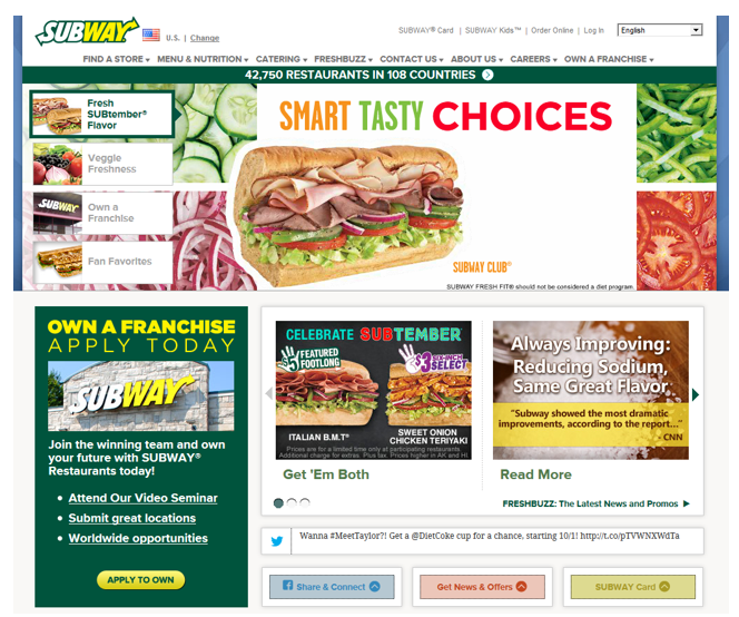
Subway’s site makes use of the colour green in its branding. The colour is associated with health, growth, and harmony.
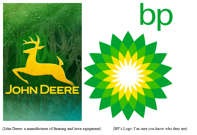
2. John Deere and BP
3. IP MorganChase and Deutsche Bank
Use of blue logos:
(Global Investment Bank Deutsche Bank)
As stated by Professor Wilkinson of the University of Sydney, meanings associated with colour can vary widely in different parts of the world. Download his document for more information and read 'Perspectives: Multicultural marketing in Australia: Sinergy in diversity,'.
So doing your homework can mean the difference between boosting business and burying it. Perhaps your investment company is extending its services to Tokyo and you feel that your website needs a facelift.
With this in mind, you decide to go with blue to reflect your reputation for honesty, integrity, and dependability.
Fast forward to six months after your Japanese debut. You are mystified because business has failed to boom, and because even requests for information are disappointingly few. ('Global marketing and advertisement: Understanding cultural paradoxes').
So what gives? It’s all a matter of cultural context. Your firm originates in the U.S. where businesses embrace blue for both a number of reasons, one of the most important being the fact this it is believed to inspire trust, according to Public Relations Guru Thomas Madden: 'Managing images in different cultures: A cross-national study of colour meanings and preferences'. Unfortunately, in your new location, blue had a much different traditionally has a much different connotation.
In the East, the colour is often associated with villainy (see: http://www.sccfsac.org/ghost_gods.html) (even worse, a ‘Blue film’ is also used to describe pornography in India and Israel), and most folks aren’t too keen to hand over their hard-earned money to someone who might take it and run.
Perhaps if you’d chosen red, things would have turned out differently, since the Japanese associate the colour with good luck and prosperity ('Colour: Cross-cultural marketing perspectives as to what governs our response to it').
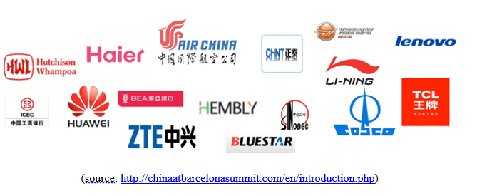
4. Logos of prominence for chinese companies
Note the prominent use of red.
5. Pepsi case study
It goes to show that even the big dogs make mistakes. At one time, Pepsi dominated the soft drink market in Southeast Asia…until they decided it was a good idea to change the colour of their coolers and vending machines from a dark 'regal' blue to light or 'ice' blue.
Uh, big deal you’re probably thinking As best-selling author Erik Qualman noted, it was a pretty big deal for a company that peddles a product designed to put some pep in your step, since light blue is a colour often associated with death and mourning in that part of the world. You can be pretty sure that when most people come face to face with a wall of vending machines, they aren’t likely to choose one that reminds them of the most recent funeral they attended. All that’s left to do is chalk one up to experience and avoid making the same mistake twice.
One of the best ways to determine which colours fit the personality of both your product and the people who might buy it is to conduct a split test. This means offering two versions of your landing page to visitor and then asking them to provide feedback about which they prefer.
While split tests (also called A/B tests) can involve creating two entirely different versions of a page, they may also be as simple as changing the apparel colour of the woman peddling your Pro-Pare potato peeler from brown to purple. Google Analytics, Visual Website Optimizer, and a number of other sites offer simple, split testing services which allow you to compare marketing variables and gain invaluable insights into visitor behaviour. Sometimes the simplest changes drive the greatest results.
6. Performable
Consider, for example, this well cited example of an increase in conversions due to a change in a button’s colour:
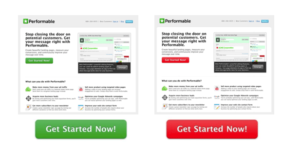
The button change from green to red, which increased Performable’s conversion rate by 21 percent. That, however, isn’t conclusive evidence that red possesses some super power to get people to take action.
Upon a more careful examination, if we take a more careful look at the image: It’s clear that the remainder of the page is designed with the green palette in mind, which points to the fact that the green call to action simply meshes and integrates with the surroundings. The colour red, on the other hand, creates a stark visual contrast.
Red-Hot Headlines and Logos: Even when they’re not Red
The average person has an attention span of about 30 seconds. ('Getting it said: The 30-second attention span'). When it comes to making purchasing decisions on your website, businesses are lucky to get a third of that from potential customers.
As determined by Jakob Nielsen, the average person in search of something online only spend an average 10-20 seconds on a page before leaving. Of all the purchasing decisions are made during this fleeting period of exposure, approximately 90% are based on colour alone ('The influence of colour on purchasing decisions related to product design').. This isn’t surprising when you consider the fact that most of what we know about the world around us enters our consciousness via the eyes.
Headlines and logos are essentials element of a landing page, and are intended to draw people in so they can see what you have to offer. They might be compared to signs and packaging which help consumers notice or recognize particular brands. In addition to capturing the attention quickly, the colours chosen for online marketing purposes must also reflect the unique personality of the product or service on offer.
In short, the right hue must be able to provide consumers with the confidence they need to take the next step. This means acknowledging the fact that most people either consciously or unconsciously associate colours with specific emotions.
- Are you trying to sell insurance, artisan bread, or adult entertainment?
If the answer is insurance, you want to inspire trust and confidence (blue perhaps?) A bread-dedicated business probably means convincing customers of your wholesome, earthy goodness. (Greens and browns may be the way to go.)
- Are you trying to encourage people to explore their more amorous side? (Red and black are often considered quite tantalizing.) Depending on the atmosphere you wish to create, the extent to which you want to promote your brand, your target audience, (and other factors) the proper colour scheme can mean the difference between a conversion and a missed opportunity.
Conversions, Brand and Colour
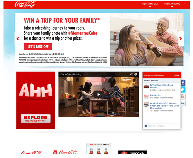
Take the example above. Coca Cola has been using the above colour combination for years. The iconic red and white strategy has been very successful.
The colour usage conveys courage, energy, vitality, and strength. Furthermore, information and text is easy to read. Such a colour scheme has effectively helped Coca Cola remain a brand name for over a century.
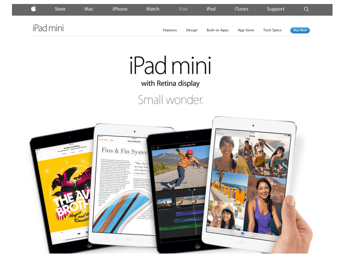
Apple’s colour combination is deceivingly simple. The contrast between the black/white allows for easy readability. The colour effectively demonstrates Apple’s reputation as a provider of sleek, sophisticated products.
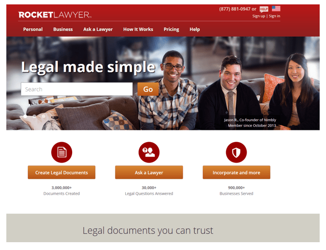
Rocket Lawyer’s website makes use of the red colour. It looks energetic. They know their limits, however. They give their users plenty of white space so their eyes aren’t overwhelmed with red.
In-the-Black Images: Meaningful colours mean more greenbacks
From your own experiences, you know that if a website doesn’t have you saying 'yes, this is exactly what I was looking for' within a few seconds, you are likely to take your business elsewhere:
'Modeling influences on impulse purchasing behaviours during online marketing transactions'. It’s all because the appropriate images and colours provide context for your product, generate immediate interest, and inspire buyer confidence. Whether you offer pool maintenance, poodle grooming, or antique harpoons, an attractive and appropriate product image is the easiest way to reign in your target audience.
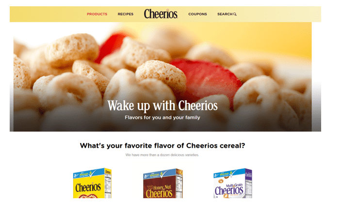
Cheerios example
Take Cheerios for example. Although one of the simplest breakfasts imaginable, on more than one occasion it has been the best-selling cereal of the year. This is due largely to the brand’s unmistakable, yellow packaging scheme (http://www.colorcom.com/research/why-color-matters)
The brain processes the colour yellow faster than any other colour, meaning that when Cheerios are perched alongside 500 other cereals in every parent’s least-favourite supermarket aisle, the eye is immediately drawn to the all-familiar 'o'.
Landing pages can employ colour in much the same way, by capturing the attention of passers-by so you can turn them into paying customers.
Bing

Bing increased their revenue by $80 million dollars by determining the precise colour of blue for their links. That’s not important, you’re probably saying? Well, people are so use to their links being blue. Back in the 1990s when WWW first came to be, the colour of most links were blue.
Blue-Ribbon benefit statements: Convincing colours
As a rule, people need convincing, and they generally despise having to make decisions whether they relate to where to go for authentic Lebanese cuisine or which shade of pantyhose goes best with the outfit from the nineties they squeezed back into. As found by Professor of Psychology Roy Burmeister, they also hate reading.
So, as a savvy businessperson, it’s up to you to help them make important choices like these with a minimum of effort. It all boils down to using colours that make helping people decide what they want painfully obvious.
Big businesses spend even bigger bucks determining which colour means the difference between millions and billions in sales. For those who do it best, the payoffs are enormous. Take Coca Cola for instance. The unmistakable red and white logo has been enticing thirsty people to buy refreshing beverages since it was created by Frank Mason Robinson in 1885. But why does it work? Part of the secret is the way in which the sleek, sexy, and simple design which is intended to reflect a youthful spirit. Why someone asks you if you’d like a Coke (sorry Pepsi people), the logo instantly springs to mind, and evokes memories of refreshment that provides a cool, caffeinated kick.
Now, take a step back and imagine the energy, action, and passion inspired by the logo’s familiar red colour in some other shade…let’s say…yellow. While yellow can suggest fun and playfulness, it is also associated with cowardice, illness, and jaundice; not what most of us want when we’re looking for a pick-me-up (although it might work just fine in Egypt where yellow is the colour of happiness and prosperity.(' Color terminology and color classification: Ancient Egyptian color terminology and polychromy,').
One product area in which colour choice can have an enormous impact on marketing success is food. Get it wrong, and you make the world’s most decadent brownies look like a dirt-based travesty.
Think about the last time you guzzled a grape soda (and if you don’t drink it, just use your imagination). Chances are the bottling and even the beverage itself came in some shade of purple- a colour traditionally associated with grapes (The colour purple). It’s unlikely you’ve ever purchased it in an orange bottle, or a green one, or a red one. It’s also unlikely you’ve ever opened a purple bottle, only to find it filled with a lemon-lime flavored beverage. If you had, there’s a chance you might have been unable to identify the flavor at all.
Research suggests that the perceived 'appropriateness' of the colours used in food packaging has the ability not only to help us identify flavours correctly, but can even influence our impressions taste.
Basically, when we see a product and think that it looks unappetizing, chances are we’ll also believe it tastes that way. This, of course, can have an enormous impact on brand image and sales.
A prime example (for those of us old enough to remember) was a product called 'Crystal Pepsi.' When compared to that of regular Pepsi, the beverage’s clear appearance and lighter packaging colour scheme gave people the impression that they would still get their favorite soft drink, but with fewer calories and a crisper, cleaner taste. In reality, Crystal Pepsi had the same basic flavour and calorie count as regular Peps: However, the 'Is Pepsi Clear the return of Crystal Pepsi?'). ambiguous sense of 'clearness' suggested by the name and the bottle was made cola-flavour identification difficult and altered consumer’s sense of taste.
Some diehard Pepsi fans even found the beverage unpalatable. (This was the result of synesthesia- when one sense interacts with, and makes an impression on another). Crystal Pepsi was a disappointing failure because its taste did not match the characteristics people would normally attribute to items packaged in a similar manner.
Watch our for my second post in the next few weeks, on conversion-creating CTA's that crush the competition.
 Thanks to David Rosenfeld for sharing his advice and opinions in this post. David is the Director at Infinite Conversions, a digital agency focusing on improving website’s sales and revenues through conversion rate optimization.


 Thanks to David Rosenfeld for sharing his advice and opinions in this post. David is the Director at


