Examples and tips to improve your conversion funnel for your persona?
 Visualizing your conversion funnels, personalizing them for your buyer personas, optimizing their CTAs, landing pages, and other elements requires knowing things you may not know and testing new concepts.
Conversion funnels are the freeway systems of website infrastructure, with landing pages as on-ramps and exit pages as off-ramps; but also with a variety of bridges, underpasses, toll booths, and traffic cameras throughout.
MarketingSherpa shocks us with the statistic that only 68% of B2B marketers have identified their funnel. And, naturally, in order to optimize your funnel and explore the things that you do not yet know about funnels, you first need to define what your funnel is.
The Basics: What is your conversion funnel?
Theoretically, your funnel is the series of steps prospects take on their journey to becoming your customers. Graphically, a conversion funnel may look like this:
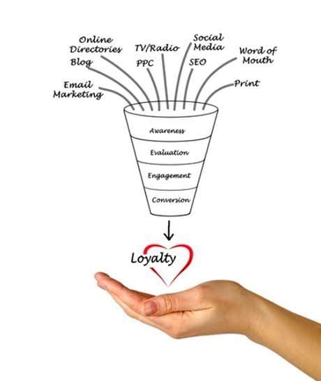
The optimist sees every step of the funnel as an opportunity to provide visitors what they need in order to progress to the next step. The pessimist sees every step as a point of divergence where visitors drop out of the funnel. The realists realize that websites typically have more than one funnel, based on different personas of visitors.
Your funnel may start from a call to action in an ad or an email. Once a user clicks that, he may be taken to a landing page. Then, he is prompted to complete a form. The form completion likely triggers a thank you page and a confirmation email.
Once you solidify your current conversion funnels, you may want to engage in optimizing your funnels, but there are a few things you probably didn’t know:
1. Funnels for Personas: Different strokes for different folks
Before you examine your funnels for optimization opportunities, you need to understand that different buyer personas need different funnels. For example, if your site targets young college students for its low-cost subscription and upper-middle class professionals for its premium services, you will find that each persona requires different steps toward becoming a loyal paying customer and advocate.
An eager (and often unexperienced) young buyer may progress quicker through a funnel toward a low-cost option; while a seasoned executive may need more proof, comparisons, analyses, and reports before making a decision to purchase an expensive subscription.
2. The Calls to Action: are yours optimized?
In tracking and monitoring calls to action, we have found certain indicators for success.
A short disclaimer is in order, however, because what works for one persona may not be a fit for another. What is effective for each industry, product, price point, traffic source, etc. needs to be tested to find the optimal solution.
In general, to be effective, calls to actions should be:
- Short and clear. 2-5 words is the optimal length.
- Urgent, descriptive, and action oriented. Typically, 'Download Today' or 'Sign Up Now' work better than 'Download the free guide to learn how to write urgent calls to action' or 'If you don’t sign up today, you are missing out.'
- Stand out. Graphically, use colors that contrast with the rest of the page. And make sure the CTA is large, bold, and in a prominent position to be noticed at the time the user is ready to convert.
A great example comes from Wix.com:

As you can see in this example, the CTA button uses short and clear text: Start Now. It is urgent and explains exactly what the button will do. The yellow color of the button immediately draws a user’s attention and invites him to click.
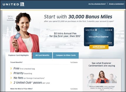
Another great example for the United Airlines credit card:
3. Optimizing Landing Pages
Volumes can be written (and have been!) about the optimization of landing pages alone. Instead or reinventing the wheel, we will just point out some things you probably didn’t know about landing page optimization.
Conversions can be increased by 86% by using video on landing pages, according to EyeView.
- Personalization is important
Anvil Media reports that Axway increased ROI over 291% with custom landing pages and tests for each of their PPC ad groups with dynamically generated keyword-specific content on the pages.
Deluxe increased conversions by 153% by using a mobile-optimized version of their desktop landing page, according to Ion Interactive.
In a study led by Harvard economist Sendhil Mullainathan, tests were run for bank campaigns in which short term loans were offered at different interest rates and with different images. The amazing results showed that a picture of a wholesome, happy woman had 'as much positive impact on the response rate as dropping the interest rate by four percentage points.' These images, often referred to as 'hero shots,' have a great effect on conversions.
Further studies show that reviews and customer testimonials add trust and lift conversions. When comparing the impact of branded content, expert content, and user reviews on items costing $399 or less,
Nielsen found that intent to purchase is strongest after reading a user review. Econsultancy found that 61% of customers read online reviews before making a purchase decision, consumer reviews are trusted nearly 12 times more than manufacturers’ descriptions, and that reviews produce an average 18% uplift in sales.
Remember: It’s your Conversion Funnel!
Studies have been conducted. Statistics have been published. Best practices have been established. But the most important things about your conversion funnels can only be uncovered by testing, optimizing, and re-testing your conversion funnels.
As we alluded to above, what works for one (or even for most) may not work in your particular case. For example, there is a possibility that hero shots won’t be effective in your funnel or that the yellow CTA that works so well for Wix and United just isn’t right for your visitors.
The only way to know for sure is to take these common best practices, apply them to your own initiatives and test the results on your funnels. Do more visitors merge onto your conversion funnel freeway with each change? Or do your exits beckon them?
Your conversion funnels are just that: yours. And to reap the most reward from them, you must test, optimize, and re-test them for yourself.
 Thanks to Sam Green for sharing his thoughts and opinions in this blog post. Sam Green is the Chief Content Editor for ClickTale, a technology evangelist in the growing field of digital customer experience. Sam has over 15 years of experience in developing thought leadership content and an MSc in International Relations and Strategic Studies from the University of Southampton. You can connect with Sam on LinkedIn.


 Thanks to Sam Green for sharing his thoughts and opinions in this blog post.


