What does your email signature say about your brand?
A signature is like a snapshot of your personality. Do you know when you sign your name in a personal or professional communication unknowingly you disclose much more about yourself, than you want to.
In this post I surface some recent examples of the email signatures in customer service and offer thoughts about the personality of those behind them and the brands they represent.
As a security conscious citizen I rarely disclose my signature for others to see. So increasingly I have become surprised when I see what seem like genuine signatures being used within customer service communications, particularly email. It also strikes me as odd that companies continue to 'sign off' their emails as if it is a traditional letter. Don't get me wrong - of course your email needs a footer and further contact information but when is it appropriate to add a personal signature, either fake or real?
Top six signatures in my inbox today
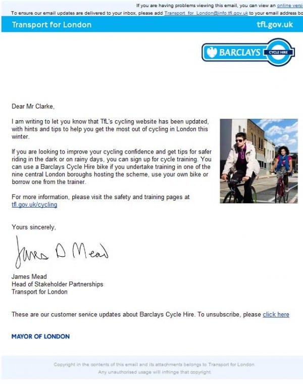
1 "€“ Barclays Cycle Hire - Customer update
Now I'm no graphologist but this signature seems disorganised and slightly out-of-control. I'm personally drawn the signature in this example which seems to undermine the simplicity of the message and layout. To receive an email from the 'Barclays Cycle Hire Team', or even 'Boris Johnson' himself would be more than appropriate!

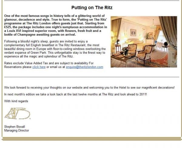
2 "€“ Ritz London - Marketing Newsletter
The Ritz Hotels' slightly abstract signature is executed poorly which dilutes what is expected to be a premium brand. I actually think for this brand a personal signature makes good sense, after all 1-1 personal service is why customers stay at leading hotels. The Ritz Hotel would be better to use professional font type and improve legibility and quality of the email which would tie in with the website and online brand.

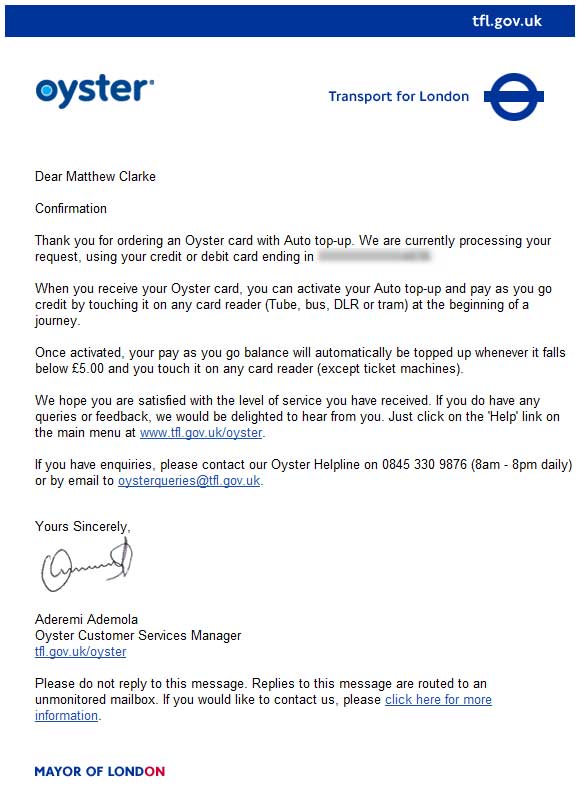
3 "€“ Oyster Card - Customer Confirmation
Adding a personal signature to a system confirmation seems over the top and unnecessary. The loose style of the signature seems quite casual and almost relaxed which runs in contradiction the financial confirmation contained in the email.

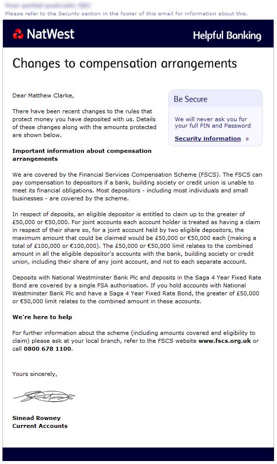
4 "€“ Natwest - Announcement
It's actually reassuring to see a real person communicating to me from a bank and I feel a personal signature adds gravitas. In this example the complex squiggle is well executed as a graphic although I cannot help but wonder if this is indeed their actual signature.

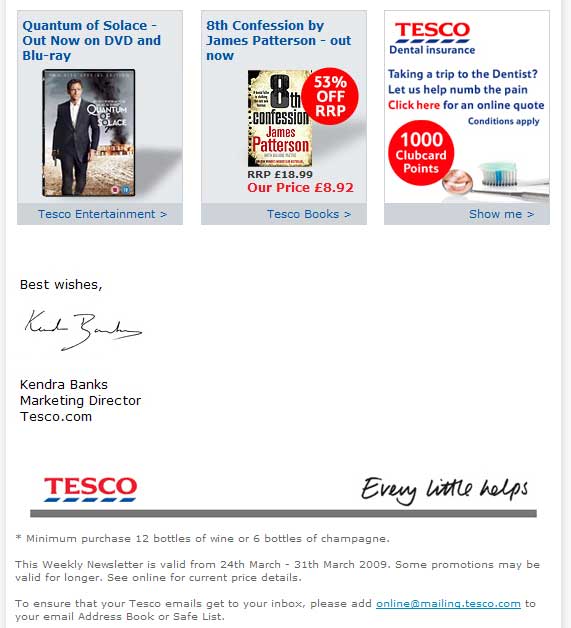
5 - Tescos - Retention Newsletter
Again my eyes are drawn to the Marketing Director's handwritten scribe which appears to be a bonafide scan of this persons own signature. Do I really need to know who the current marketing head is for Tesco.com? Is my brand relationship with her personally or with Tesco? I'd personally be more than happy if this was left out.

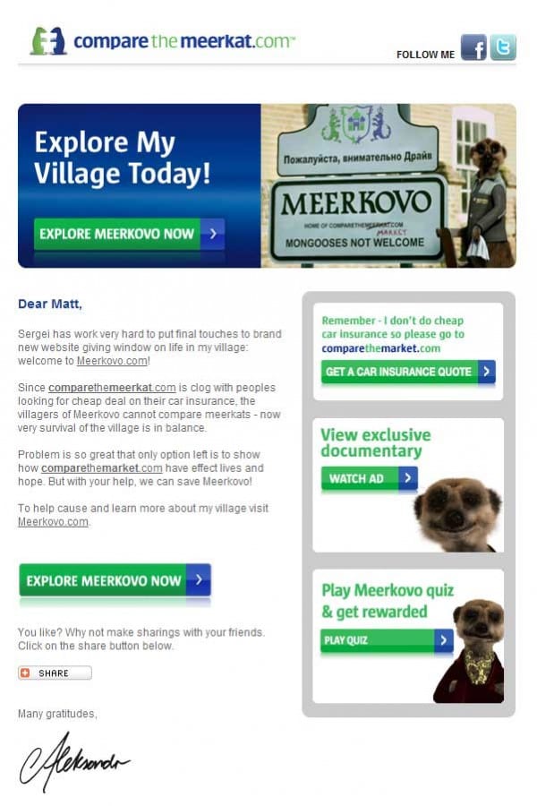
6 - Compare the market - Brand Advertising
Finally a cheeky extra example of how meerkaters , I mean marketers, want me to believe in the personality of the brand for Compare the Market. The clever little sign-off is both appropriate and well executed.

So take a look though your inbox today and see for yourself how many times you see a personal signature. Ask yourself if the signature is giving off any feelings or underlying personality and if these are appropriate to the brand in question.
My suggestion is less is more when it comes to closing off that email. Don't get sucked into following convention and don't freely give away your own personal property. Do you agree?
Send us your examples of best and worst practice and we will add these to this post.


