Best practices from the 2014 Form Conversion Report
It all started with a common question from our customers. 'How do I increase my conversion rate?' Marketers know that increasing your conversion rate is one of the simplest ways to impact your bottom line. Conversion rates are a key indicator of how well your website is capturing leads and performing in your industry. Online forms, one of the biggest components of the conversion, are an often overlooked part of helping improve rates.
With help from our customers, Formstack noticed a gap of online information around form conversion rates. So, we decided to tap into our own data goldmine and put together a report of our findings. We’ve uncovered some tips that’ll help every industry with conversion rates and optimization practices.
Tips on optimizing your on-line forms
Conversion Rates by Industry
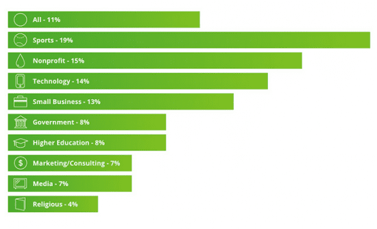
One of the first things we looked at in our data was the average conversion rate of each industry. It’s helpful to get a quick benchmark for each industry so that you can move forward with that knowledge.
Below you’ll find nine industries and the average conversion rates we discovered for each. While the specific types of forms each industry is building reflect a lot on their conversion rates, we also found four key optimization areas the higher converting industries were using more frequently.
Learnings for improving your on-line form
- 1. Custom form designs - The top performing industries are more frequently branding their form pages by using brand colours, images, text, etc. This helps eliminate any user disconnect between your site and hosted forms.
- 2. Embedding forms - Using embedded forms on the top half of your landing page exposes traffic to your form without being forced to scroll down the page.
- 3. Using form logic - Use a feature of forms, that Formstack calls 'conditional logic,' to show and hide questions based on previous answers. This will help reduce friction on your form by not frustrating users with unnecessary questions.
- 4. Clear calls to action - Avoid indecisive visitors by stating one clear benefit to completing the form. Multiple messages will dilute your benefit and lead to confusion.
Conversion Rates and length by form type
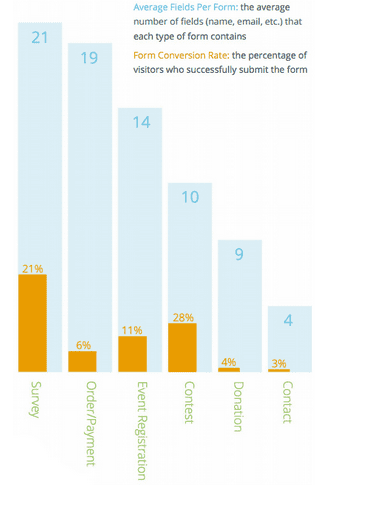
When reviewing form conversion rates, keep in mind that form types impact conversions. For example, if users click a link to enter a contest, it’s likely they’re ready to complete your entry form. But not everyone who visits your 'Contact Us' page will need to submit a form; some might just be looking for your street address.
With this in mind, it’s easier to understand why we found surveys, registrations, and contest entry forms to be among the highest converting forms. We also found these three form type are able to incorporate more form fields than other types. This is likely the result of user incentive to finish the form or the user’s preconceived notion the form will be longer because of its type.
We found many order forms include around 19 fields and convert at about 6.0%. This is one form type where it’s extremely important to be concise and limit your number of fields. Not only can you increase conversion rates with shorter order forms, but you can also save lost sales.
We suggest you keep testing your forms for many other factors such as question types, question layout and order, one versus multi-page forms, and even small things like text size and colors. You might find the simplest thing is frustrating your users and hurting conversions.
Top form submission times and tips on your button text
Timing of your promotion can be critical in our world of short attention spans and social media threads. To help combat this, we’ve analyzed the most frequent times of the day submission occur.
Depending on your form type, use this information to adjust promotions, and then schedule your emails and tweets to be at the top of inboxes and twitter threads.
We compared various form types across all hours of the day and discovered most forms are completed around 1 pm.
The six form types and their most popular times are below.
- Surveys: 10am - 1pm
- Order/payments: 11am - 2pm
- Donations: 12pm - 3pm
- Registrations: 1pm - 4pm
- Contests: 1pm - 3pm and 8pm - 9pm
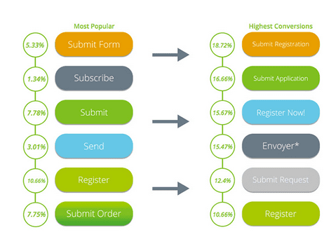
Another important thing we learned from the data was that more specific button text showed a correlation with higher conversion rates. Think of your submit button as the stamp on your envelope. It’s the critical final touch to make the process happen.
Below, the column on the left represents the most frequently occurring button text we found on forms. On the right is the list of best converting button text:
Learnings about the button type
Text such as 'Submit' or 'Send' are plain and very generic. Instead, try using text that’s form specific, such as 'Send application' or 'Register now.' If you’ve got an order form, then use text like 'Checkout' or 'Send order.' Focus on making the action 100% clear to the user. Getting away from generic button text also makes the form process seem more branded.
Key Takeaways from Formstack's Conversion Report
Here are the four big takeaways from the conversion report you can use to better optimize your online forms.
- 1. You can still convert well on a long form - It’s always a best practice to eliminate excess form fields and make forms as short as possible. But we found when it comes to surveys, registrations, and contest forms, longer forms aren’t necessarily bad.Surveys, for example, average 21 fields, but still capture a really great 21% response rate. When creating a longer form, it’s important to provide a clear benefit to users, such as assuring them all feedback will be heard.
- 2. Forms need a strong value proposition - Surveys, contests, and event registrations convert the highest traffic. Perks, such as knowing an opinion was heard or the chance to win a prize, will give users a reason to complete your form.
- 3. There are strategic times for form promotion - We discovered the most popular time for form activity is around 1pm. Take a look at your form type and the most active submission times. Then match your engagement efforts to help increase conversions. Also keep in mind every social media platform has more active days of the week. Use this information as well to time your promotion.
- 4. Expect different conversion rates - You should expect different conversion rates depending on the type of form and industry you’re in. Stop comparing your rates to that one blog post you read about a 45% form conversion rate. Your business is in an industry, and each industry performs differently.
Checkout the full Conversion Report
The 2014 Form Conversions Report was compiled and analyzed by Formstack. The team collected data from over 450,000 accounts and internal customer surveys to create this report. Follow this link to access and download the full form conversion report.

Lance is an SEO Specialist and Designer. He works at
Formstack in Indianapolis. They are an online form building application that allows users to build powerful forms and collect user data with no coding knowledge. Thanks to Lance for sharing his advice and opinions in this post. You can follow him on
Twitter.


 Lance is an SEO Specialist and Designer. He works at


