Examples from big brand Ecommerce sites which smaller businesses can test
The web has transformed the way people compare and buy everything from fruit to flat-screen TVs. The demand to be able to shop online has fuelled a race to join the likes of Amazon, with small independent e-commerce retailers springing up on a daily basis. But it’s important to remember that increasing sales doesn’t necessarily have to cost hundreds of thousands of pounds; small improvements can make a big difference, and even the biggest organisations may be losing revenue unnecessarily.
This post features eight of my top tips for maximising e-commerce sales and includes good practice examples from some of the most successful e-commerce sites.
Tip 1: Remove dead ends
Your site should have no dead ends. Full stop. This should be the first rule of thumb. Every page should be designed to channel visitors to the right product, service or sales representative, even if they’ve already converted previously.
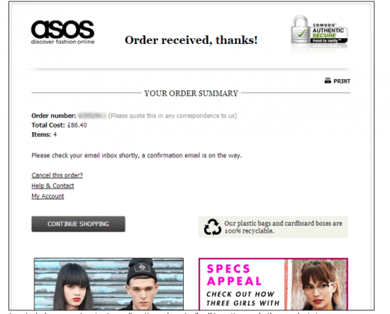
Asos includes a prominent primary 'continue shopping' call to action, and other products too.
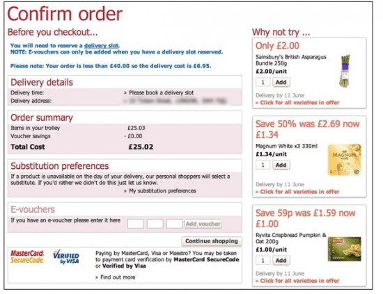
Sainsbury’s includes additional products on the right-hand side.
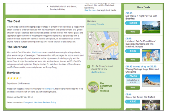
Groupon includes extra offers on the right just in case the visitor is no longer interested in the main deal.
Tip 2. Cross-sell your products and services
Cross-selling is very important and the most successful companies all tend do it very well. For example, have you ever queued up at a supermarket and decided to take up their offer of a chocolate bar? This is a common industry tactic to encourage customers to spend more money, and it works online too.
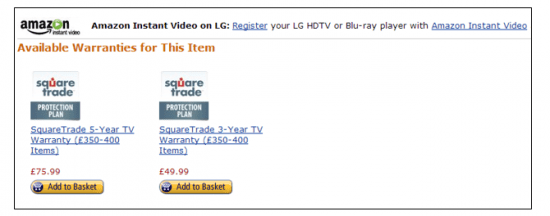
Amazon promotes its extended warranties and 'Amazon Instant' service to a customer who is viewing a Blu-ray player product page.

John Lewis promotes products based on previously viewed items on the basket page because it’s their last chance to increase the basket value order.
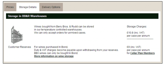
Berry Bros. & Rudd promotes its storage service on product pages because many of the wines are collected.

Amazon offers a wrapping service within the checkout process. Amazon also promotes their credit card through their e-commerce site.

Amazon also promotes their credit card through their e-commerce site

The king of cross-selling, Amazon encourages multiple buys that increase total basket value
Tip 3. Build, protect and promote your reputation
There’s a saying, 'reputation is everything', and it’s true; especially online, where competition is fierce and sites like trustpilot.co.uk make it easy for visitors to review a company’s reputation. It’s therefore key to build trust from day one, and keep it there by gathering regular customer feedback.

John Lewis is famous for its ‘honest’ reputation, which is supported by product warranties.
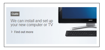
John Lewis also provides help guides to stop people abandoning technical or awkward products.
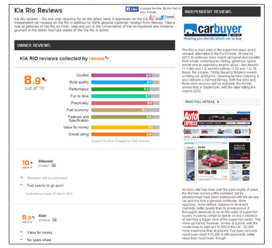
Kia is so confident in the quality of its cars that the website displays independent customer feedback; some of which is in real-time.

Loan company Zopa prominently displays its awards and respectable reviews.

Dyson is famous for its innovation, led by founder James Dyson, and promotes this reputation via a website video.
Tip 4. Show off customer footprints
Remember that visitors not only consider a seller’s reputation but the product reputation too, and many people use ‘external conscience’ when comparing products online (a subject that’s covered, along with many other user insights, in this Box UK user experience white paper).
For example, Thomas may like the sound of Product A more than Product B, but finds there are no comments for A but 78 positive reviews for B. After considering his options he decides to add Product B to his basket. Thomas was not willing to risk a product that may not have been bought by other people so he used ‘external conscience’. This behaviour is common so encourage customer feedback and show off those customer footprints!
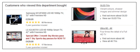
John Lewis promotes products bought by other customers, includes customer ratings and highlights warranty details.
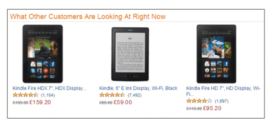
Amazon uses real-time customer data to display currently viewed products.
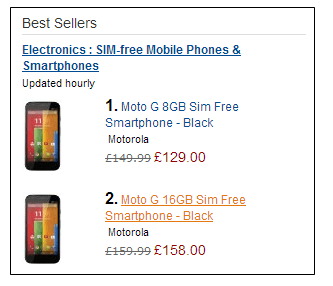
Best-sellers are popular with visitors.
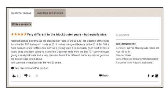
Berry Bros. & Rudd has an excellent approach to customer feedback, with FAQs, and detailed customer comments and profiles, which can help reassure visitors (e.g. 'that person is from my area and likes the same wine as me. I trust her judgement'). Up-and-down voting also filters out unreliable comments and promotes the best.
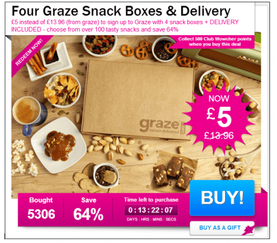
Wowcher displays a 'Bought' statistic next to the sales percentage, reassuring visitors that other people have bought the product.
Tip 5. Target key personas
Don’t throw all your eggs in one basket. Identify the different visitor types via user research, choose the most valuable and target them with relevant content on key pages, such as the homepage and landing pages.
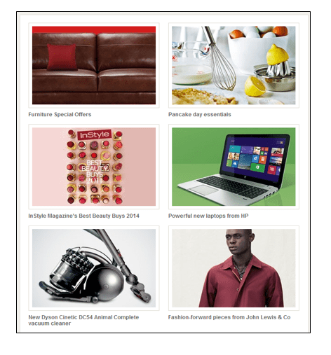
John Lewis displays a variety of product types on its homepage. Focus isn’t placed on a single product or products for a given occasion or gender but instead the bets are spread, e.g. between furniture, technology and fashion. Special occasions, such as pancake day, are also made use of.
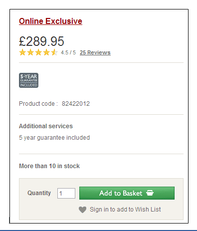
Impulse buyers are a common visitor type. John Lewis acknowledges this fact by targeting them with 'Online Exclusive' products.
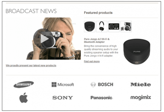
Promoting new or featured products is likely to appeal to ‘gadget geeks’ who enjoy buying the latest technology.
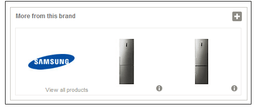
Promoting ‘fanclub’ brands like Samsung or Apple is another good idea.
Tip 6. Don’t forget the finer detail
You’ve done very well to get visitors to your product page, but the tough bit is getting them to click the ‘add to basket’ button. Achieving this goal is easier if you display useful product details and highlight the most important, such as price, delivery and offers.
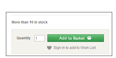
John Lewis displays the latest stock levels. If it’s low, the chance of a purchase increases.
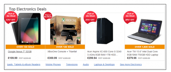
Ebay promotes the offer rate, number of sold items, RRP, and uses clear photography.
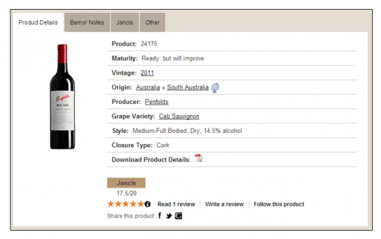
Berry Bros. & Rudd includes a lot of detail, making it easy for visitors to compare products and make an informed choice.

Apple includes beautifully crisp photography on its website.
Tip 7. Remove checkout ‘registration’
No visitor enjoys registering for an account, so why risk losing their custom by forcing them to? It’s much like asking a store customer to fill out a form before taking their money. It’s better to make the first step pain-free and give them the option to create an account later. Removing this requirement should be one of the first changes to your website as it’s likely to drive up your conversion rate.
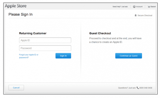
Apple allows visitors to continue as a guest.
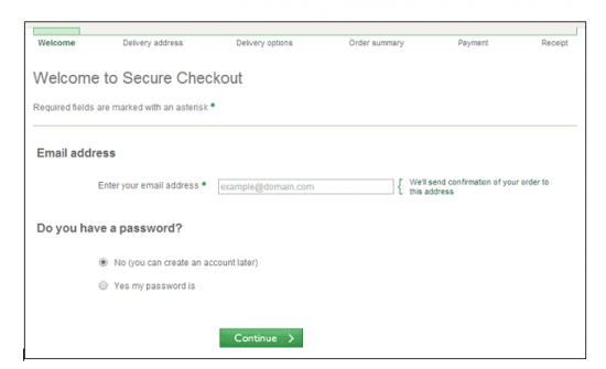
John Lewis explains why email is necessary, and allows visitors to create password later.
Tip 8. Conduct usability testing
My last tip is to conduct regular usability testing on key aspects of the website experience such as the checkout process, common user journeys, and forms. There are different types of testing which can deliver quantitative and qualitative results, ranging from low-cost rapid remote testing through to moderated lab-based testing.
Due to this flexibility there is no reason why some form of iterative improvement through user testing shouldn’t be a key part of your digital strategy (my blog post on usability testing mistakes can also help ensure you get the most from your testing activity). Because, ultimately, it’s important to remember that you are not your customer.
Summary of E-commerce site comparisons
I have to admit; two of my favourite websites are two of the most successful: John Lewis and Amazon. John Lewis has created a site that not only looks beautiful and has a great user experience but, like Amazon, has a powerful sales strategy behind it. Amazon’s site is market-leading when it comes to conversion techniques, such as '1-Click Ordering' on mobile and the 'Was this review helpful to you?" question.
Although both of these companies invest hundreds of thousands of pounds in conversion rate optimisation, it's important to remember that building a strong reputation, listening to your customers and providing useful details can be achieved for next to nothing, so follow this best practice and put your e-commerce strategy on the path to success.

Thanks to Gavin Harris for sharing his advice and opinions in this post. Gavin Harris is a User Experience Consultant at
Box UK You can follow him on
Twitter or connect on
LinkedIn.


 Thanks to Gavin Harris for sharing his advice and opinions in this post. Gavin Harris is a User Experience Consultant at


