Creative approaches to say sorry more positively
Having worked on a number of web projects over the years, I still receive great examples of 404 page designs sent to me by my former team members.
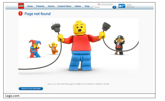
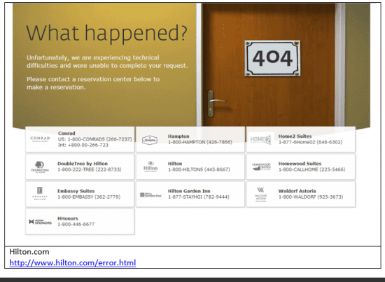
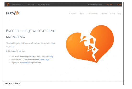
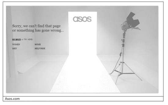
Why? A well designed 404 page can be an opportunity to build your brand when something goes wrong for your user and I attempt to bring them in all web projects I work on.
If you're not a webmaster, you may not know what a 404 is, although you will certainly have seen them! Technically speaking Wikipedia describe it as 'The 404 or Not Found error message is a HTTP standard response code indicating that the client was able to communicate with the server, but the server could not find what was requested.'
Your users will describe it, to quote a great TED talk by Renny Gleeson as 'a slap in the face, …..you feel like you have fallen through the cracks'
404 pages can be overlooked on a web build, redesign, or general web updates and this is an opportunity missed if your company’s page is, well, annoying and not helpful to the end user. Yes you may never have out-dated pages, and yes someone may just have typed the link incorrectly, or they may have been sent the wrong link.
Look at your own company websites 404 page could you be providing a better user experience and helping your users?
Most importantly build a process and reports to review your 404s regularly in your analytics or using Google Webmaster Tools to minimise the number of 404s. But some will be inevitable, so make sure they are not just a black on white "Not found" road block.
Tips for your 404 page and some great examples in action
- Let your brand shine through and keep the experience of your main site in your 404 design and don’t forget to keep the copy in line with your brands tone of voice.


- Don’t blame the user, you want to have copy that says 'something went wrong, we are looking into it'

- Re direct the user back to your website as this is an opportunity to point them in a helpful direction. Add a helpline number, support enquiry form, popular web pages or product categories, don’t be afraid to push your products, or even demo pages.


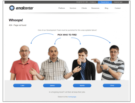
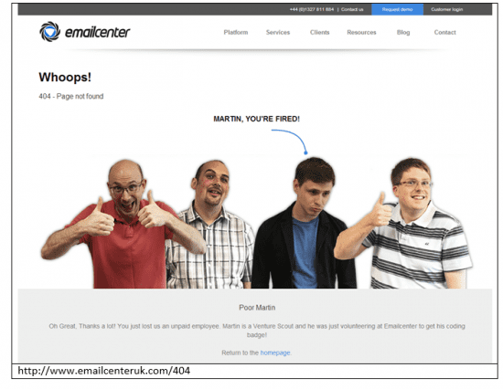
- Add some humour and make it a fun experience, and bring in the faces of the businesses to show off their talents.


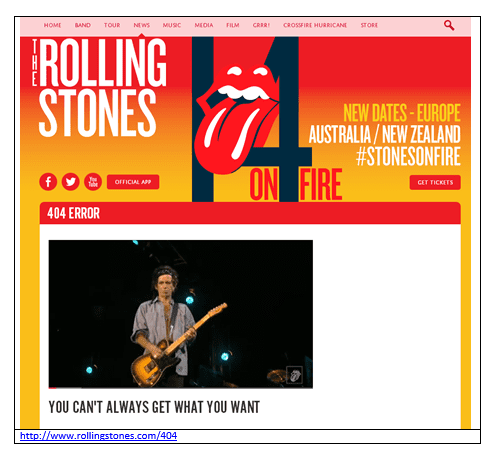
- Add media. Out of all the 404’s that I find I think my favourite is The Rolling Stones –'you can’t always get what you want, but if you try sometimes, you just might find what you need.' A wonderful 404 page design that links directly to a youtube video .

As a final tip for smaller businesses, Google Webmaster Tools provide some Javascript you can add to your Not found page to automatically prompt the user with the nearest page or encourage a search - see https://support.google.com/webmasters/answer/136085 for details.


