Specific CTAs now available to increase response for advertisers using Power Editor
Facebook has rolled out a new feature recently that's useful for Facebook advertisers to be aware of since it's specifically to help with boosting direct response.
You can now create ads related to posts that feature a call to action button. In its announcement, Facebook suggests CTAs advertisers may use are:
Shop Now, Learn More, Sign Up, Book Now or Download.
The feature is only available in Power Editor (the free Chrome app for Page editors) and it's well worth checking out. For those familiar with creating what I described in a previous post as "dark" (or unpublished) posts using Power Editor this is simply a new option to click through as part of that process. I'd certainly suggest testing posts with this new button rather than simply including the call to action within the image or text as previously.
And for advertisers struggling to include a call to action within the 20% text rule it's helpful.
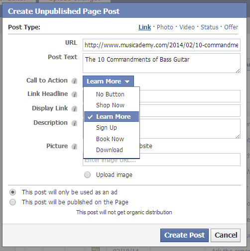
In this post I describe the process I've have worked through to add a call to action button for a post. You HAVE to do this in Power Editor initially as an Unpublished Page Post (which you then "publish" so that it appears on the Page as a normal post). Click here to learn how to create the Unpublished Page Post.
You can see there are five fixed CTA text options:
- Shop Now
- Learn More
- Sign Up
- Book Now
- Download

Click "Create Post" and the post will be sat in your Unpublished (or Dark) posts within Power Editor. You can then easily select it and either post immediately or schedule for Publication (don't forget to upload your changes once you have finished your work - an easy error for first time Power Editor users to make). Of course if you are simply using it to create an ad then you'll probably want to keep it Unpublished.
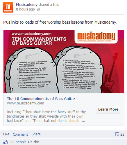
The example I'm showing below is not for use as an ad (it would still break the 20% rule) but I did want to test a CTA on a standard post for reasons that will become clear. I selected a link post that I anticipated would be pretty viral so would get lots of potential interest from friends of fans as they shared the content. A CTA button should in theory result in increased clicks.
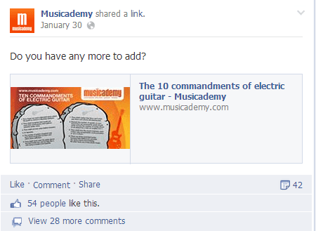
Compare the new-style post (left) with the one I created a few weeks ago (right) not using Power Editor. Apart from the CTA, you can see how the left hand ad looks so much better in newsfeed:


Now what this clearly shows (even without the CTA button) is that I could have improved on the old ad by doing it in Power Editor. You can see the extra real estate the post has in newsfeed done this way, but I was busy, it takes more time, I'm travelling at the moment and Power Editor isn't nice on a small screen etc etc. But putting the two side by side has certainly taught me the hard way that it's worth making the time to use Power Editor, even for those organic posts.
Do ignore the Likes and number of Comments figures. They are not comparable as one is much older and has some ad budget behind it. The organic reach of the Power Editor version was significantly higher - no surprise - it looks a lot better.
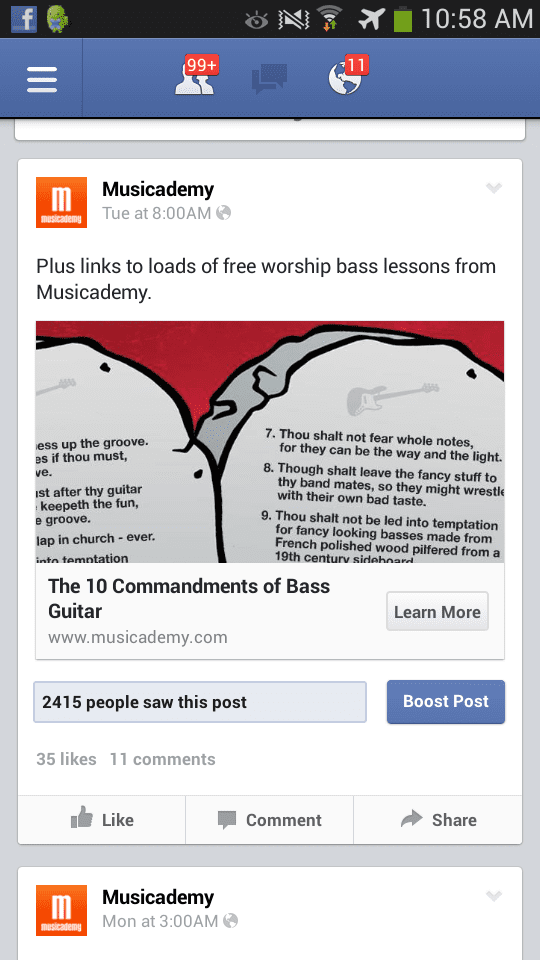
Here's how the new post surfaced on mobile (this was deliberately a landscape style post which admittedly doesn't crop well for mobile) but this is partly because I wanted to encourage people to click through (the text is so tiny you need to anyway). If you're confused about optimal images sizes then checkout this excellent infographic.

Have you used these Call To Action buttons yet? How are you finding them?


