Check you’re not making these 5 mobile SEO mistakes to get your SEO right in 2014
Importance: [rating=5]
Recommended link: Google’s new advice covering mobile SEO mistakes
December 2013 update
We originally alerted readers to Google's new advice on mobile SEO in June 2013. This is a BIG deal since more searchers are performing mobile searches and your mobile SEO traffic may fall if you get the user experience wrong as explained below.
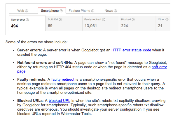
In this update, Google have again highlighted the importance of a seamless mobile experience by releasing a new tool to help site owners review mobile SEO errors. We also advise comparing your mobile/desktop SEO traffic in analytics to see whether you may be missing out on mobile SEO visits. Here is the output from the new Google Webmaster's tool taken from Google's new announcement:
June 17th alert
Over the last few years we’ve seen “moving goal posts” on Google’s advice for mobile SEO as the technical options for delivering mobile experiences have changed. Initially, the advice was to create mobile-specific sites on a separate mobile sub domain, e.g. http://m.company.com and to notify Google about them through mobile site-specific sitemaps and giving access to Googlebot-mobile crawler.
Around a year ago, Google updated its recommendations for building smartphone optimised sites to explain that Google supported three mobile SEO configurations, as remains the case:
-
"Option 1. Sites that use responsive web design, i.e. sites that serve all devices on the same set of URLs, with each URL serving the same HTML to all devices and using just CSS to change how the page is rendered on the device. This is Google’s recommended configuration.
-
Option 2. Sites that dynamically serve all devices on the same set of URLs, but each URL serves different HTML (and CSS) depending on whether the user agent is a desktop or a mobile device.
-
Option 3. Sites that have a separate mobile and desktop sites".
You can see that for the first time they made a clear recommendation for a single URL for each piece of content based on responsive design.
These are explained further in Google’s Webmaster guidance pages on Building Mobile-optimized websites.
Mistakes to avoid in mobile sites
The latest guidance is also useful in that it explains mistakes to avoid which can affect your mobile rankings.
The mistakes to watch out for are:
- 1. Faulty redirects. For example, redirecting to the homepage rather than relevant content. For example:
 While Google won’t be able to detect these errors directly since no error is generated, it’s well known they do distinguish between short clicks and long clicks i.e. short clicks are where people search and then search again immediately because they don’t see relevant content (in contrast to long clicks where people search, engage with a site and don’t repeat a search for some time). As AJ Kohn explains in his post these are not based on bounce rate in analytics since this is not a sufficiently accurate signal and Google have said they don’t use Google Analytics data within SEO spam analysis.
- 2. 404 Not found errors. For example, if a mobile user is detected and sent to a 404 page because of the device they are accessing on.
- 3. Googlebot-Mobile errors. For example infinite redirect loops which means the mobile site can’t be crawled.
- 4. Unplayable video on mobile sites. Likely to be a problem on iOS if your video isn’t delivered through HTML5. This could lead to an increase in short-clicks.
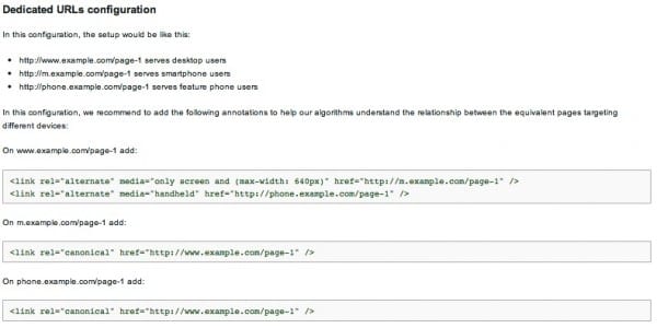
- 5. Tagging to show the link between the mobile and desktop site not in place. Not explicitly explained in Google’s errors post, this is a problem if you are following Option 3 above with a separate mobile site. Google gives separate details of how you should markup/tag pages with rel="canonical’ and rel=’alternate’ as shown here:

Using analytics to check you're not making these mistakes
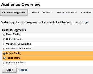
Applying advanced segments is the technique to use here. Since Google have said there is the potential for different rankings for mobile device searches you should isolate SEO results for mobile and check you're getting the volume of traffic you are expecting. I’m sure many reading this far will know this, but the screengrab below shows how you can apply advanced segments to break out your mobile natural traffic and keywords in Google Analytics.

You should check that the brand and non-brand traffic you receive in mobile is at least consistent in volume with your desktop site. Beyond that you should check the quality and value also in terms of conversion rates and revenue generated although you can expect conversion rates will be lower for smartphone devices - see these desktop vs mobile conversion rate averages for reference.


 While Google won’t be able to detect these errors directly since no error is generated, it’s well known they do distinguish between