A case study of using social media in higher education
In this post I will give a summary of a detailed analysis of some findings from a brief audit Carlton Jefferis and I have recently carried out when pitching for some social media consultancy for the University of Hertfordshire. I hope you find the insights shared useful and in addition to comments and advice throughout you'll also find some great creative ideas for content which can work in other sectors too.
Multiple audiences, multiple departments, multiple platforms

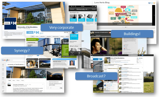
The first thing we notice is that the University utilises many different social media platforms and within each has multiple accounts to reflect different Schools/Departments. The question is, does this lead to a silo-ed, somewhat inconsistent approach or is it necessary?
A University has to juggle messages to multiple audiences - students, prospective students (UK and international), parents, alumni, staff, local businesses, other educational establishents and a raft of other stakeholders. It's easy to see how these different audiences could require a very different messaging approach, and that's before you add in the layer of different disciplines varying from health care studies to astronomy.
The University has developed its presence with a corporate look and feel. It is a campus university with a number of architecturally interesting buildings. These buildings regularly feature in their social media, often without a student or staff member in sight.
Missed opportunities?
Throughout our audit we found examples of missed opportunities. The University is not without some great content, we simply found that it wasn't being surfaced or repurposed as effectively as it might be.

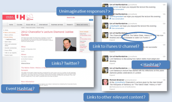
Consider the examples above. On the left you see a news page on the website announcing a special lecture. There are no links given to the Twitter account or a special Facebook Event and no hashtag suggested. On the day of the lecture a handful of delegates tweet about it (without a hashtag - the use of a hashtag, and reference to it at the start of the event, would have driven far more online traction). The University does at least respond to those tweeters but rather than continue in an engaging conversation, asking what they thought about an aspect of the lecture, they simply give a "hope you enjoyed it" message.
The University Twitter team were live Tweeting the event but without a hashtag some of the tweets could seem somewhat strange when read in isolation. There is also a missed opportunity to connect to their iTunes U channel.
The mobile experience
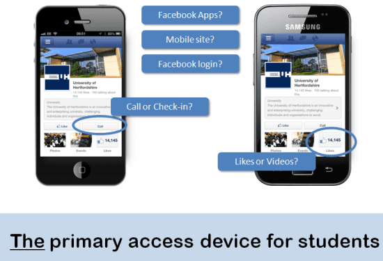
Mobiles and hand held devices are increasingly the student's weapon of choice but the website does not appear to have a mobile version (at least the site doesn't automatically offer mobile users a mobile version). After some digging in offline communications material we did find a .mobi URL linking to a mobile site of sorts. Clearly a bit of work to be done there.

The main Facebook Page is not optimised for the mobile-centric student audience. Take for instance the "Call" button that's automatically added by Facebook if a telephone number has been provided in the Page's profile. At first glance this would seem like a great addition and very useful for customer-facing businesses like retailers or service providers. However, in the context of the student market it would be far more appropriate to offer the "Check-in" function that's automatically associated with Place Pages. This is a real missed opportunity for driving ongoing social engagement and will become ever more important as Facebook moves into local search.
The inclusion of the "Likes" tab view rather than some other more important piece of communication, such as video, is also a missed opportunity. The University has developed a Custom Facebook App called a Mini Guide but at present Custom Apps do not appear on Page Timelines on the mobile platform so this valuable content is lost completely. Unfortunately the Mini Guide's reliance on Flash technology means that it would never function on iOS devices such as iPhone and iPad even if a student were able to locate it.
Timing is everything

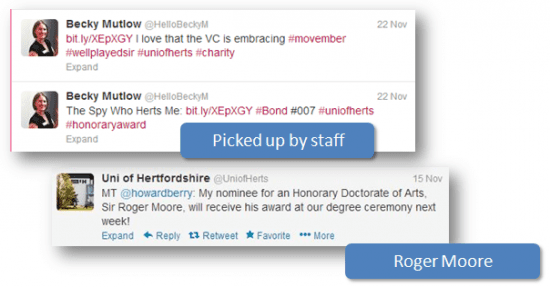
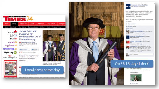
A fabulous news opportunity emerged during the time when the latest James Bond movie - Skyfall - was at its height, with Roger Moore being given an honorary degree by the University. This was picked up by staff and others on Twitter before the event and immediately afterwards. The local press ran a story and it hit the University's news page but failed to surface on the Facebook Page for some 13 days.

Making the most of your assets

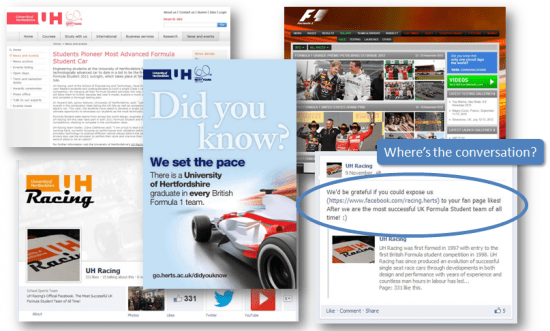
The University has a cutting edge engineering department and UH Racing is apparently the most successful UK Formula Student team of all time. Some attempt has been made by the team to profile it's successes with a Facebook Page, and it achieves coverage in the University's News pages on the website and some offline communications. However, a plea from UH Racing on the University's main Facebook Page for coverage went unanswered.
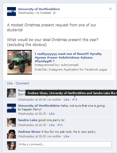
Looking through the Facebook Page there was a remarkable absence of conversation occurring. The University would post a question and wait for answers but rarely - if ever - respond to the answer or "like" any of the responses. We felt that they were missing a crucial way of validating and encouraging engagement and suggested a change in approach. The result was this:

You can see a lighthearted response to a fan's comment as well as a "like" from the University itself.
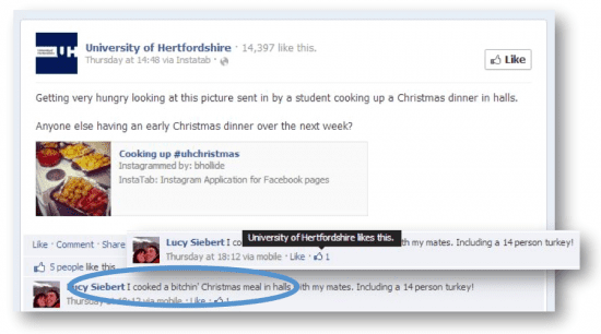
However, it is important to exercise discretion when responding as the "voice" of a third party, in this case an educational institution, as the following example illustrates:

Above you can see a comment from a fan which uses the word "bitchin". This has subsequently received a "like" from the University. Given the University's status we would question whether it's appropriate to endorse this type of comment in public. That's not to say it is or it isn't, only that discretion must be applied and that an organisation shouldn't feel obliged to "like" every single comment. It can be useful for Page admins to "like" comments to acknowledge sight of them to the fan (the fan will receive a notification, a useful piece of reciprocal social currency), but it should be reserved mainly for the comments that truly provide value to the ongoing conversation in the context of the original post.
The "Recent Posts By Others" part of the Page was really driving the University's PTAT (People Talking About This) metric as many fans were posting comments, links and questions. Whilst the University replied to customer service related questions, links and other content tended to be ignored. We're pleased to say that this has now changed and there is much more conversation taking place.
Repurposing content
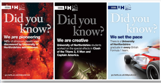
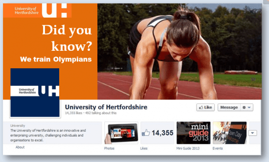
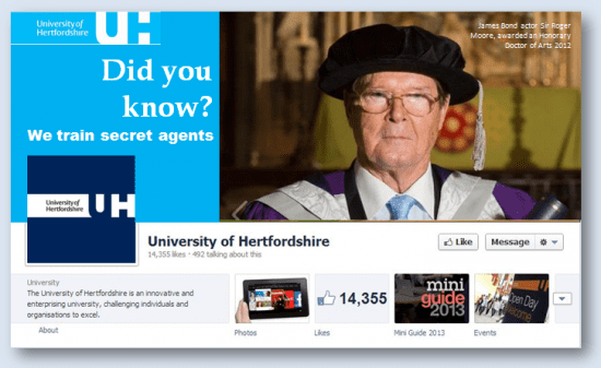
The University is awash with wonderful offline content. The marketing team have done a great job in developing a range of assets including posters and advertisements. These don't seem to surface on their social media platforms as often as might be helpful. Not only does this result in a lack of synergy and integration, but it's a missed opportunity for messaging that could easily have a viral effect. What student, proud of her university, would not retweet or share the following messages?:

We'd suggest that even if these creatives were profiled at the time of launch, they can be re-used at appropriate times - when something amazing happens in astronomy, during the British Grand Prix and so on. The Facebook cover image is a good place to do this and the University could develop an approach a little like the Google Doodle that reflects current anniversaries and events but also messages about the University's achievements.
Use your cover photo

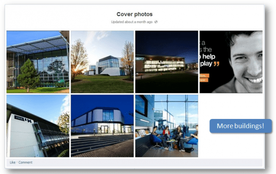
We noticed that the University rarely changed it's Facebook cover photo and when it did inevitably the pictures were of buildings. Nothing wrong with the buildings per se, especially if topical (so for instance, on a snowy week upload a picture of a frost covered campus). But we felt that mixing in more photos of people would really help and perhaps some new messaging approaches too.

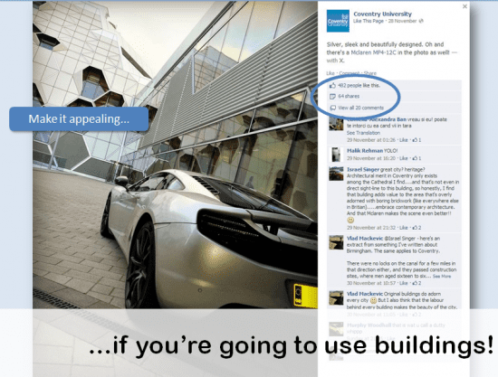
Coventry University show how to use building photos really well. While this photo didn't involve people it did involve a highly desirable - and thus shareable - Supercar. This image got masses of likes, comments and shares.
Cover photos are the second most important image asset for a Facebook Page after the Profile Picture. This is because cover photos are surfaced throughout Facebook whenever a user hovers over the Page name, so they are a useful way of stimulating interest and drawing people in to your Page.
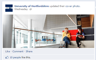
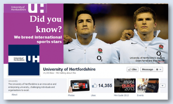
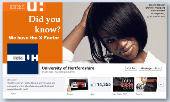
We were pleased to see that immediately following our recommendations, the University of Hertfordshire changed their cover image to one that combined some stunning architecture and people. Whilst we feel they still have some way to go in exploiting the full potential of the cover photo, this change resulted in a News Feed story to all their fans and a small number of likes:

YouTube

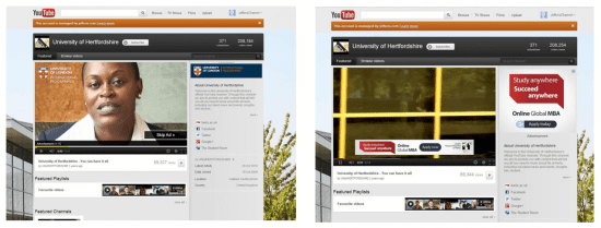
The University's YouTube channel would benefit from more recent content; the featured video (whilst a nice promotional piece for the University) is 3 years old. A lack of synergy between YouTube and Google+ is evident. We also noted that competitors of the University of London and London School of Business and Finance were running ad campaigns targeting University of Hertfordshire videos.
Google Plus it

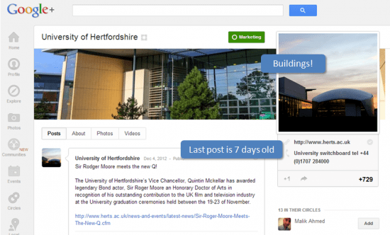
With Google Plus becoming more important than ever in search engine optimisation terms, it's more important than ever to have a vibrant presence there. The University has indeed got an account and a few hundred followers but it is clearly a neglected channel, as so many are. With many Facebook users becoming increasingly irritated by the presence of sponsored stories and ads in their News Feed, Google Plus is an obvious alternative platform. The University should particularly be considering this platform for communications to certain stakeholder segments, for instance, international students.

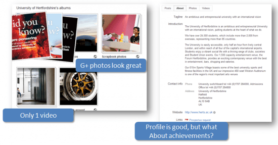
On the positive side, we felt that the University had chosen some good photos for their G+ presence, including some of the offline campaigns. However, there was only one video uploaded and the 'About' profile, whilst being clearly written lacked any personality (that "corporate" word again) and failed to shout about the many benefits of being involved with the University, or showcase any of its many achievements.
iTunes U

We were really impressed to see that the University had embraced iTunes U making course content freely available. There are only a handful of British Universities to do this so far. Radical new approaches to online learning are in the news every day (see this BBC report of the Open University's FutureLearn project).

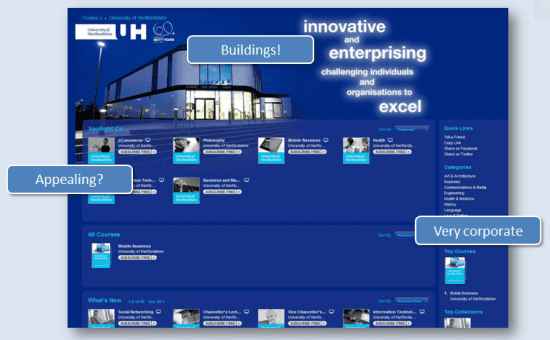
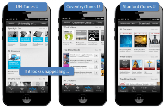
We felt that UH could make their early adopter presence a little more appealing though, and would cite Coventry University (again) and Stanford as good examples to follow.

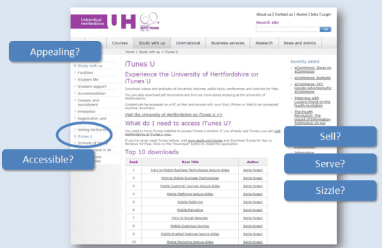
Finding the University's social media platforms is something of a challenge. The screen shot above is from the UH website page promoting their iTunes U channel. Unfortunately there are no images, no screen shots, no visuals to promote what is a highly visual FREE service. It's also buried in their website navigation.

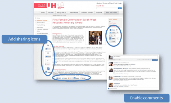
A really basic mistake is the complete absence of tools such as social sharing icons to allow website visitors to share, like, tweet or +1 content throughout the University website. In fact the existence of any social media presence whatsoever is absent from all but a handful of website pages. The News page above is a good example. We felt this ought to work more like a blog with comments enabled and sharing icons. We mocked-up a number of options for how it could work. This is all very straightforward - but crucial - stuff.
Use apps to run Facebook competitions

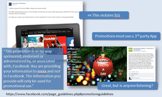
Now UH is not the only brand to run competitions on Facebook whereby fans receive prize giveaways in return for Likes. But if you take a look at the Promotions section of Facebook's Terms of Service (ToS), you will see that this breaks them and Facebook could close down your Page overnight.
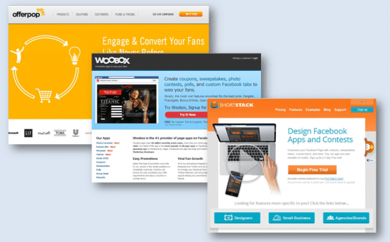
It's not difficult to use a third-party app providers to run competitions, and there are plenty to choose from. This is a small selection:

Messaging must stem from the corporate strategy
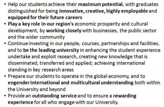
Below is the University of Hertfordshire's Mission Statement:

We would see this as the foundation for the University's messaging approach. It's clear from reading this how the creative approaches to date have been very "corporate". UH wants to position itself as a professional business-facing partner. However, as we have seen, many effective messaging approaches that the marketing team have developed offline have not resurfaced in their online platforms (we've not particularly focused on the website in this case study where we were asked to consider social media usage).
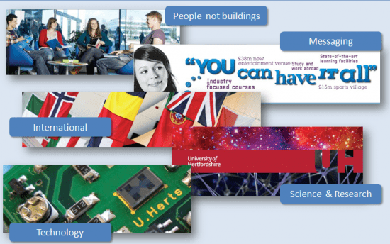
We've emboldened some of the key messages from the Mission Statement that should surface in social media messaging and below we quickly mocked-up a few tactical ideas that outwork it.
Tactical ideas for the Facebook Page


We've not taken any new photos, or used any stock photography in these ideas. They are all images taken from the University's publicly available websites. It's a useful reminder about how we all need to think about utilising the content we have - thinking like a journalist to repurpose all your hard work to earn a little more from it.

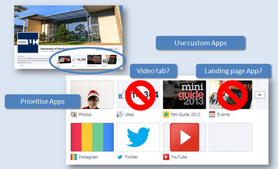
And finally, below are some really basic tactical suggestions for optimising the top section of the Facebook Page where the tabs (or Views and Apps as they are officially - and confusingly - known) appear. We'd suggest not wasting valuable real estate with the default view showing the number of Likes - that's displayed under the Page name in any case. The Events view is also of questionable benefit as UH events are very sporadic. With the exception of Photos these views and apps can be moved around. The University has a nice promotional video on it's YouTube channel which could be uploaded directly to Facebook. Doing so would enable a Video view which would also render on Facebook mobile platforms. Alternatively, UH is attempting to use Instagram to drive photo-sharing. A link to this, YouTube or the Twitter account would be more useful than the defaults at present.

In conclusion
Carlton and I spent a few days reviewing the University's social media platforms (these are just the edited highlights) and it's amazing how many little tweaks we were able to suggest that increase the ability of these tools to communicate and engage with the audience.
We hope you have found this insight helpful. What particularly stands out for you? What changes will you make to your organisation's social media efforts as a result of reading this case study.
Carlton Jefferis is founder and CEO of Gettus! a digital start-up which has developed a "user pull" (rather than "vendor push") social marketing platform that integrates with Facebook and Open Graph. He also consults on digital marketing.
Marie Page is co-founder of Musicademy, a specialist e-retailer teaching contemporary music on DVD and online. She also trains, consults and blogs on digital marketing and social media. You can hear Marie talk on key issues to consider in social media and content marketing in our free webcast on the 11th January. Marie is a regular contributor to Smart Insights and author of the recently published Guide to Facebook Marketing.
Carlton and Marie are also available for social media consultancy and training - contact them for more information.


