Your website reflects your organization
No one wants their website to look tired and out of date. Being aware of the latest website design trends means you can ensure your website keeps impressing visitors. It’s not about chasing the latest fads, which you should be careful to avoid, but rather understanding the current state of best practice and applying these to your site where relevant to you.
Website design agency Numiko builds stunning and complex websites for some of the most prestigious organizations in the world. So we asked their team of web designers to uncover the latest web design trends for this year and share what their predictions are for 2024. Here’s what they identified as the current top web design trends:
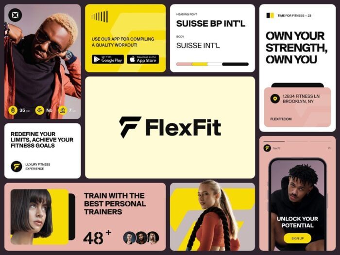
Bento grid layouts
These types of layouts aren’t new. In fact, they’ve been around for decades. However, they have exploded in popularity recently, in part due to their adoption by Apple both in their online presence and iOS.
The bento grid layout feels modern and playful. It’s also very simple, as it’s a form of grid, making it easy to use. You can see more examples of Bento Grids here.
Apple’s decision to use the Bento grid layout for their pages showing the iPhone 14 Pro and Apple Card have propelled its popularity. Apple is probably the world-leading brand in design, so their use of it will prompt many other designs to consider it for their websites.
Website technologies have developed to support the Bento grid designs, making them easier for developers to deliver. This combined with its integration into iOS means we predict this hot web design trend is just getting started and will continue to grow in popularity in 2024.

Fluid layouts
Fluid layouts are fully scalable and ‘fluid’ design systems that mean a website no longer snaps to predefined breakpoints and instead proportionally scales to a users’ viewport, ensuring a more consistent experience for users across devices. In design terms, this means no-longer using pixel based measurements, but instead using percentages.
Elements within the grid adjust proportionally, so the layout smoothly adapts to different sizes. This is the most effective way to ensure your website looks great on all devices. With the rise of new device types such as smartphones with folding screens, like the Galaxy Z fold, it’s more important than ever to ensure your website is perfectly flexible to whatever device your visitor is using.
AI-generated imagery
The proliferation of AI-generated imagery will explode in the next few years. This will affect website design and imagery heavily. This trend started recently with the launch of MidJourney v5 in March 2023, and is set to gain further momentum as AI image-generation tools continue to improve. Dalle-3 is now out in alpha and is due to be released to all Open-AI subscribers in October 2023.
Below is an example of AI-generated imagery. It’s already on the cusp of realism, it could soon be indistinguishable.
This raises ethical questions, particularly for charities - does using AI-generated imagery of non-existent people diminish the legitimacy of your message?
Despite this, we have no doubt that we’ll see AI imagery as a major trend in 2024, potentially with some pushback. Its ease of use means websites that may have lacked great photography in the past and therefore rely on flatter designs, will now be more likely to use images.
AI-generated video may also start to improve in the same way as AI imagery has over the past year, increasing the use of video and animated content.

Renewed focus on accessibility
Website accessibility is nothing new, but new developments over the course of this year mean it’s receiving more attention than ever. The WCAG standards which set out the official requirements for websites to reach different levels of accessibility and has recently updated its guidance to WCAG 2.2.
In the UK, all public sector websites have been required to meet WCAG AA accessibility standards since 2018. The updates to the WCAG guidelines mean that web design teams will be looking to accessibility afresh in 2024 and building more accessible websites than ever before.
Retro / nostalgia
It’s 2023, and the 90s are cool again.
Fashion moves in cycles, and strange as it may seem, there’s now enough time between us and the early 90s that a current pop star’s music videos are deliberately cultivating a 90s look.
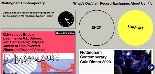
Web designs are not immune to this. Certain websites are embarrassing 90s or 2000s fashion trends and applying it to their design. Nottingham Contemporary Art Gallery for example opted for a nostalgic, 90s-inspired design for its new website.
It’s fun, quirky, and stands out from the crowd. It’s a great example of how trends can be unpredictable, they don’t always go one way. Sometimes you have to leap back into the past in order to be cutting edge.

Large typographic hero images
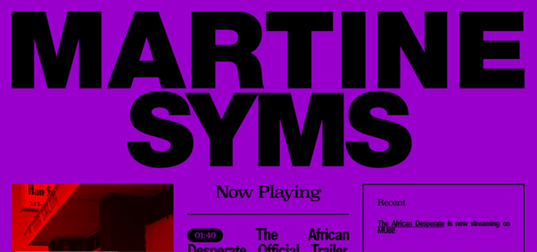
The ‘hero image’ is a classic of web design. A way to showcase your product or evoke a feeling with a single powerful image. The typographic hero image takes this style of design but updates it by switching to using oversized typography to create a memorable impression.
Artist Martine Syms’ website uses extra-large typography in the place of a hero image to make a bold impression on the visitor.
Numiko applied this trend to their own website, which uses extra-large typography in place of a hero image, with the addition of masked video, using the typography as the mask.

Microinteractions
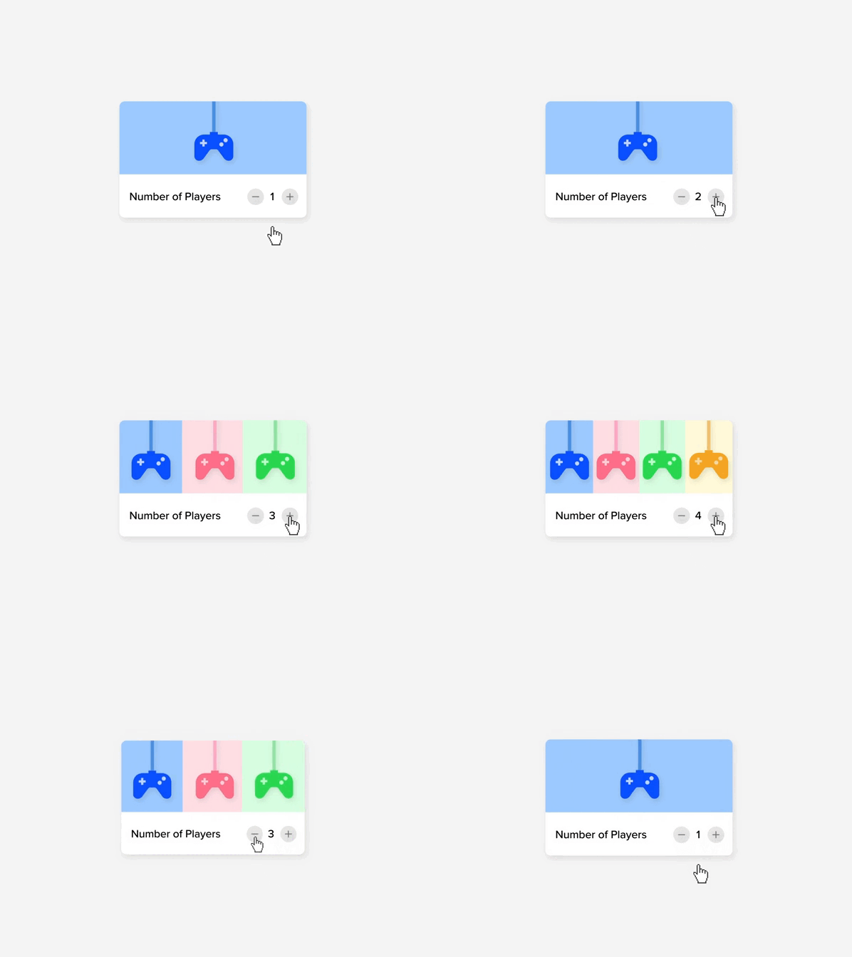
Microinteractions in web design are subtle interactive elements that enhance user engagement and experience. They provide feedback, guide user behavior, and serve various functions such as loading indicators, form validation, and gamification.
These small design elements play a significant role in brand identity and contribute to user satisfaction and usability on websites and digital applications. The interaction itself may be just a simple animation on a button to indicate a change of status, but these little elements of movement help bring a website to life.
By giving the user subtle clues about changes in status or interactive elements, they can help improve the UX whilst adding to the aesthetic feel of the website, such as in the example below.

A simple but effective micro interaction website is rotating the hamburger menu to indicate when it is opened. Or you can animate it to become a cross, indicating that you tap there to close it once opened.

Bold and custom typography
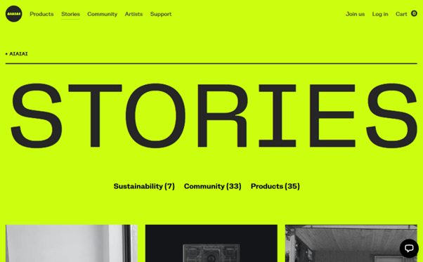
Bold typography is a trend characterized by the use of large, impactful fonts. It serves to immediately capture attention, establish a visual hierarchy, and convey brand personality. This trend enhances readability, adapts well to mobile responsiveness, and complements minimalist design principles.
Designers often use custom fonts for creative expression, and when combined with animations and interactions, it can create engaging web experiences. However, it's essential to consider accessibility to ensure an inclusive user experience.
For a long time, typography trends emphasized simplicity, serifs were out and Helvetica was king. But now things are going in the opposite direction. Serifs are back. Designers are using typography more creatively, using uncommon fonts to stand out from the crowd.
E-commerce store aiaiai employs a typographically driven design to great effect, creating a captivating website that stands out from the crowd.

Predictions for 2024
The design trends outlined here are likely to continue to grow in popularity over the course of 2024. The Bento Box layout is currently being propelled by Apple, and so has further to run, but we may see it peak after another year or so.
AI imagery will evolve rapidly so this will keep getting more and more use in web design over the course of next year. However, because AI will make great imagery ubiquitous, it will mean that great imagery will no longer provide a way to stand out from the crowd.
That’s where you’ll see trends like creative, bold typography come into their own, as a way to stand and position your brand as different from the rest.


