Early studies reveal a mixed message
Value: [rating=3]
Recommended link: Simply Measured Timeline engagement data
Dave has recently covered 9 recommendations for the new Facebook Timeline pages for brands. These switched over on the 30 March 2012.
The question is, has this new platform helped or hindered marketers? Some light is shed on this by this initial data from social analytics software provider Simply Measured, that suggests the change is having a very significant upside for brands.
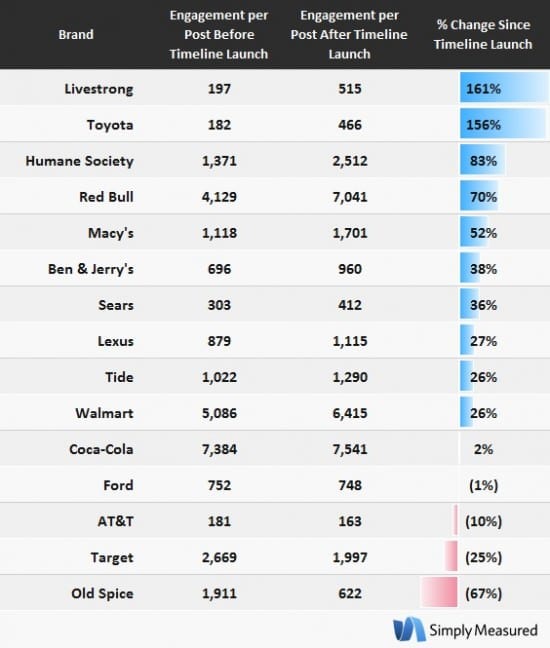
Average of 46% improvement in engagement across 15 brands
Simply Measured looked at 15 early adopting brand page and found that average engagement on brand posts (comments and Likes) rose 46% in the three weeks after the switch compared to the three weeks before. Prior to the Timeline introduction, the 15 brand pages saw an average of 1,672 points of engagement per post, rising to 2,441 after switching to Timeline.

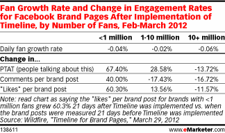
Little overall improvement for another 43 brands
Simply Measured got my attention since I saw this when reading this from Wildfire, suggesting that engagement was lower, specifically for larger brands of which Wildfire has monitored 43 of of them. The table below from Emarketer is interesting, only in that it suggests that the much smaller brand Fan pages that are benefitting most.

How are you finding it? Good or bad?
Timeline is clearly creating measurable flux on many brand pages, but the data is too sparse at the minute. Our opinion is that any positive change is likely temporary whilst people find it interesting and there's a little hype. Fundamentally, Timeline has afforded us new tools and a new format to deliver engaging content, it's ultimately for brands to do just that, to create campaigns and tactics that drive new fans to the page and turn them into advocates. Without doubt, watch this space as more data and useful case studies come to the for. Have you any experiences that support or contradict the above?


