How to Easily Cultivate Trust with Button Copy that Puts Your Audience’s Needs First
Marketers are busy and often juggle way too many responsibilities at once. Something’s gotta give, and sometimes it’s the button copy. It’s understandable, but when you skip this one detail, you create a very bad impression with your audience.
By settling on generic button copy, you risk coming off as a lazy marketer who focuses on getting the lead or the sale instead of your customers’ wellbeing. Consequently, conversions suffer.
So it’s time to rid the world of generic button copy.
If Your Button Copy is Good Ole “Sign Up”, “Send” or “Submit”
You’re probably not doing this on purpose, but I’m not gonna lie – it’s bad.
When site visitors scroll through the page, a generic “submit” button doesn’t tell them a thing other than the fact you want something from them. Truth be told, they probably won’t even notice it, which might and might not make you look like a lazy marketer.
Banner Blindness Causes Button Blindness
Buttons are similar to banner ads in a way – and banner ads haven’t been the happening thing in years. All the way back in 2011, Solve Media, a CAPTCHA ads company, declared that “you are 279.64 times more likely to climb Mt. Everest and reach the summit than you are to click on a banner ad”.
We’re so used to banners – and to buttons asking us to sign up or buy stuff – that our brain automatically blocks them out. It’s our brain’s way of helping us work a little less on what it considers non-important tasks. It’s kinda like our very own time-saving app!
Don’t want to get blocked out? You’ve got to make your buttons stand out.
But button blindness isn’t even the worse part.
Overcoming Button Blindness isn’t Enough if Your Button Copy Doesn’t Build Trust
Let’s say you use a button color that stands out. All the conversion rate optimization experts say to do that, right?
People notice your button – and then what happens?
The existence of a button already tells visitors you want something from them. Their walls go up, their resistance strengthens, and your button copy does nothing to build trust.
Generic copy puts the focus on the “work” visitors need to do, on the “risk” they need to take.
In turn, it could make you look like you’re just in it for the conversion, not to help your audience shine.
How to Easily Change that Terrible Impression and Cultivate Audience Love with Button Copy
I know you’re busy. But before you click the “back” button or save this post for “later”, let me show you some real life examples of easy fixes you can implement on your own buttons right now.
Tell Them What They’re Getting to Save Them Time and Get Them Excited
The easiest button copy fix is to tell your visitors what they’re getting: At the very least, you’ll be perceived as a marketer who values her audience’s time.
Insurance company Geico makes it easier for site-scanning visitors to take action. Not only is their button a different color than the rest of the page, but it spells out “Get a Quote”. It’s obvious what visitors are encouraged to do. A “submit” button would have taken more effort to find out what it is Geico wants us to submit.
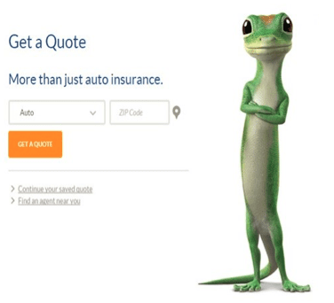
Yes, visitors still need to take action, but by putting the emphasis on the “reward” they’re getting instead of what they have to do to get it (for example, fill a form), you also position yourself as a marketer who can be trusted. You get that it’s not about you – it’s about what’s in it for them.
Petfinder knows this. Its “Find a Pet to Adopt” box can’t be missed on the page and it’s pretty clear what it’s here for, so the site could have just written “search” on its button. But Petfinder went a step further and reminded its audience of the reward. It’s much harder to resist a “Find Pets” button than a “search” button.
If you run a site similar to Petfinder, keep reading and I’ll show you an even better CTA you could use on your adoption or foster search button.

Meanwhile, if you must use “submit”, at least do what GoldieBlox does on the blog that promotes its toys for girls that are more than princesses –pair it with a statement like this:

While our focus today is about the actual button copy, remember that the copy you write around it matters too. Apply the practices you learn in this post to this part of the copy too, and visitors will come along for the ride.
Invite Them to Join Something Greater They’ll Fear to Miss Out
Your passion matters in marketing, but it’s always about how your passion helps your audience. One of the best ways to do that is to create a community, a tribe, a nation… that plays on humanity’s FOMO – fear of missing out.

Caz and Craig Makepeace, founders of yTravelBlog, are on a mission to help everyday people accomplish their travel dreams. Their button copy invites readers to join them and their large community on their travel journeys.
Similarly, when you opt in to Entrepreneur on Fire’s newsletter, you do more than sign up to a newsletter. You join Fire Nation – a movement of passionate entrepreneurs who are making their dreams a reality.
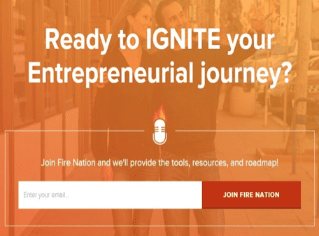
But inviting your audience to join a community does more than play on our need to belong. It tells your audience you’re committed to something bigger than yourself for their greater good. You can help them succeed because you’ve created the infrastructure and support they need to run the distance.
Remember, this only works if you’ve indeed created a community and if this is a part your regular marketing strategy. yTravel Blog has a huge, engaged social media community on multiple channels. John Lee Dumas has made a point to treat his massive audience as a nation of entrepreneurs in every interaction with his Entrepreneur on Fire audience – from podcast episodes to newsletter emails to Instagram posts.
Show Them the Emotional Benefits of What They’re Getting
Content marketing is about building those know, like and trust factors – and your button copy is no different. When you write benefit-driven button copy, you get perceived as a marketer who really cares.
Dessipi gets that shopping isn’t always easy, especially if you’re not model-sized. Following a promising headline and two lines that quickly explain how the site personalizes your shopping experience, Dressipi’s button copy promises us we’ll finally have a good shopping experience.
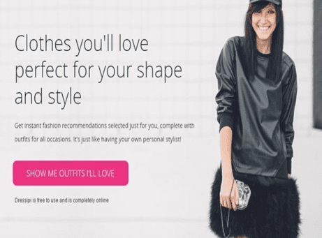
This type of button shows your audience you get what makes them tick, what lies beneath the surface, scares them or makes them come alive. You get to create an emotional connection by writing a CTA that grips their hearts.
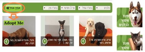
Like this pet adoption site from Haifa, Israel. In case you can’t read Hebrew, that green button with the arrows says “Adopt Me”. With photos of dogs and cats all over the page, what animal lover can resist that CTA?
Style Guru, an Israeli styling duo that helps women express themselves and own their power through styling choices, once had a button on their site that said something like, “I’m already beautiful. Remind me how?”
When your button copy gives your audience hope their dreams can be realized, it shows them you believe in them, in their abilities, in their beauty. It positions you as a marketer who’s here to celebrate them and advocate for them, a marketer they can like and trust – that you won’t let them fail.
That’s what Emmy winning life coach Rhonda Britten does when this button of hers helps site visitors believe they can master their fears and create emotional freedom.

Ultimately, you become your audience’s mentor. You become the leader on their journey for a better life or a more successful business.
What’s your favorite button copy strategy? Share your before and after with us in the comments!

Thanks to
Ayelet Weisz for sharing their advice and opinions in this post. Ayelet Weisz is s Freelance writer who starts every day by dancing, before helping companies from 4 continents increase ROI and make a difference with case studies, web copy, blog posts and more.
Click here to win a free copywriting package from her. You can follow her on Twitter or connect on LinkedIn.


 Thanks to


