12 practical tips for customer preference centres
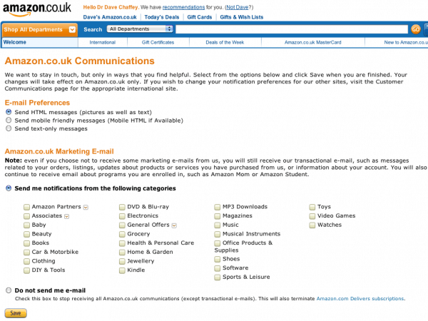
Preferences centres have never really caught on have they? Many of the big retailers like this one from Amazon or Tesco have had them for years, but they're still not used so widely.

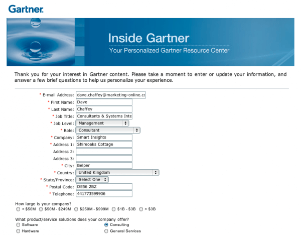
Here's a great example of a B2B preference centre:

I remember, as far back as 2003 I defined these ‘E permission marketing principles’ to prompt email marketers to think how to improve relevance and targeting of emails - the main purpose of communications preference centres.
The key advice remains valid I think:
1. ‘Offer selective opt-in to communications’
Offer choice in communications preferences to the customer to ensure more relevant communications. Some customers may not want a weekly e-newsletter, rather they may only want to hear about new product releases. Remember opt-in is a legal requirement in most countries.
Four key opt-in options, selected by tick-box are:
- Content – News, products, offers, events
- Frequency – weekly, monthly, quarterly, or alerts
- Channel – Email, direct mail, phone or SMS and smartphone
- Format – Text vs HTML and now a choice of mobile as Amazon have
2. Maximise opt-in to communications
Whenever I review a newsletter sign-up, for example during account creation for sale or in a B2B lead-generation context I always check to see whether the box is pre-ticked since this will help list growth. Pre-ticking the email opt-in is legal in some European countries where the law permits this during course of sale or negotiation for sale (i.e. with prospects. In the UK, both Amazon and Tesco take advantage of this.
Here is the relevant piece of legislation from the UK Privacy and Electronic Communications Regulations 2003.
(3) A person may send or instigate the sending of electronic mail for the purposes of direct marketing where—
(a) that person has obtained the contact details of the recipient of that electronic mail in the course of the sale or negotiations for the sale of a product or service to that recipient;
(b)the direct marketing is in respect of that person’s similar products and services only; and
(c)the recipient has been given a simple means of refusing (free of charge except for the costs of the transmission of the refusal) the use of his contact details for the purposes of such direct marketing, at the time that the details were initially collected, and, where he did not initially refuse the use of the details, at the time of each subsequent communication.
3. Create a ‘common customer profile’
A structured approach to customer data capture is needed otherwise key data needed for delivering targeted e-mails will be missed. You don't want to ask for lots of details straightaway, so a preference centre enables you to gradually add data.
It sounds obvious, but… consider the utility company that collected 80,000 e-mail addresses, but forgot to ask for the postcode for geo-targeting!
This can be achieved through a common customer profile – a definition of all the database fields that are relevant to the marketer in order to understand and target the customer with a relevant offering.
These forms belie their importance – I think they are the second most important pages on a site after the home pages. One company I worked with, B2B company Tektronix used three levels of profile from 1 – basic contact information, level 2 – position, market sector and application and level 3 – detailed information about standards and preferences. Through having goals to grow level 2 and 3 detail, improved targeting was possible.
4. ‘Don’t make opt-out too easy’
I've changed my mind on this since it's a legal requirement of course and many opt-out processes still don't work so instead subscribers may report the emailer as spam which can hit your overall deliverability. Still, I still think there's some merit in what I said way back:
"My view is that we often make it too easy to unsubscribe. Yes, providing a straightforward opt-out is part of permission marketing and in many countries, a legal requirement. Although offering some form of opt-out is now a legal requirement in many countries due to privacy laws, a single click to unsubscribe is arguably making it too easy. Instead, wise e-permission marketers use the concept of ‘My Profile’. Instead of unsubscribe, they offer a link to a web form to update a profile, which includes the option to unsubscribe to some or potentially all communications. Amazon’s communications preferences page is a good example of this approach".
The use of ‘My Profile’ can be tied to the principle of ‘selective opt-in’ – you could call it selective opt-out. Put the ‘My profile’ option in the e-mail prompt the user to keep their contact details up-to-date.
5. ‘Watch don’t ask’ - use ‘Sense and Respond’
This is still valid and is perhaps one reason why a preference centre is not so important.
The need to ask interruptive questions to better profile customers can be reduced through the use of monitoring of clicks to better understand customer needs and to trigger follow-up communications or ‘Sense and Respond’.
Some examples of personalisation through this technique:
Monitoring click-through to different types of content or offer. The interests of individual list members can be assessed through monitoring what they click through to. Lastminute.com reputedly tailor their newsletters to many different template types according to content clickthrough. For example, if you click through to theatres or city-breaks, then you will receive more of this type of content in future.
Monitoring the engagement of individual customers with e-mail communications. This is achieved by monitoring trends of opening and click-through by individual customer. These metrics indicate the level of interest of individual customers and we can monitor how these vary through time and use follow-up communications. For example, perhaps a buying signal is suggested by a customer who has not previously responded to e-mails who starts clicking through to the web site more frequently. This could be followed up by a tailored e-mail communication or a phone call.
Follow-up of response to a specific e-mail. If a B2B vendor offers information about a new product launch which encourages click through to a landing page then they have two main choices of follow-up. First, the form could contain a question asking about the future buying intentions or whether contact from a sales rep is required. Alternatively, if there is a capability to monitor an individual who has clicked through to a page, then it may be best to use this to prompt a call from an account manager or sales person. The second approach may result in more sales, but of course there is a danger that the customer may react negatively to monitoring or ‘stalking’ of this type and it is arguably not permission marketing.
8 more practical tips to improve a preference centre
My inspiration for writing this post are these additional 8 tips from Matthew Simons of Acxiom written up on the excellent DMA blog. We're also building one ourselves for the new version of SmartInsights.
Here are Part 1 and Part 2 of Matthew's article. Here's my take on the 8:
1. Give sign up prominent real estate on your web site.
Agreed! And the preference centre of course.
2. Only Ask What You’re Prepared to Deliver
Yes, this is particularly relevant for profile fields you won't target against.
3. Don’t Confuse Preferences with Market Research
This follows on… KISS!
4. Only Ask Frequency if You Can Deliver
I'd add that it's best if you control this since it's often appropriate with "right touching" to increase frequency for active subscribers and decrease for inactives.
5. Tell Subscribers What to Expect and why they should give up personal information
You need to sell and reassure.
6.Start simple and Get the Basics, Then Ask Detailed Information
Agree!
7. Use Welcome and Thank-You Communications to Enhance Preference Election
As I mentioned above this can be explicit or implicit. Dell have a nice "tell us a little more about your self after registration". I'm not sure how successful this is, but it feels a bit more like having a real conversation.
8. Make your preference centre an acquisition tool
This is often missed, but it's a good ideas - encourage social sharing - either after form completion in the preference centre or in welcome emails.
So there are the 12 tips. What do you think? Do you have others? Why aren't preference centres more common?


