Examples of how to integrate social sharing into email designs
You will have noticed how many emails include "share to social" buttons as a limited form of integration. Often they are not so effective as this report on viral and community links in Emails from Chad White at Responsys shows. Oftentimes, the links are in the header or footer and get little traction.
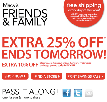
In the report, Chad argues that since folks do like to share, creative can be designed to integrate social sharing and give it more emphasis. Here are some examples to inspire:
First, an example from the report. The social sharing is still fairly incidental, but it has got more prominence than many.

Here's another social email example from Chad's Retail Email blog. It may not win design awards, but the integration is there. As Chad says:
Ignoring the word cloud (which is feeling pretty dated at this point), this email does a great job of supporting its invitation to connect with real-world examples from each social network. It becomes a lot less abstract with an example, in the same way that a pitch to sign-up for emails is strengthened by showing a sample email. Including tweets, wall posts and other items from social networks in emails is definitely a growing trend.

The third and final example is the best, I think, with good integration of social into the message, integrated with copy to support the campaign goal. It gives it a human touch and feels like a fresh approach.
It's from another good source for inspiration - the Email Design Review site by Elliot Ross (Twitter). Elliot is Senior Creative Designer & Strategist at eDialog London.


