Do colours really have an impact on conversions when it comes to web design?
Is there a 'British' web colour palette, or a Chinese one? Have web users from around the world adjusted to a Western led approach to colour and is it standardised? Within this blog, these and other questions will be assessed by GlobalMaxer’s cultural conversion expert Joe Doveton.
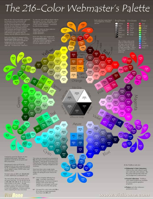
Source: Visibone
From feeling blue to shaking off a black mood, phrases can express a linguistic synaesthesia of emotions, commonly shorthand for an experience articulated through colour. By no means is this limited to English either, with most languages having their own such as the German’s 'blauer Montag' (a day off work), the French 'une peur bleue' (a morbid fear) and the Swedish 'sväva på rosa moln' (to be in love).
So, how important are the cues of colour in web design? Should designers really make an effort to localise colours for each market’s website? In many cases, the answer is yes, but it depends on context and the interplay of colour, language and page composition.
There is surprisingly little academic research into cultural colour that governs multiple countries, however, there are a number of insights which still have some validity.
For instance, there is a perception of the German high tech industry and the sleek silver styling of brands like Mercedes, synonymous with high quality. In China, the colour red is thought to have peaceful and lucky connotations, whereas in the West red is associated with action, excitement and danger. Blue, red, yellow, white and black all have traditional significance based on the original elemental concept of Wu Xing. Japanese culture has a blurred definition of blue and green - meaning that green traffic lights are in fact blue in Japan!
One study by Joe Hallock et al (2003) surveyed 232 subjects in 22 countries and grouped findings into general trends to reveal some interesting universal results:
- Blue and green together made up 56% of the favourite colour grouping
- Orange, brown and yellow contributed 61% of the least favourite colour group
There was also some correlation between least favourite colours and colours thought to be 'cheap' or 'inexpensive'.
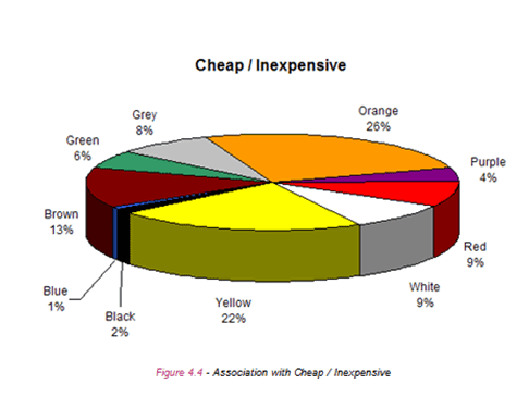
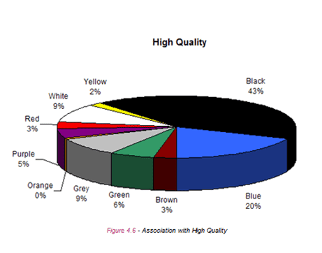
Credit source: Hallock Colour Assignment Survey, 2003
Colours associated with high-quality like blue, black, white and grey were also associated with emotions like trust, security and high technology, which is perhaps a reason why so many high tech brands use these colours in their marketing channels.
At GlobalMaxer our cultural MVT testing programme has seen evidence of a strong preference for national colours.
Call to action colours with red is often preferred in China, while orange is strongly favoured in the Netherlands.
Colours have sentiments that bleed across concepts like nationality, religion, secularity and positive and negative associations.

In the following table you’ll see:
- In some secular societies national and secular countries are the same
- Religious societies often have religious colours that are also associated with some negative experiences
- It could be advisable to steer clear of colours that cross over as both religious and negative
In researching secular colours we concentrated on many objects people see in everyday life from post boxes to public transport, political parties, road-signs and police uniforms.
It’s interesting that although there are cultural differences across nationalities there are also consistencies: transport and communications groups favour vibrant (often primary) colours, authority bodies almost always use dark, sober colours.
So, depending on your brand offering using secular colours can be a safe bet to reflect security and inclusiveness.
Perhaps the most interesting aspect of culture and colour is how globalised brands tend to override cultural factors. In a world dominated by pan-national brands corporate identity is increasingly important- think about Coca Cola’s ubiquitous corporate red and white, McDonald’s golden arches or IBM’s long standing nickname 'Big Blue'.
When it comes to web design it’s quite safe to test colours already in use by global brands to create a kind of halo effect around its association.
For example, in 2002 an Islamic company launched Mecca Cola in France to show solidarity with Palestinian groups.

In Japan, Mos Burger - a home grown burger chain - featured a red logo with a Latin script name and 'M' styling.
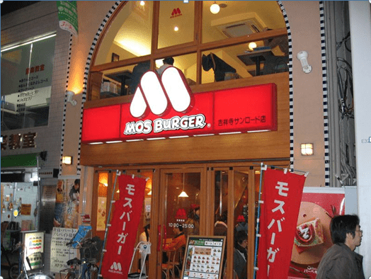
As you can see colour can both compliment local culture and standardise groups or products.
Five top tips for using colour in web design
To make sure your web design is ‘culture friendly’ here are my top five cultural colour tips:
- 1. Colours can be both negative and positive within the same culture - context is everything. Make sure you investigate fully what connotations it represents. Use ones which don’t have a negative and positive meaning as it could have repercussions on your conversions
- 2. Industry type is significant: high tech brands are expected to be robust, secure, high quality and exclusive. Toy shops are expected to use primary colours. Don’t forget, you can piggy back on the back of established brands too
- 3. Red is sensitive for different reasons in different cultures - proceed with caution
- 4. If colours are used in secular life in a culture, chances are they’re safe to use in web design. Often colours associated with religion also have some negative associations so steer away
- 5. Never create a web design without testing it – it might look great but if you haven’t applied Cultural Multivariate Testing (CMVT) you might see all your hard work come to nothing

Thanks to Joe Doveton for his advice and opinions in this blog post. Joe is the Head of Client Services at
GlobalMaxer, UK’s leading Cultural Conversion expert. He has 17 years industry experience, working alongside a number of high profile brands including STA Travel, Manchester United, Vodafone, Sony and Panasonic. His area of expertise ranges from traffic driving disciplines (online advertising sales, ad planning and buying, ad networks, SEO & PPC) to site-side optimisation (web analytics, usability, conversion, AB and multivariate testing). Regularly speaking at conferences world-wide on all facets of multivariate testing and conversion, his ‘know-how’ on how conversion patterns vary across cultures is second to none. Editorial credits include UX Magazine and I Gaming Business Magazine to name but a few.Moreover, Joe recently worked on a cultural conversions chapter for the renowned CRO industry bible ‘Landing Page Optimisation’ by Tim Ash (2012). In addition, he is also one of the main speakers at Conversion Conference Boston 2013.


 Thanks to Joe Doveton for his advice and opinions in this blog post. Joe is the Head of Client Services at


