The magic of creative briefs
Back in the days when I was a young, ambitious advertising executive, I once spent a whole week learning how to write a creative brief. Yes really – a complete full-on Monday-Friday in a hotel, up at 7, bed in the small hours and non-stop presentations, lectures and exercises in between.
Why did they think it worth it?
It must have cost the ad agency I worked for a fortune, but they knew it was worth it. A good creative brief produces thoroughbred creative work. A poor one leads to work that looks like an old donkey. It gets cobbled together and then gets chopped and changed as everyone’s thinking develops on the hoof. (There’s nothing like some finished design work to make people realise, “What we really want to say is…..”)
Why it’s still worth it
Last week, I was reminded again of just how powerful a well-written creative brief can be. I was asked to write a sales letter for a client, a leading supplier of B2B services. The initial ‘brief’ was so woolly and jargon-filled it was impossible to know where to start. Since it was a client I know well (and one who is always keen to save money) I offered him a lower price if he was prepared to do a new creative brief using headings I would supply.
Sheer gold
He agreed, and two days later, I had a brief that was so tight and focused that I was able to do the creative work in half the time (and half the cost). Even better, it was a more powerful communication because the message came zinging across loud and clear from the very first paragraph.
The magic headings of a creative brief template
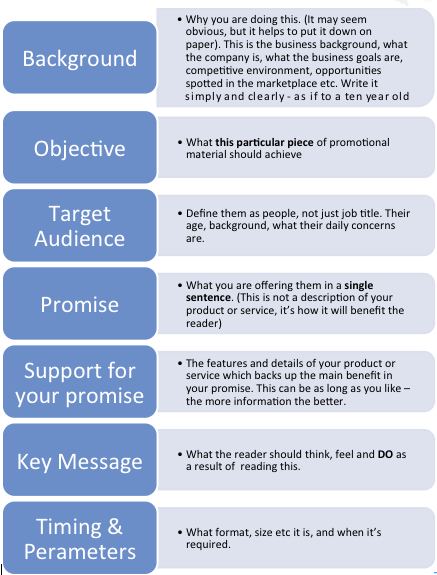
So how do you go about writing a creative brief? What, in essence, did I take away from my week of high-voltage learning and £££’s of (my former employer’s) money? If you’d like the golden nuggets, without the pain or the expense, here are the headings that I sent my client last week.

Doesn’t it look deceptively simple? I'm sure you've seen similar before, but I find it's the focus on the promise and key messages which makes the biggest difference from other brief templates I've seen.
It’s a bit like the Tardis – not a lot to see on the outside, but if you go inside and start using it, you’ll find hidden worlds.
I've found that this process works for any creative work, from a TV or radio commercial to a website, a landing page, a banner ad, leaflet, brochure or press ad. It always leads to a better end result, whether the work is done in-house or outsourced.
The process makes the difference
As a little footnote, my client said that he’d found the exercise really helpful and inspiring. “I found it a really useful tool because it forced me to think about the sales letter from the point of view of the recipient. Not what I wanted to say but what they wanted to hear.”
He’s now a convert and will be using this framework for all future creative work. However, it’s interesting that it was only when he experienced the process of writing a creative brief that he realised its true value. If you’re not convinced, then I urge you to try using these headings for your next piece of promotional material. I promise you the results will be worth it.


