An interview covering the process, tools and skills needed to increase conversion, leads and sales

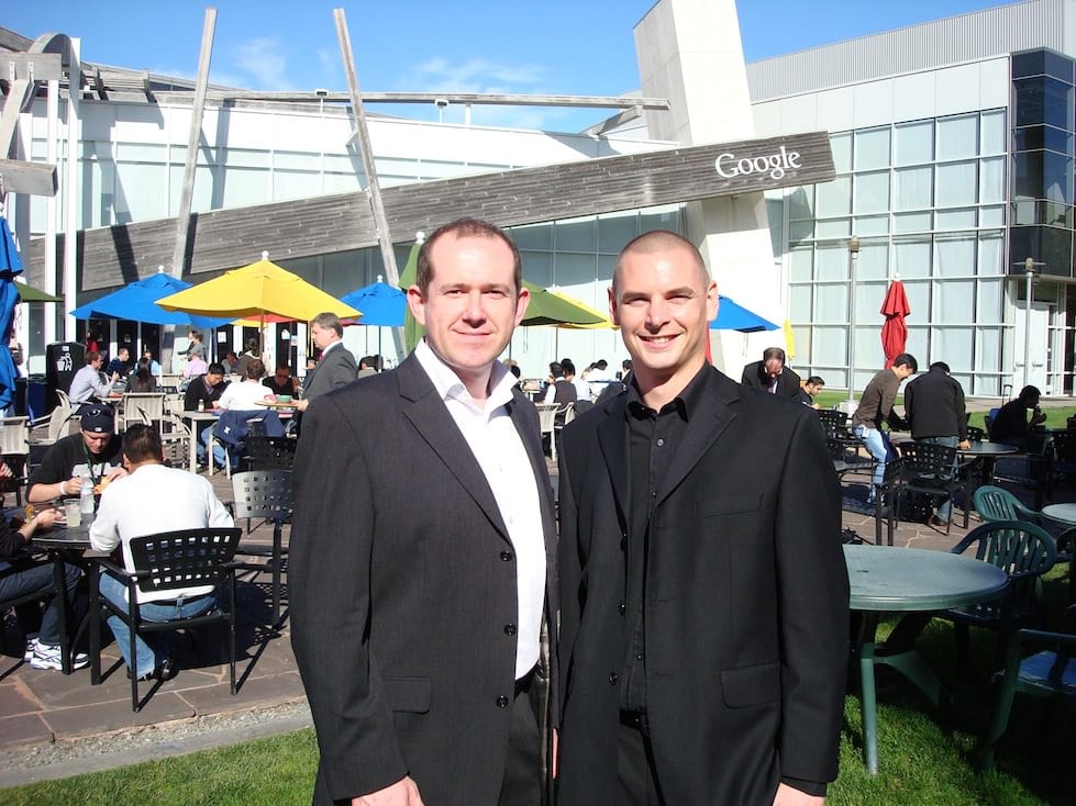
Karl and Ben at the Googleplex
Many web consultants have relevant-but-similar backgrounds. They're experts at design, or pay-per-click advertising, or another specialty.
But when I recently met Ben Jesson and Karl Blanks from Conversion Rate Experts their background didn't fit the norm. Their company was founded when a real-life rocket scientist teamed up with a internet marketing specialist to look at websites through unconventional eyes.
This unusual perspective has turned out to be highly profitable for their clientele, which includes firms like Google, Vodafone, and Sony.
In this interview we explore how Conversion Rate Experts approaches optimisation since I think companies, agencies and consultants can learn a lot to their approach to returning the commercial returns from websites of all types.
I've asked them about the process they use to increase leads or sales from an online business and we've included links to a lot of the tools they use.
2012 update:
When I completed the original interview with Ben and Karl back in 2010, I asked whether they had a summary of their process to share. We did cover this in Question 3, but recently Karl has been in touch to say they now have an infographic to show this process. I thought I'd share it so you can review your processes against it. You can read more about their process on their blog where they expand upon each step.

What is Conversion rate optimisation?
Q1. We're seeing a lot more companies working now on CRO. What is it? Is it more than landing page optimisation?
Yes, it should be. Landing page optimisation focuses on one page. We coined the term Conversion Rate Optimisation ("CRO") in 2007 to describe the process of optimizing the business itself. It's really commercial optimization
A proper job of CRO includes the review of the entire process from the initial lead-generation ad, all the way through to the post-sale follow-up. The real goal is to identify which parts of the sales funnel will yield the greatest wins with the least work.
That means it's necessary to bring a lot of disciplines to the party, including understanding traffic sources, visitor psychology, and the company's position in the marketplace, including its core strengths and weaknesses. On top of that there's usability testing, copywriting, and web design factors to look at.
All these elements go into creating hypotheses for testing. We're maniacal about testing, because we've seen too many businesses merely throw a series of "best practices" against the wall to see if anything sticks. Best practices should not be the answer to optimizing a website, but merely one starting point for formulating a test strategy.
Once we determine what truly works for a particular website, then we examine how our findings might be used in other media channels. For instance a better series of benefit statements might be transferrable to direct mail or email autoresponder campaigns"”subject to testing in those media, of course.
The business case
Q2. How do you help companies persuade colleagues of the returns from CRO, the business case?
It's easy; we explain that CRO allows companies to generate more revenue without spending more on advertising. It's about getting a higher return from the existing ad spend.
Unlike certain industries like public relations, the entire foundation of CRO is based on data, measurement, and testing. You don't need to present arguments when the data can do the talking for you. Once you measure the value of visitors, conversions, and sales, then it's simple arithmetic to show how, say, a 10% boost in conversions would help the bottom line.
Here's another powerful side-benefit: When you optimise your funnel and bring in more revenues, you then have earned a luxury: You get to decide whether to pocket those profits or plough them back into even more advertising, thus distancing yourself even further from your competitors. It's a nice problem to have.
Identifying the biggest opportunities
Q3. What approaches do you use to decide which part of a site needs most urgent attention?
FORTUNE magazine called what we do "a combination of multivariate statistical analysis and good old-fashioned detective work" and that pretty well describes our approach.
It's often very useful to map out your entire sales/conversion funnel and make sure it's being comprehensively measured in whatever web analytics package you prefer.
Then you should look for the biggest drop-offs from one step to the next. We like to say that we look for the "blocked arteries" (that is, pages"”or page elements"”that get loads of visitors but are underperforming). How do you know if something is underperforming? Clues come from a range of feedback mechanisms: the analytics data, usability tests, surveys, customer support feedback "¦ and, of course, gut feel. Of course, we have the advantage of having been engaged by companies on several continents and in many industries, so we have a good knowledgebase of what's good and what's bad. See our list of effective tactics and strategies.
What mistakes limit conversion?
Q4. Give some examples of the most common "conversion rate killers" you see.
Killer #1: Not split testing. Many people think they're done if they take action to make changes to their site. In reality they're only "done" when tests show that the changes in fact improved conversions. Installing a "best practice" magic button that another site swears by might actually lower conversions. Despite the popularity of video, Google once discovered through tests that video reduced conversions on one of its pages. You simply must test to find out.
Not long ago, multivariate testing software cost more than £5,000 per month. Now you can use Google Website Optimizer and other software packages for free, so there's really no excuse. We created a tool, called Which Multivariate, which helps you to select the best software for multivariate testing.
Killer #2 is "meek tweaking""”in other words, making changes that are never likely to have a significant effect.
Killer #3 is asking for the sale on the first visit. It's often a good idea to test the creation of a multi-step conversion funnel, in which you provide great value before you ask for the order. Comparison charts, forums, special reports, and email marketing are examples of elements that allow you to provide good information, ask for names, cultivate a relationship and thereby improve the chances of a sale.
We recently gave a talk on 15 Common Causes of Conversion Death
What are the latest approaches?
Q5. Are you seeing any innovative design techniques that are helping conversions?
Excellent design is a prerequisite for conversion, but the biggest breakthroughs tend to be the new tools and techniques for gathering insights into the visitor's mindset.
For determining how visitors interact with a site we often use both Clicktale and CrazyEgg.
KISSInsights and Ethnio are both good for asking your visitors to give you immediate feedback on your site. GazeHawk enables you to conduct an eye-tracking study on your site for a tiny fraction of the traditional cost.
Many of your readers will already know about how wireframing is important in order to get agreement on functional aspects before you take the time to make a site look good. We like Balsamiq for that purpose. [Editor - I use that too - a great simple wireframing tool for consultants and agencies]
Finally, your readers may want to get our free newsletter to see what a million-dollar landing page looks like, along with a graphical analysis. We call it that because it generated over a million dollars for one of our clients.
If you want even more examples of what's possible with conversion improvement, watch the video in the header of our website.


